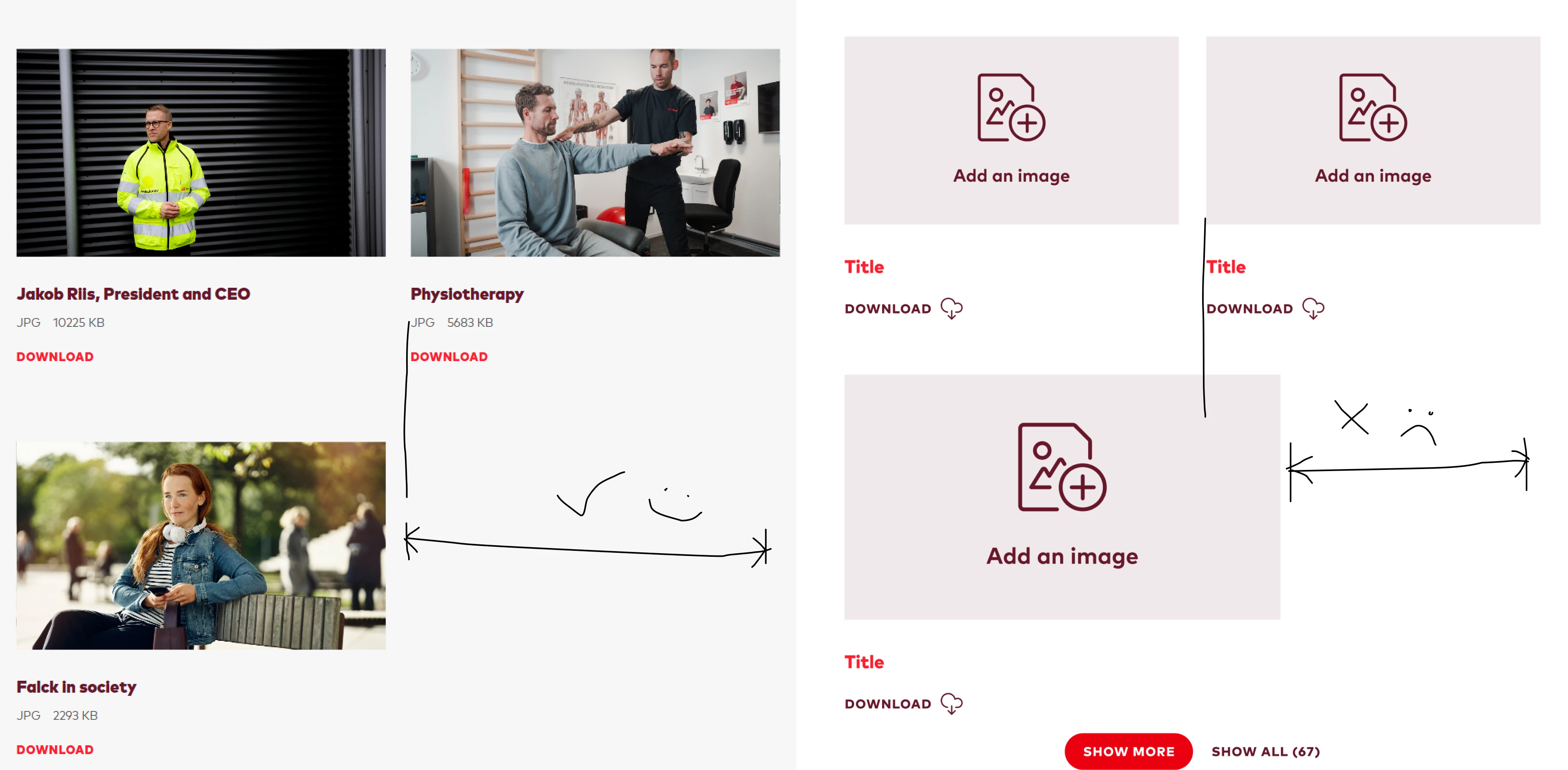
Hi everyone,
I’m looking for a better way to maintain consistent widths for component instances across responsive breakpoints (Tablet/Mobile).
Currently, everything works perfectly on Desktop where instance widths are fixed. However, the layout breaks when using min-width and max-width for smaller screens. I’ve experimented with Layout Grids, but they leave awkward empty spaces below when an instance's visibility is toggled off.
I’ve considered making every single row toggleable, but that feels like a bloated, confusing experience for the designers using the library.
Does anyone have a solid workflow or a "holy grail" file for handling these responsive group cases? I’d love to see how you’re structuring your layers!
