Make auto layout frames extend upwards
I’m trying to get an auto layout frame with two text boxes in it expand upwards when text is added, and have the text stay aligned to the top of the box, rather than extend the box downwards.
I can get this working with the text only by changing the auto layout alignment, but as soon as I fill the frame with a colour, it doesn’t seem to work.
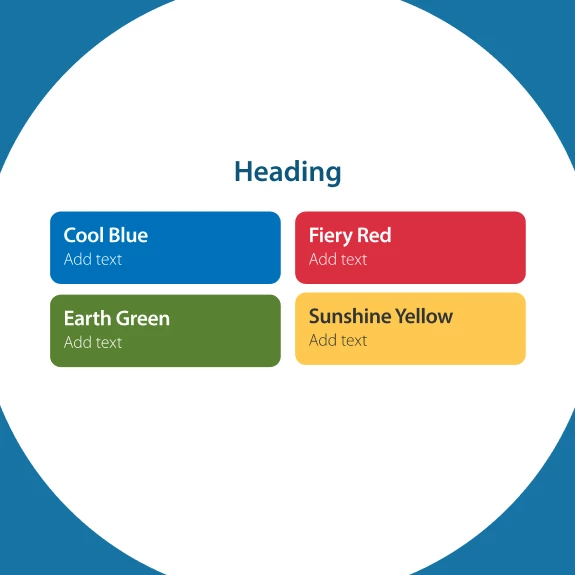
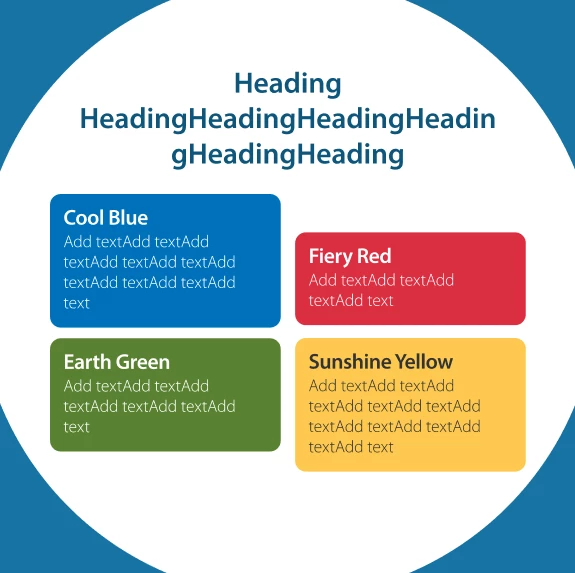
The reason for this is I need keep the horizontal gap consistent across the image, so effectively, the top two boxes (red and blue) expand upwards when text is added, and the bottom two boxes (yellow and green) expand downwards.
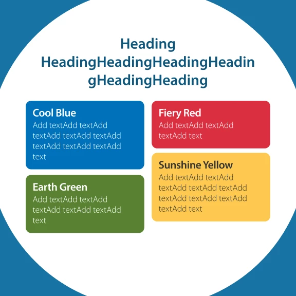
The current build I’ve got them to expand downwards only, so the horizontal gap breaks if the boxes are different heights. I’m using auto layout on the left and right columns, which are then in an auto layout with the heading to make sure everything stays central in the image when text is added.
The images - first pic is the template with nothing added. Second pic is how it works now, final pic is how I want it to look when text is added, so the horizontal gap is consistent.
I’ve tied myself in knots trying to work it out, so any help appreciated. Maybe I should look at grids?