Hey guys! This is my first time posting on the Figma community, pleasure to meet you all! 😊


So my question is…


If you’re designing a product for a web browser and you want to test it on a phone, how do you personally accommodate for the phones notch and the browser header and footer that would usually be on the page?


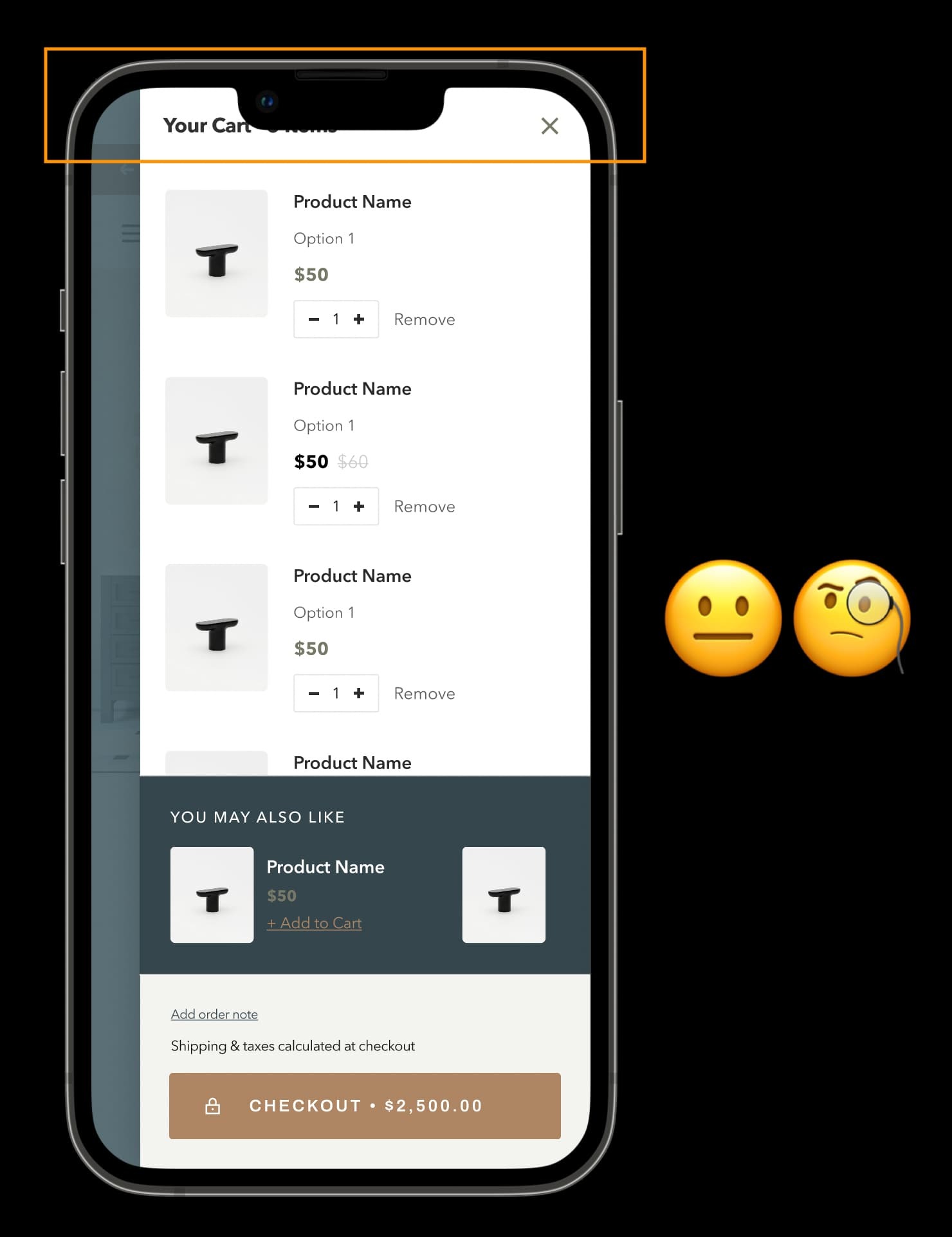
When I load my design on a template or on my iPhone, the content goes behind the notch and I’m not sure of the most efficient way to design around this.


  • Is it as simple as ading in fake browser headers and footers into every design?

  • If so, would you submit designs to developers with these included in, or remove them at the end?


Thanks in advance!

Tom

I’m gonna bump this because I’m currently experiencing this issue and wondering if anybody has any insights into how they handle it, cause it’s a bit of a faff!


Something I was thinking was, it’d be great if Figma did a Prototype Frame of an iPhone with a notch, but with the option of including Safari’s address bar and controls at the bottom.


Alternatively, should I put my design in a frame and then place that on another frame that has the header and footer in?!


Thanks for reading! Feel like I’m overthinking this haha. 🙈


I have this “notch” problem… Maybe I’m doing it wrong…

I want to present my mobile prototype on iPhone X, my designs include status bar – but on the actual device (prototype saved to Home Screen) it shows this additional top margin and everything is displayed below the notch…


Glad to see I’m not alone haha!


I’m pretty new to Figma so maybe I missed a “prototype top margin” setting that is somewhere out there… If not, I think my workaround would be duplicating my prototype page, removing the notch+status bar from my designs and pushing the content 46px up… Tried that for one of the screens, kind of works out – the only disadvantage is the white margin at the top & no status bar.


Any idea or solution to this


I would just like to support this as an option and have full empathy for everyone. Without detracting from Figma because its fantastic and we stopped using invision and zeplin for Figmas tools, but invision was great for his in its view options.


Any update on this issue after an year.


Hi team. Any news on this? As mentioned previously being able to have Figma automatically adjust the designs to accomodate for the notch like Invision would be a great addition! Here’s hoping!


I just add the system status bars into all my comps. I treat it like it’s part of the design, and doing it this way helps me account for it in the design process. I never thought it should be any other way, though I’m aware that in invision days they drew it automatically, I didn’t enjoy that approach.


Hi folks. Just wanted to give a big old + to this thread here.


I recently finished a full website design and prototyped everything out nicely, then realised that the iPhone 13 Pro device prototype doesn’t include the status bar… so I included it in my mockup in the header component. Problem solved! Yay! 😃

Uploading: Screenshot 2022-07-25 at 12.27.22.png…](Screenshot 1)


Or so I thought. Until I opened up one of my nice drawer overlays. 😦

bUploading: Screenshot 2022-07-25 at 12.27.13.png…](Screenshot 2)


On a real device, the status bar always displays regardless of the app that it’s used in. In some apps (like Safari) it’s on its own opaque background, but on others it’s on a transparent background, but it always takes up space to either side of the notch.


I think that this is a feature that should be baked into Figma’s device settings for the prototype to be close to a real world preview. The status bar should remain visible at all times - currently in my mockup it scrolls along with the rest of the mockup - so surely it would be a question of just updating the image the device prototype uses to include the status bar?


Could we have this added as an option?


Perhaps the following:


  • **iPhone 13 Pro - No status bar ** (the current option and the only option)


  • iPhone 13 Pro - Status Bar on White (for Safari - I will use this most frequently)


  • iPhone 13 Pro - Status bar on Transparent Background (for other applications)


Thanks!


Hi folks. Just wanted to give a big old + to this thread here. (sorry, deleted my last post as I couldn’t find an “edit” button).


I recently finished a full website design and prototyped everything out nicely, then realised that the iPhone 13 Pro device prototype doesn’t include the status bar… so I included it in my mockup in the header component. Problem solved! Yay! 😃


Or so I thought. Until I opened up one of my nice drawer overlays. 😦


On a real device, the status bar always displays regardless of the app that it’s used in. In some apps (like Safari) it’s on its own opaque background, but on others it’s on a transparent background, but it always takes up space to either side of the notch.


I think that this is a feature that should be baked into Figma’s device settings for the prototype to be close to a real world preview. The status bar should remain visible at all times - currently in my mockup it scrolls along with the rest of the mockup - so surely it would be a question of just updating the image the device prototype uses to include the status bar?


Could we have this added as an option?


Perhaps the following:


  • iPhone 13 Pro - No status bar (the current option and the only option)


  • iPhone 13 Pro - Status Bar on White (for Safari - I will use this most frequently)


  • iPhone 13 Pro - Status bar on Transparent Background (for other applications)


I can empathize with the problem you described in the latest post because I do similar overlays, however I still prefer to add the status bar into screens myself, instead of Figma automatically adding it. I want to be able to customize the time shown and state of the status bar, and be able to configure these things per screen. Figma would maybe need to make the status bar configuration customizable on every single prototype screen, and also include a way to show it in exports. I do remember how Invision used to handle this automatically, and even then it was my preference to include the status bar manually.


Got it. How do you accommodate for the status bar needing to float or be “sticky” when scrolling, Brian?


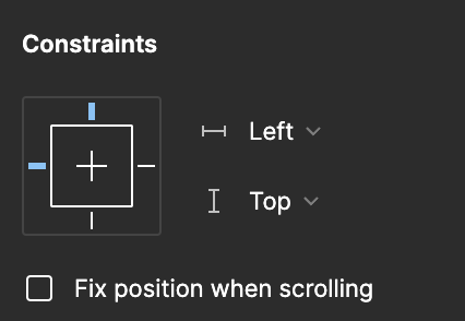
You can use the “Fix position when scrolling” checkbox for that. Make sure you set the constraints to top.


image


Thanks! I’m aware of that. The way I had it was to have the status bar in my navigation component, but because it’s in a component the “Fix position when scrolling” option isn’t available.


I could technically have instances pasted onto the page frames above the navigation. A bit inelegant but it will do the job!


Just bumping this up. Especially helpful for website design.


Glad to see I’m not the only one having this issue. A bit frustrating designing so many frames and finally when you see the prototype running, the notch covers all the headers. Really hope the Figma team would come up with a solution!


Hello from the future! This is still not implemented. +1!


it’s almost 2025 and this is not implemented yet. Does anyone have a solution??


Bumping this, Please add a checkbox for display below the notch.


Reply