

William69
New Member
Nov 2, 2026 9:44 AM UTC
Question

Help balancing these visuals

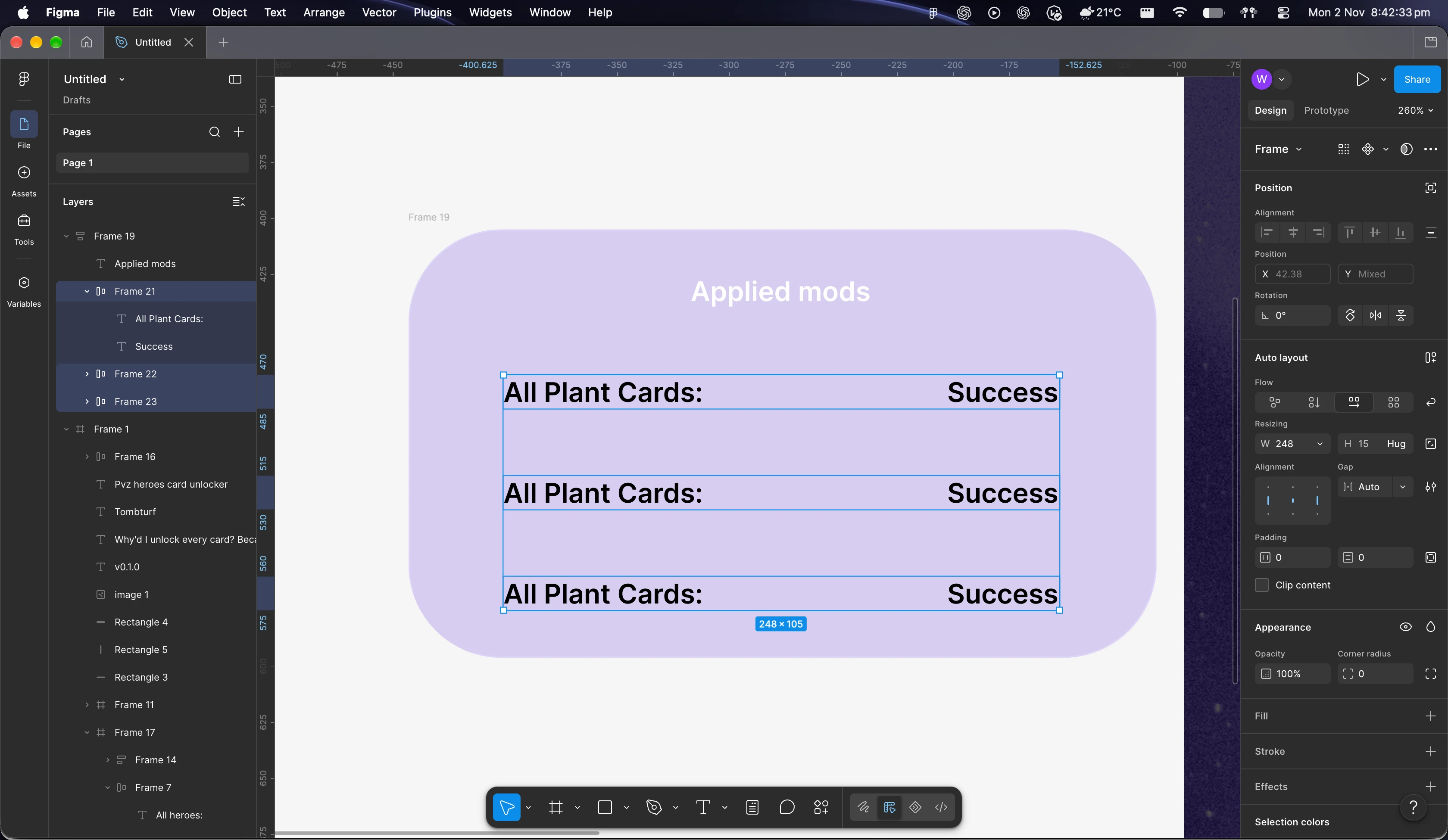
Hi. I just started figma yesterday. I made a decent mockup of a tool I wanted to make, except that I did it all by freehand. I am trying to remake them but with auto layout. However, even though it’s mathematically centered it looks very unbalanced relative to the “applied mods” part. I’m not sure what I can do to fix it
 

2 replies

William69
William69Author
New Member
Nov 2, 2026 9:45 AM UTC

I want it so that regardless of the length of the text on each side, it still looks visually centered relative to the subheading

Ondrej_Pavlicek
Figma Ambassador
Figma Ambassador
Nov 2, 2026 2:41 PM UTC

Hi there! 👋

Welcome to Figma and awesome job diving straight into Auto layout so early on, that is definitely the way to go.

There is no single correct way to fix this, but one important decision to make first is whether you want to go down the path of columns or rows.

I went with rows here so that it is super easy to scale and add more options later. One approach that has worked really well for me in similar situations is breaking the content down into distinct rows with clean horizontal dividers.

Example of row-based layout

When you set it up this way, it handles different text lengths and automatic wrapping much better without looking awkward under the heading.

Responsive text wrapping

Just sharing this as one possible option that might help. Hope you get it sorted out! 👍

Product designer @ NETWORG | Designing Model-driven Power Apps in Figma | Power Apps DesignKit (Model-driven) | Disclosure: I’m part of Figma’s Forum Ambassador program.