Shailesh_singh
June 27, 2022
Question

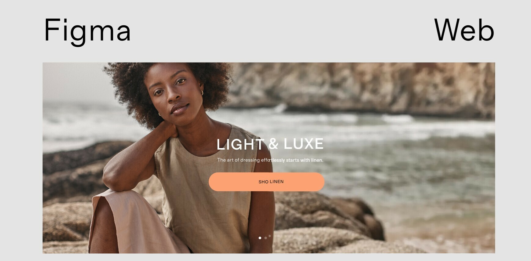
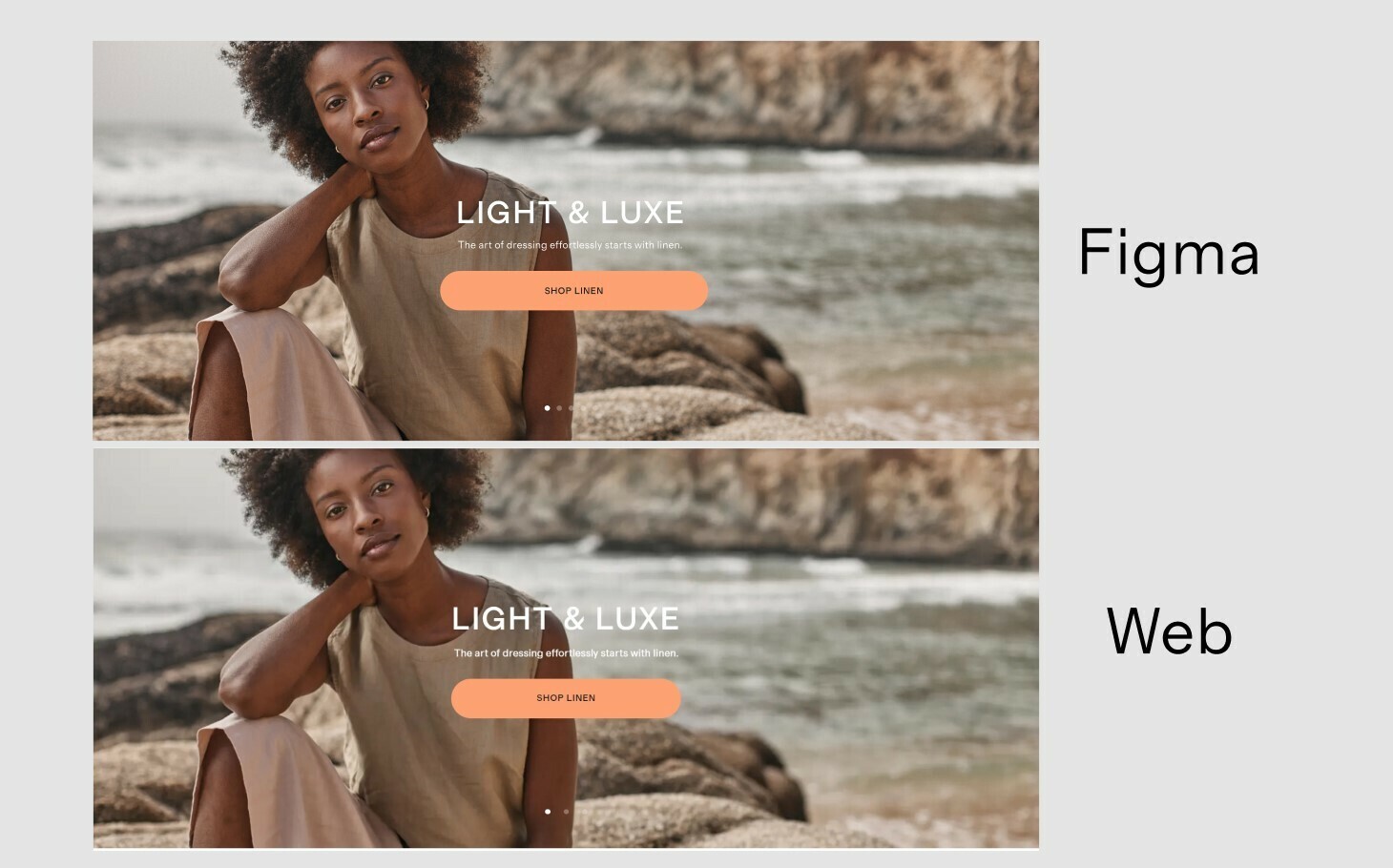
Font in browser seem bolder than in the figma?

  • June 27, 2022
  • 11 replies
  • 24306 views
  1. We’re seeing a difference in how font looks in Figma, and how they appear in the browser.

  2. The font size on the site was a lot bolder visually, despite being the exact same size, weight and the exact same font file. It feels very misleading and I’m not sure if maybe this was just an isolated experience because of the font we used.

  3. Attaching the screenshot of comparison

  1. Font – Grosa, type – woff2

  2. Did anyone else experience this? What could be the issue here?

Edited: Added few more Images for better visibility of difference in typography.

This topic has been closed for replies.

11 replies

Joe_Garlick
Active Member
October 24, 2024

I think Figma should remove smoothing/antialiasing so it looks more like what it looks like by default in most browsers. ort at least offer the option to toggle this. I find it incredibly frustrating when I set the tone/contrast and size and then it looks different in the browser and I’ve heard from front-end devs they prefer to shy away from adding smoothing/antialisasing to the code. It can make for less contrast and be harder to read which becomes a usability and a11y issue. I’d prefer to just design with what it looks like int he browser.