Hi everyone,
I'm experimenting with Figma Make and trying to generate a chart with two overlayed line charts (e.g., rainfall and water level) that share the same x-axis.
The challenge I'm running into is that the generated charts don't consistently align with the x-axis. The data points and lines appear shifted horizontally, resulting in one or both lines not sitting correctly above their corresponding dates/ticks.
I've tried several approaches:
- Attaching a Figma design file as a visual reference
- Uploading a PNG screenshot with annotations and arrows pointing to the alignment issue
- Writing detailed prompts that clearly describe:
- What should change
- What should remain unchanged
- The specific alignment problems
- Breaking the request into smaller follow-up prompts after the initial chart was generated
A typical issue is that:
- The two line series use the same dates but their points don't align to the same x-axis positions.
- One line may start or end in a different horizontal position than the other.
- Axis labels, grid lines, and data points don't always appear to use the same spacing calculations.
The frustrating part is that Figma Make often fixes one problem while reintroducing another, even when I explicitly tell it which parts of the chart to preserve.
I'm wondering:
- Has anyone had success creating multi-series line charts in Figma Make?
- Are there prompting techniques that help preserve chart structure while fixing a specific layout issue?
- Is there a way to reference existing elements more reliably so Make adjusts only the requested area?
- Are there known limitations with charts, SVG generation, coordinate systems, or data visualisation components in Figma Make?
Any advice, prompting examples, or successful workflows would be greatly appreciated.
Thanks!
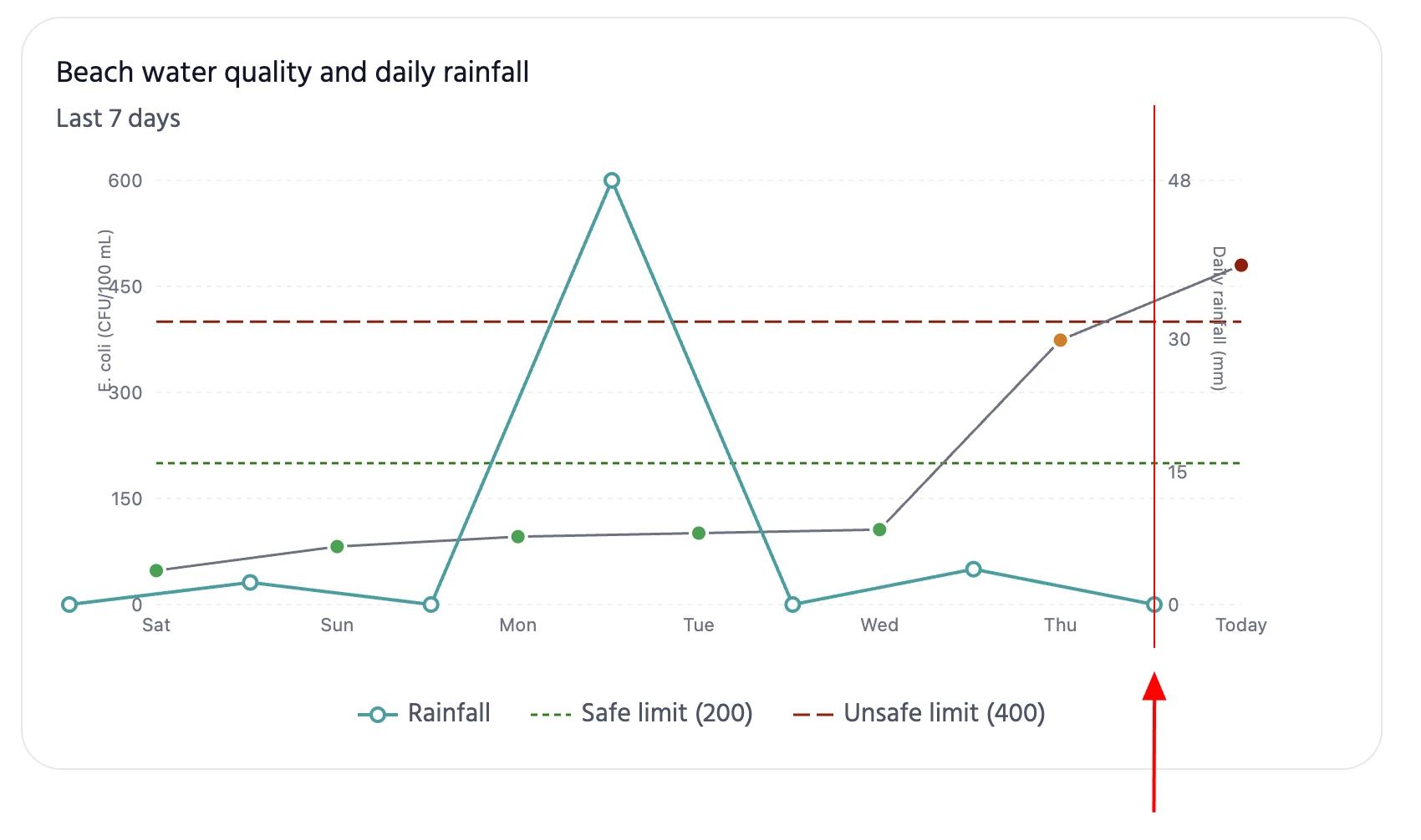
Example of the PNG screenshot with annotations and arrows pointing to the alignment issue:
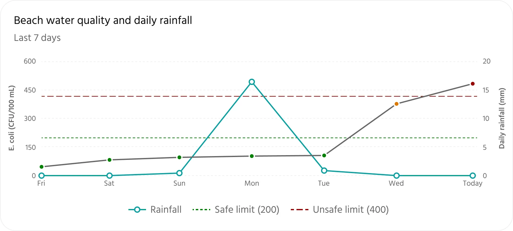
Example of the Figma file I created with the proper layout, uploaded as reference: