

Question
Design Challenge: How to visualize "56-to-1" efficiency without looking like a marketing gimmick?
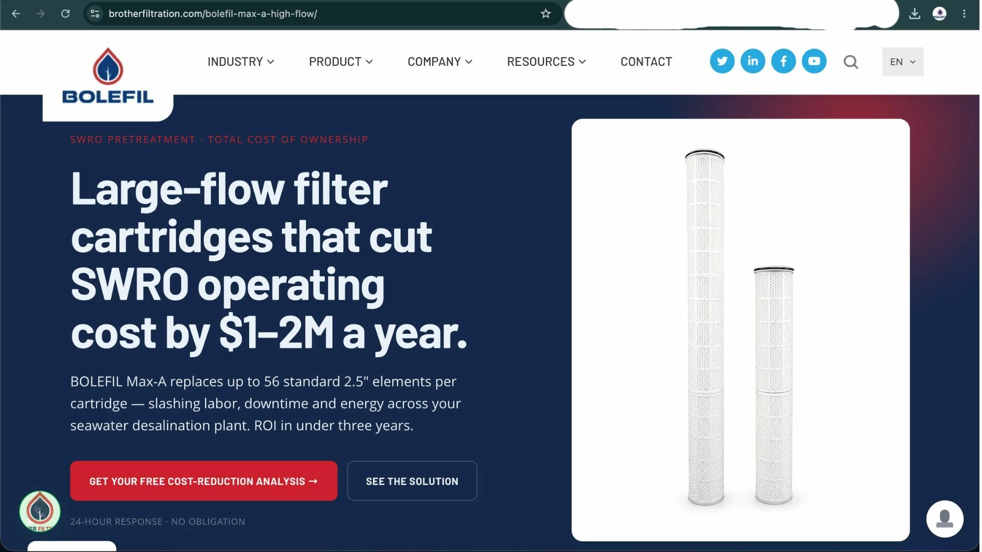
Hey Figma Community, Following up on my previous threads about RO pretreatment and coalescer landing pages, I’m iterating on a new hero section for the BOLEFIL MAX-A—a high-flow filter for large-scale desalination and data center cooling. The Design Challenge: The product has a massive performance claim: one cartridge replaces 56 standard ones, cutting costs by $1-2M/year. For an engineering audience, these numbers are so high they can almost trigger 'marketing skepticism.' My Current Strategy (Screenshot attached):
- Hero Statement: I led with the financial impact ($1-2M/year) in a bold, SaaS-style layout to elevate it above a traditional industrial catalog.
- Visual Scale: I used a clean 3D render on a high-contrast container to make the hardware feel 'premium' rather than 'dirty industrial.'
- Consultative CTA: Focused on a 'Cost-Reduction Analysis' rather than a hard 'Buy Now.'
Where I want to go next (Looking for feedback): I want to move from 'Static Information' to 'Visual Proof.' I’m considering a few 'Angle B' ideas:
- Interactive Scale: A hover-state or slider that physically breaks the MAX-A down into the 56 standard units it replaces.
- X-Ray/Cutaway: Shifting the render to an 'X-ray' view to show the internal pleated media (the how behind the flow rate).
- The 'Dashboard' Aesthetic: Designing the feature section to look like a live system monitoring tool.