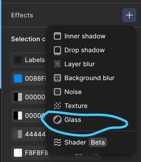
Hi @Agha! You can approximate the look of the Glass effect in CSS using backdrop-filter, a partially transparent background, and subtle highlights.
Our Glass effect also includes refraction, depth, and dispersion, which don’t really have parallel in CSS properties to help reproduce the full effect. Also, just to note it in case you were wondering, Dev Mode currently doesn’t generate CSS for Glass.
For a website, this is a useful starting point:
.glass {
  background: rgb(255 255 255 / 0.15);
  -webkit-backdrop-filter: blur(12px) saturate(120%);
  backdrop-filter: blur(12px) saturate(120%);
  border: 1px solid rgb(255 255 255 / 0.3);
  border-radius: 24px;
  box-shadow:
    inset 0 1px 0 rgb(255 255 255 / 0.4),
    0 8px 24px rgb(0 0 0 / 0.12);
}
These are example values so you’ll want to tweak those to match your design. The blur approximates the Frost component, the background adds tint and transparency, and the border and inset shadow suggest an edge highlight. Saturation is an optional visual adjustment.
Make sure you place it over an image or other visible content so there’s something behind it to blur. Also, keep the background partially transparent, rather than lowering the opacity of the whole element and its text. MDN explains how backdrop-filter works if you want to read more in depth on this.
To get closer to the curved-edge distortion and rainbow fringes, you’d need a custom implementation, such as SVG filters, with testing in your target browsers. The CSS above won’t reproduce those parts of Glass.
Feel free to share your results if you get a look that you are happy with in CSS - I’m sure it’d be helpful for others who want to recreate this effect in CSS.