

Sergio_Miguel
July 10, 2023
Solved

Change padding when toggle off a property

  • July 10, 2023
  • 14 replies
  • 5787 views

Hi, community!

I am dealing with an issue and I’d like to see if anyone experienced the same and can share the solution. Any ideas to test are welcome.

So in my company’s Design System, we have components that when we activate a toggle the padding can vary, like a button that by default has 16px left padding but when the button has an icon the padding is only 12px. So if it was the other way around I’d just solve this with, a not-very-nice hack of, having the icon inside a box with the additional padding, but in this opposite scenario I’m not finding a good solution for this.

Did anyone have the same issue and want to share the solution? I’m trying to avoid a new variant for this only because of padding, but it’s not easy.

How the component looks like:
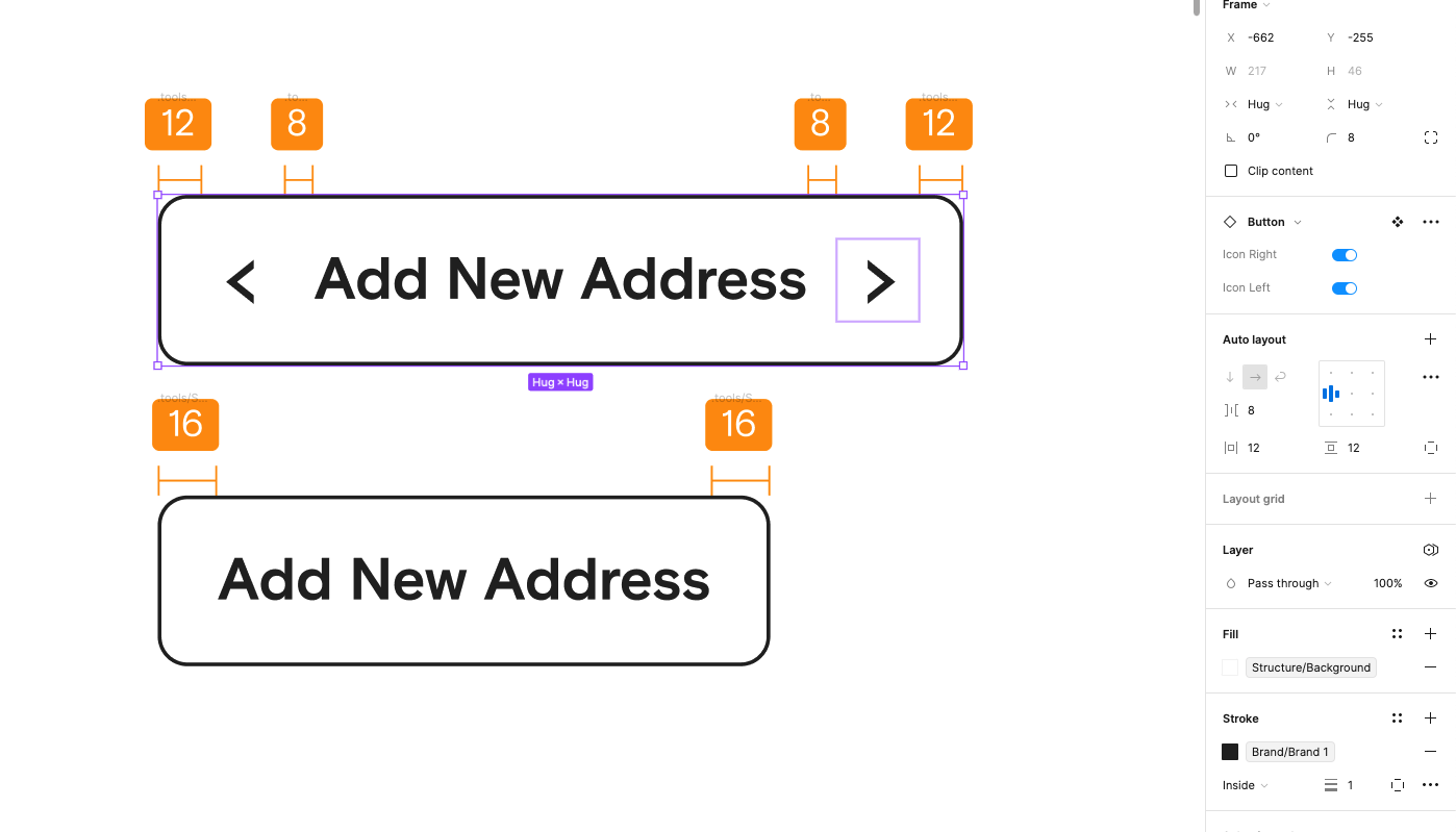
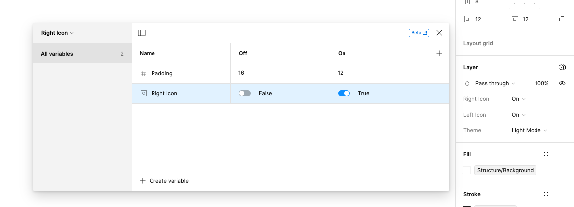
I’ve found a solution using variables, although it’s not possible to connect a variable with a property toggle, right?
This topic has been closed for replies.
Best answer by Sergio_Miguel

Thank you both. I am aware of that, although if you read my first comment my goal was to avoid having a variant only because the padding changes when toggling on an icon 🙂 The way I solved it was adding a boolean variable and a number variable to the padding and this was when I apply the “Icon on” it changes the padding accordingly. This solves the issue, the only thing that is not perfect is that variables are not shown in the properties panel, which means that our designers need to be educated that there are components with properties and variables and they have to look for both.

Maybe this is something Figma can improve in the future and centralize the configurations in one place.

14 replies

Frazer
January 26, 2024

@Sergio_Miguel - yeah annoying, that’s what I didn’t like about the previously proposed solution.

This new approach is fully automatic. You toggle the icon visibility and it adjusts the padding accordingly. The best bit is when we do get the support to be able to use variables dynamically we will have the same experience just a better implementation.

Anyway, im glad you got something you are happy with regardless.

Marija_Dimovic
New Member
November 12, 2024

Hi! I’m interested in how this would work the other way around. I have a card component that includes an image on the left. In this state, I would like the left padding to be 8 px, as the image has white space on the edges, making the smaller padding fit better. However, when the image is toggled off, I want the left padding to increase to 16 px. Currently, we’re using spacing components, but would like to find a solution that would work instantly whenever we switch the image toggle. Thanks!

Max_M1
New Member
November 22, 2024

How you apply this boolean variable to component?

Smith_Samuel_D
Active Member
December 9, 2024

Howdy folks! Just stumbled across this thread and wanted to share a simple, no-variable, no-variant solution I have been using the last two years with great success.

This solution uses spacers, which are empty frames that exist within the Auto Layout. Our button needs 16px when no icon is present, and 12px when an icon is present, and there is a 4px gap between the icon and text. Looking at these numbers, you see the math works out nicely.

By creating two 4px spacers and placing them within the layout, we can “fake” the gap between the text and icons, as well as giving us our appropriate 12px and 16px padding. 12px from padding, and 4px from the spacer.


The example shown by the original poster of this thread is a little more tricky because the numbers do not add as nicely. (See their original image below 👇)

To achieve this we will use the icon boolean properties, as well as two additional 4px spacers.

If we apply the corresponding boolean property for the icons to one spacer on each side of the text, those spacers will disappear when the icon is toggled off, giving us the 16px spacing desired when no icon is present. 12px from padding, and 4px from the spacer.

Let me know if you have any questions about this method! 🤠