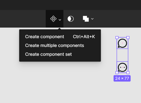
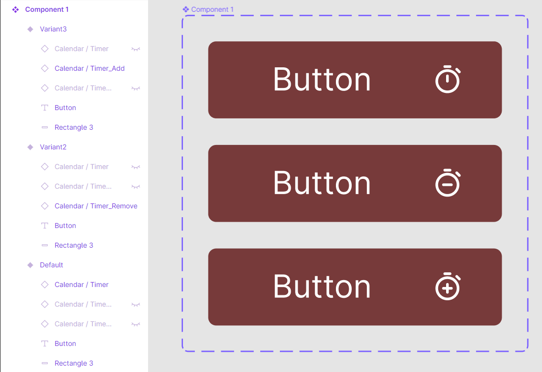
I would recommend that you create a component set with the components of the icons you want to appear! In the image that I uploaded, both icons are different components and when you create a component set you can add the hovering effect you want. Hope I have helped you! Cheers 😁 😇
Thank Nikos for your answer. 🙂
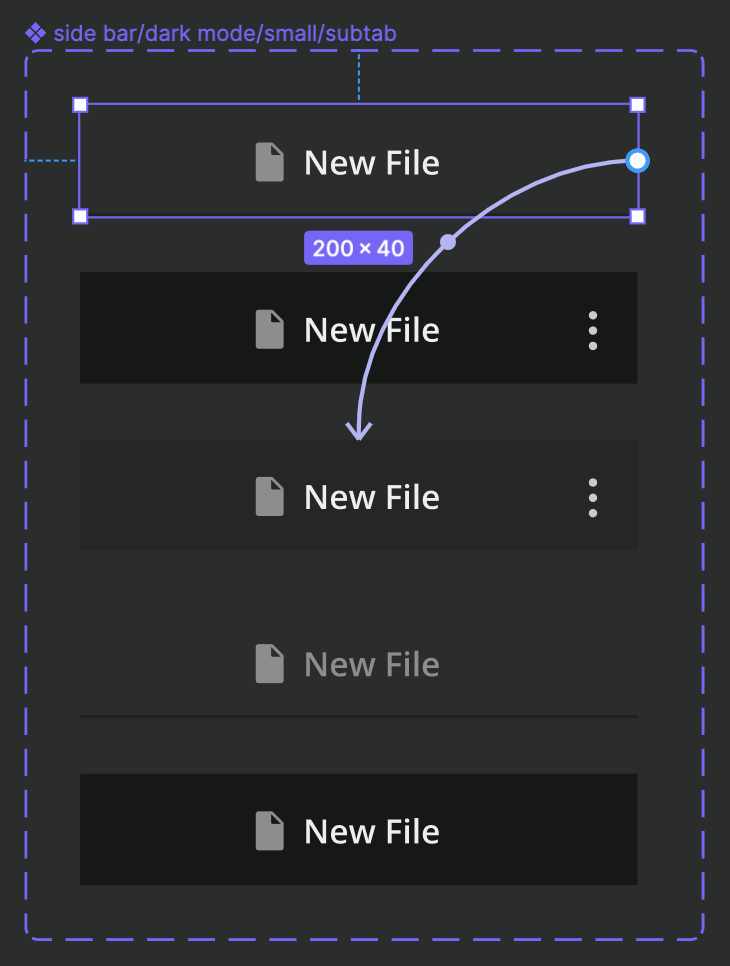
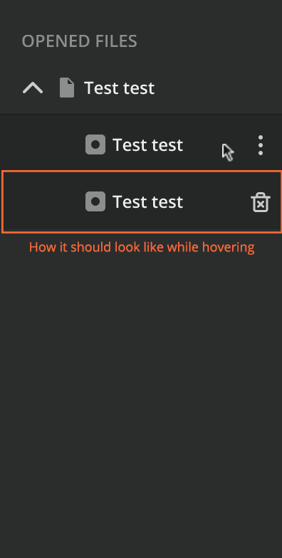
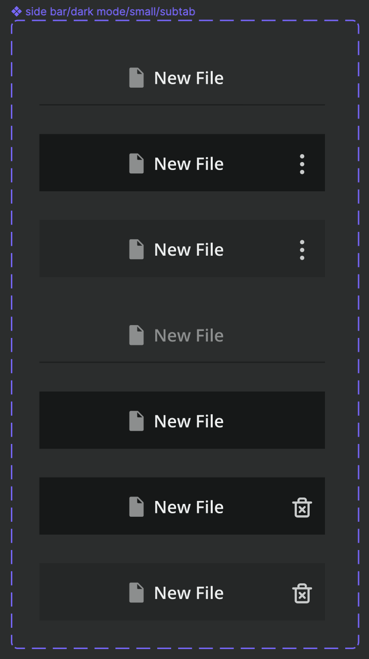
This is what I did—or at least what I think I did. As you can see in the first picture, this is my component with different variants. While hovering the kebab icon appears. In my file, I want to use this component but have a delete icon instead of a kebab icon. But when I go to the presentation mode it still shows me the kebab icon. I also swap the icon in the hover variant to be a delete icon, which I just put below. You can see that it shows the delete icon.
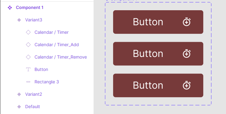
The same happened to me before when I created a component for a button that contains an icon. Also in that case it showed me the wrong icon that I actually swapped for while hovering. It displayed the icon which was defined in the main component. So for each possible icon in that very button, I created a new component—which can be a pain in the … when you create an entire design system based on that kind of way.
Something that I saw just now: I also swapped the file icon to a different icon. This does not cause any issues—maybe because it is used in every variant of the component?
Hover and Press for the prototype effects!
Thanks again, Nikos.
I tried to hide it in the default state and make it visible in the hover state. That’s fine—but only as long as I don’t swap the instance of the icon. I think the issue is, that the parent has no defined icon here. So, either the icon is always visible, meaning also in the default state or not visible (hidden) at all (also in the hover state).
Nevertheless, you helped me. For every upcoming hover state with a different icon, I will create a new variant and then—depending on the use case—I will change the variant to which it should change while hovering.
Thanks Nikos, i was looking for if there is universal way how to create button with outline icon on default and filled version on hover. Created icon with both states, one hidden. In button, i used the instance and showed correct version in each variant/state. And it works!
Christina if thats similar to what yo want to do and is not working, just make sure that you use same layer names in each (eg Outline and Filled in mine)