
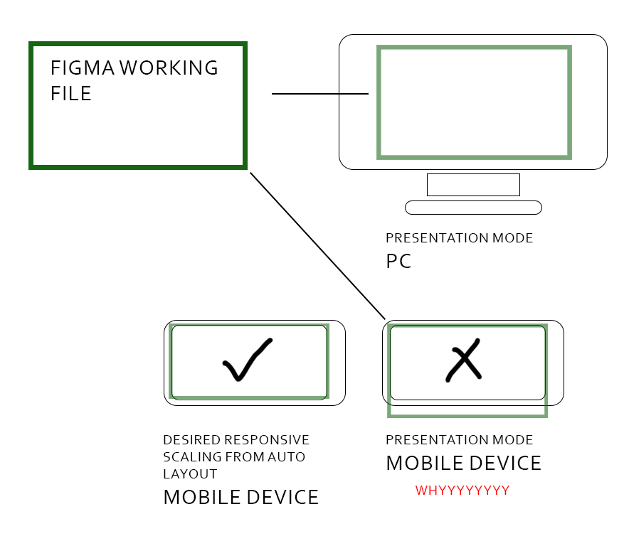
So I have this prototype made at 1920x1080.
I am able to make it fit to the screen on PC because there is such an option.
When I open the same prototype via Figma App on Mobile Device, however,
I am unable to make it fit to the screen. The prototype presentation is made fit to the width of my Mobile Device and ignoring the height.
So as you can see from my image, the height was too long for my Mobile Device and I had to scroll up and down to present the prototype on my Mobile Device even though I do not intend for it to work this way.
This design was meant to be port to Unity for development so I have already set the constrains such that certain UI elements will stick to Top, Left, Right, Bottom.
But I just cannot present that kinda responsiveness in Figma.
I have already tried to search on Figma forum and couldn’t find an answer to this.
If there’s any plug-in that would help, do let me know!!!
Your desperate designer,
Riviolas