
I’ve been dealing for some time with the quirks of using fonts as icons and Figma’s somewhat temperamental application of component variables, and I figured it was long since time to reach out here and maybe get some thoughts on how to better approach this.
Where I’m at now:
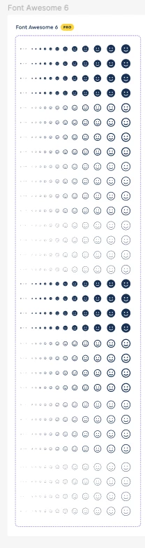
Currently, we’re using Font Awesome. Their figma system is comprehensive, but simple - it just gives you a base icon with a large variety of options, but lets you replace the text to get the glyph you want.
This is a nice beginning, but I also want the convenience and guardrails of selected, specific icons for approved usage - designers shouldn’t be grabbing any text out of FA, and we can do this by providing more typical layout of icons. So, my stuff:
I’ve taken Font Awesome’s setup, taken out all the states I don’t need, and created a “base icon”. This component has options for Background shape, Padding, Icon style, Size, and of course the icon text itself.
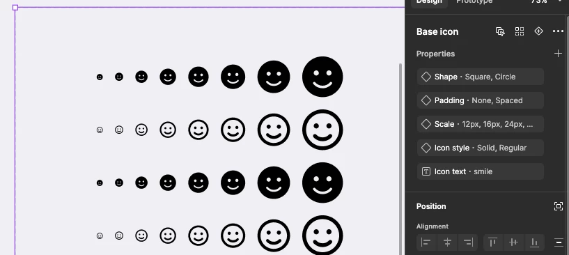
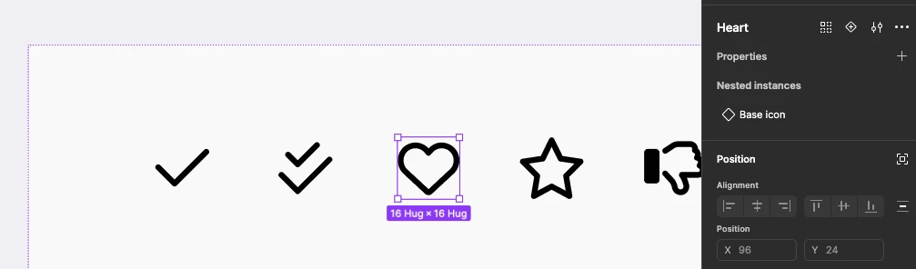
I then have a set of approved icons, which are simply this base icon, re-componentized, with the icon text overwritten.
If we stopped here, this seems to work really really well!
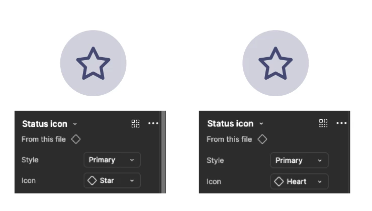
However, If we then place this icon into another component, and even worse, use that component in another, we get this long messy chain of inheritance that Figma doesn’t like - if we change the icon in a component, it is an absolute gamble whether or not it will respect the changes, *especially* the text override. Any messing with the core properties of the icon makes it worse - bigger sizes, different colors, etc. the more you edit the less it seems likely to respect you.
This is *constant*
and this essentially kills the utility of the icon component in the first place. You have to dissect, manually override or detach the component to get it to work correctly. I’ve fought this so many times and I’m just not sure what order of operations works or doesn’t - sometimes it works, sometimes it doesn’t. I’ve worked with support a couple of times, and it’s basically come down to “reset your icons” - I assume so the inheritance is as simple and smooth as possible. I’ve reset *all* the icons in my file an irritating number of times. I’m looking for something new.
tl;dr:
Currently the icons are laid out:
(Base icon)
Different sizes
Different padding
Different background shapes
Different styles
(Icon)
(Base icon) + text override
Problem is the component overrides in figma sucks, and doesn’t work half the time. I don’t know why or what I’m doing wrong.
New Direction
I’ve come up with a couple possibilities for what to try next. These are fairly extreme changes I’m not looking forward to doing, but I’m tired of battling with this - If there’s any thoughts on how to better approach this, I’d be very, very appreciative.
1 - Only use base icon
This is how Font Awesome’s file is laid out. To change the icon you change the text, and there’d be UX documentation what the approved icon is. I may be able to leverage text variables to create a library, but that probably wouldn’t allow for preview images at all. This is an easy/lightweight setup, but a) requires UX following the rules, and more importantly b) does not support changes down the road. Widespread icon update will require a lot of manual work.
2 - Create all variants
Create all possible variations I need of every single icon. Most of them don’t need the full 64 or whatever it is I have, so the work isn’t as extreme as it’d seem, but still - this is the brute force method, and it seems absurd that I’d have to resort to this.
3 - Use vector shapes
The core issue here is, I think, that I *have* to make a new variant for each font size, and font style, since those are all protected in the single font object - if I could split out each of the variables, it becomes much simpler. The way to do this would be to forgo the font, and convert everything into SVGs. The problem in my eyes here (besides a “why should I have to”) is just ensuring the designer->dev connection is maintained. We’d have vector icons, but they’d need to be paired with FA tags, and devs would need to understand they’re to use the font, not the image - that’s currently baked in pretty well. This is a documentation and communication problem, and not insurmountable, but…
Just frustrated because it seems like the setup I have should work easily, and it just doesn’t. My question is, broadly - are these my only options? Is there something else I can do? Does someone have fully font-based icons working in their design library? Or am I the only idiot trying to get this to work?
Thanks so much, any ideas or help you have here would be much welcome.