Hello,
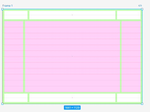
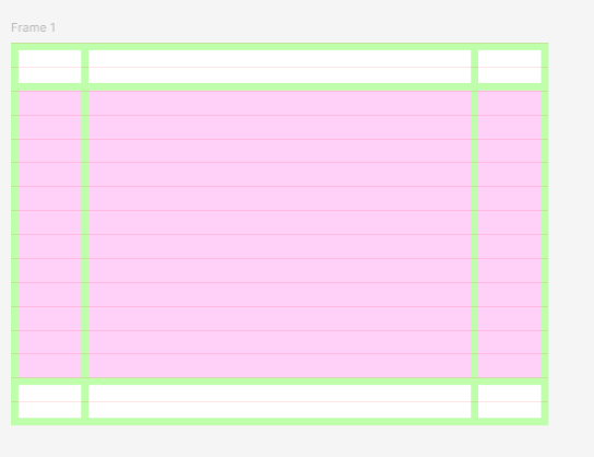
I cannot find a way to create what I want. I would need a responsive layout of the page, with the content divided in cells:
a1, b1, c1 → header
a2, b2, c2 → main
a3, b3, c3 → footer
but with the b2 having a fixed aspect ratio of 4:3 and a height of around 75% of total height depending on min-width of a2, c2.
I have tried numerous ways, but because of the lack of percentage, vh, vw units and relative sizes, I cannot figure out how to do this. Coding-wise, with a variable and some calculations in css this is doable. I am posting some screenshots before and after resizing the frame → The norma behavior should be not to destroy the layout while keeping the ratio of b2.