Question

Best practice for Icon grid


I’m currently creating a design system and when it comes to icons, i’m not sure what do to regarding the frames for the icons and padding inside it.

Google Material UI recommends to have 24x24px frames for the icons and that you add padding so that your icon is 20x20px inside the frame.

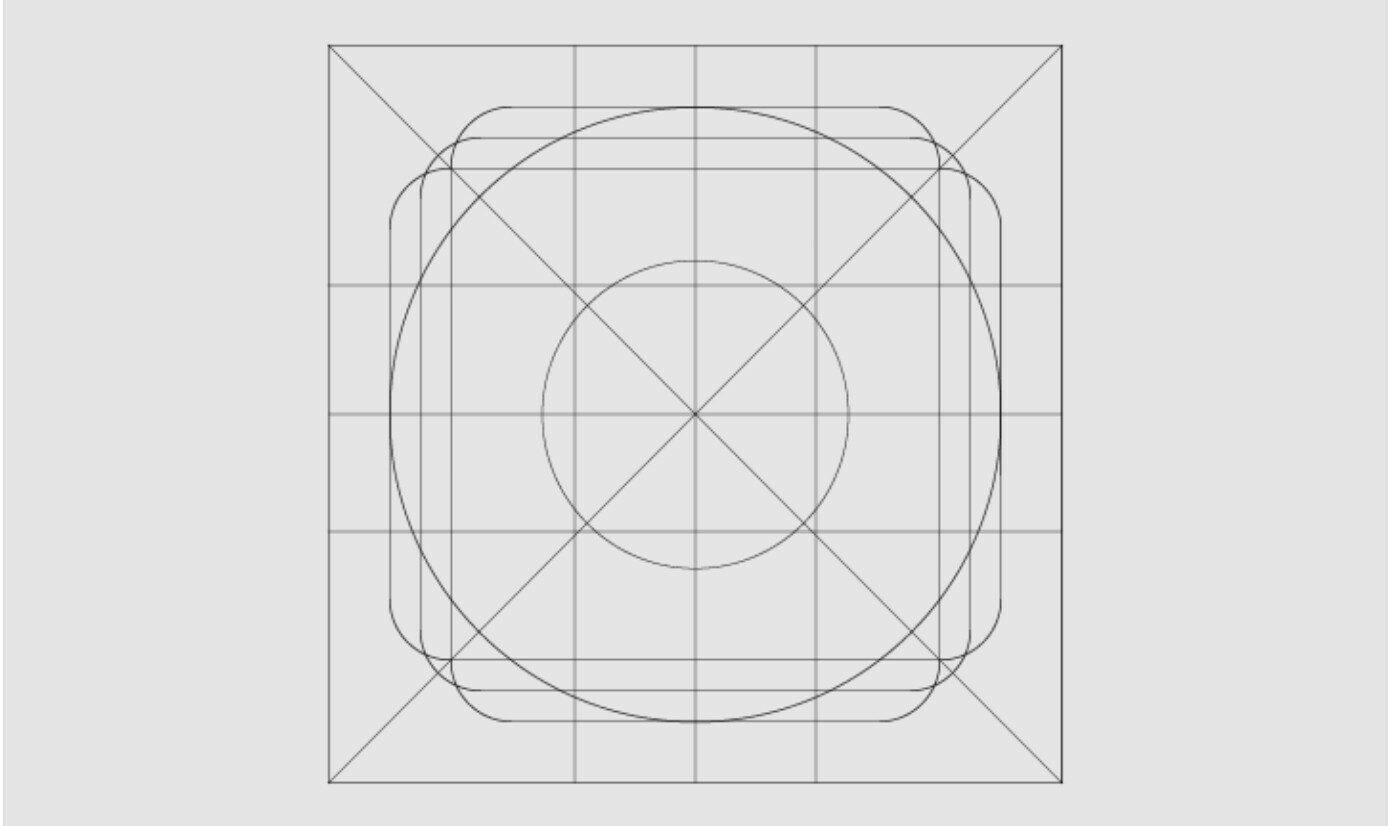
But that seems weird to me, if i do that, my paddings are going to be off. I have a 8pt grid, and let’s say I have some text and an icon, if I set my padding to 8px, in reality the distance between the icon and the text is going to be a bit more than 8px.

I stumbled across an article about design systems recommending something like that.

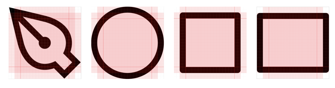
That seems more appropriate to have a pixel perfect design. But most of the ressources I find follow the general rules of material UI regarding icon frames.

What do you guys think ? What method do you use for your icons ?

2 replies

Tadeo Santana

Hey, I hope I find you well.

As far as I know when designing icons, these grids are meant for placing elements or reaching certain sizes in order to maintain a structure among the icon library. However, many grids lie upon the need of a square grid, every square with the size of 1px. The real thing is using this grid (the square one) to build your icon and using the other method as a form of keeping track of coherence in your design.

For the grid, be sure if the units are even or odd. I mean, if you’re going to work using 24 x 24 px (even) or odd sizes. I remember, Google Material advised using even units in order to match with the 8 px grid but it depends on yor design and way of your work.


Don’t buid a system that constraints your needs to design. Be functional but have the ability to bend your system in order to achieve your goals. Also, if you’re working for a brand, aim for having an unified look and feel. It doesn’t need to be using 100% pieces of isotype or logo; but having characteristics that relates icon to the brand.

Hope you have a nice day.

if you need anything, please reach at ilustracionlino@gmail.com


Tadeo Santana

Also, not every icon needs to be on a square grid. It depends of the use and needs of you or your client for using the icon library. For the text and padding, maybe it varies because you used a 8 pt grid and later a 8px grid. However, eye rules over all so try to place elements in order to keep a balanced design.


Reply


Cookie policy

We use cookies to enhance and personalize your experience. If you accept you agree to our full cookie policy. Learn more about our cookies.

 
Cookie settings