Solved

Child frame expands the parent frame

  • November 1, 2023
  • 4 replies
  • 1025 views

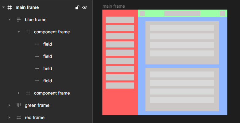
Hello everyone! I’m working with a main parent frame that contains three child frames. Within the blue frame, there are several other frames with fields and its set as a component. My goal is for the main parent frame to automatically adjust its size whenever the components inside the blue frame expand (thus the blue frame expands, but in my case the main frame does not). Any guidance on how to achieve this would be greatly appreciated. Thank you!

Best answer by IraX

Set it up as a 2-column layout; so two containers, left and right, in a parent container. Left is the sidebar, right is the header and content.

The rest is a matter of applying “Fill” and “Hug” appropriately with the right spacing.

It’s all fluid and you should be able to view this to see the auto layout settings:

Figma – 2 Nov 23
View original

4 replies

tank666
  • 4858 replies
  • November 1, 2023

Add an auto layout to the main frame.


  • Author
  • 2 replies
  • November 2, 2023

I’m sorry, turning on auto layout only isn’t working, so I had to delete my previous comment because when I turn on auto layout everything gets messed up. When I edit it and put everything in place and add a new component to the blue frame, it pushes the blue frame out of the main parent frame or the blue frame gets under or above the top green frame. Generally, I just need a dashboard layout with a sidebar, a fixed top bar and a main area which expands with every component added or with a longer component variant, and thus the sidebar expands as well. I see that the way of doing this is trough auto layout, but I must be missing something, like I need to use another frame within a frame with a different setting, or I have to use a rectangle or a group or a section within the blue frame or something else which I haven’t figured out yet. I’m struggling with this for a couple of days already.


IraX
  • New Participant
  • 145 replies
  • Answer
  • November 2, 2023

Set it up as a 2-column layout; so two containers, left and right, in a parent container. Left is the sidebar, right is the header and content.

The rest is a matter of applying “Fill” and “Hug” appropriately with the right spacing.

It’s all fluid and you should be able to view this to see the auto layout settings:

Figma – 2 Nov 23

  • Author
  • 2 replies
  • November 2, 2023

2 column layout left-right was precisely the thing I was looking for because, as you say, the rest is just applying Fill and Hug. Thank you very much, also for providing the file for my review, which I took advantage of


Reply


Cookie policy

We use cookies to enhance and personalize your experience. If you accept you agree to our full cookie policy. Learn more about our cookies.

 
Cookie settings