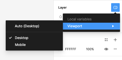
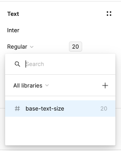
Is there a workaround for setting the font size for specific breakpoints within a responsive design? It seems there has been a lot of work put into making designs behave responsively through the use of constraints and auto layout both in design and prototype mode without any thought on how text scales between large desktop and small mobile screen sizes. Framer handles this well by being able to specify font sizes for each breakpoint. It would be great to have this as a native feature in Figma also.
Enter your E-mail address. We'll send you an e-mail with instructions to reset your password.


