New UI or Old UI?
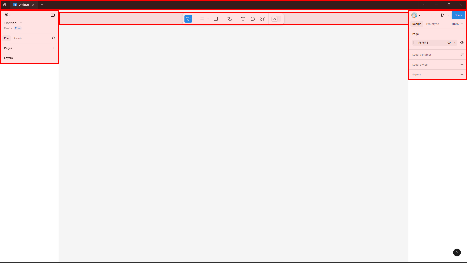
Well, many others must have already asked this question, but what is the point of this bottom toolbar?
In the previous UI, all the app's tools were located on the sides and at the top, which is actually very practical and comfortable to use.
With this toolbar at the bottom, this ends up requiring an unnecessary downward movement that is quite annoying unless the user uses shortcuts to access the tools on the toolbar, the main element in the UI, (on large monitors this is really annoying).
A solution to this discomfort would be to put the toolbar at the top again or allow this adjustment manually.
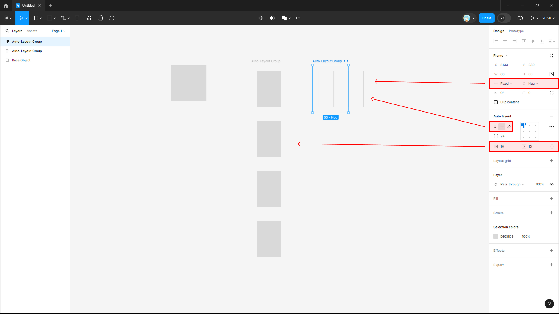
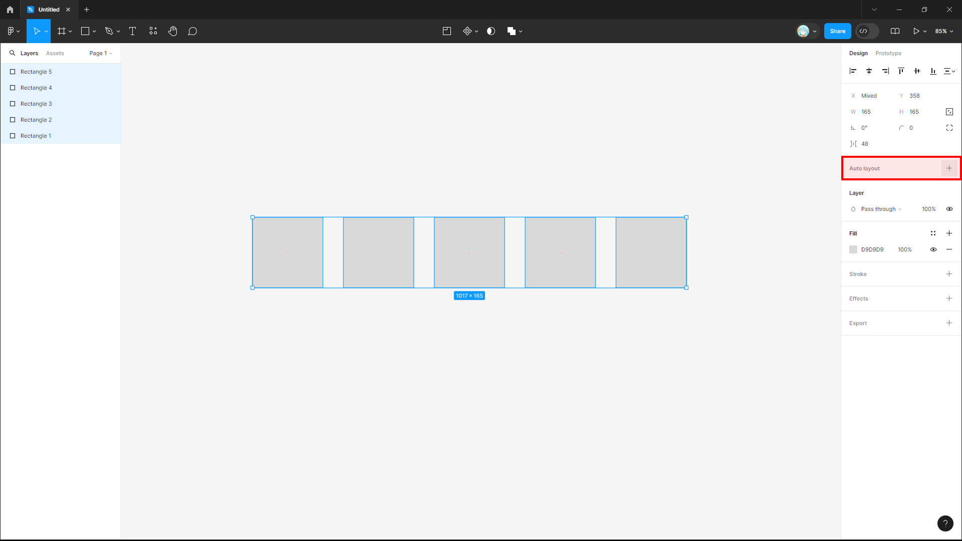
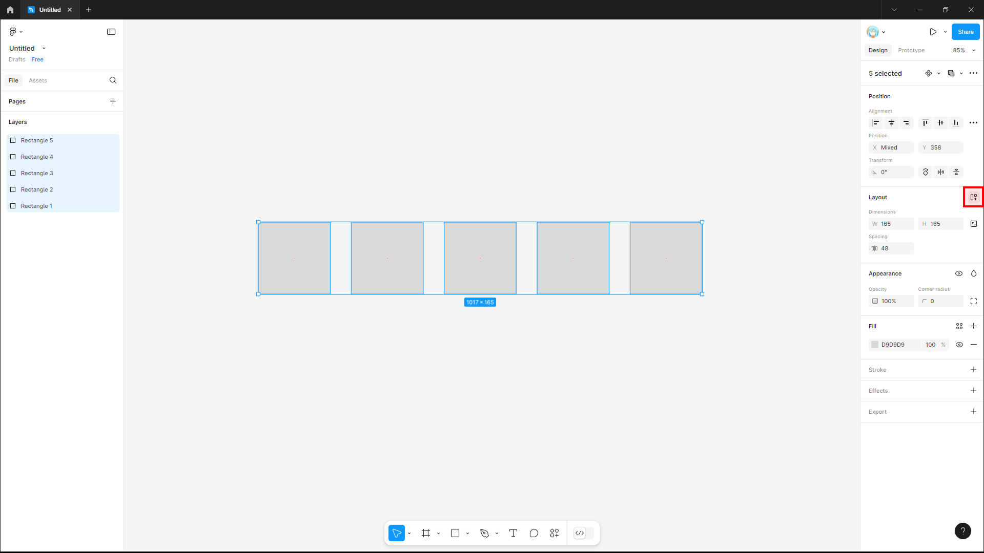
Auto Layout
The auto-layout button, even though it only had a + icon in the previous UI, had a label that indicated exactly what it did. In the new UI, the auto-layout is just an icon and the user needs to keep the mouse over it to know what it does, something that can confuse new users or those who don't know the "Shift+A" shortcut.
Shortcuts
Speaking of shortcuts, holding "Shift" to create a shape currently does not automatically activate its "lock aspect ratio", so this takes away some of the practicality that existed before and causes some problems, such as in auto-layout, where shapes are distorted when their direction is changed or the spacing of the group in auto-layout is adjusted.