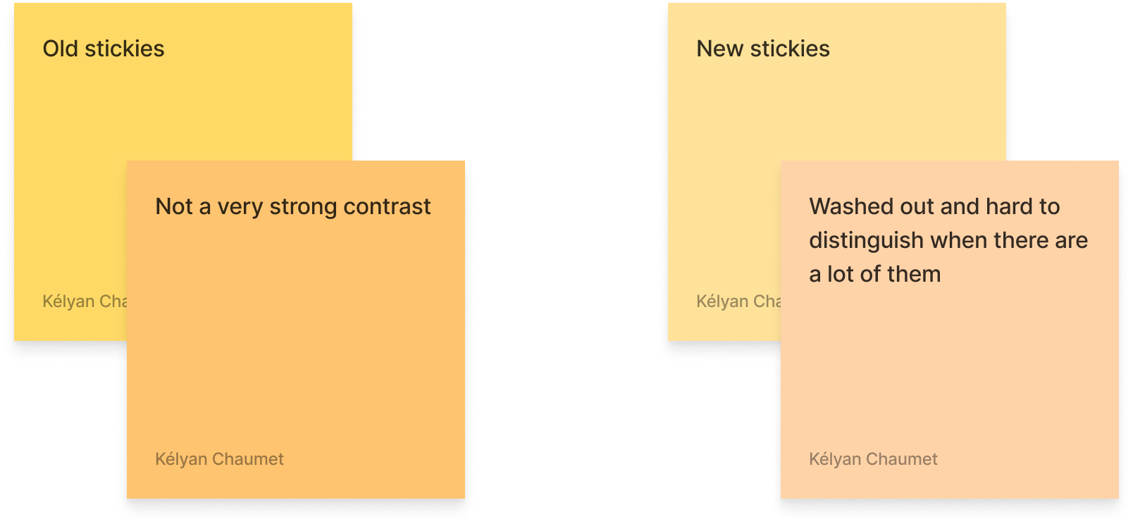
The most recent update changed a few things in Figjam. First, they added a lot of new “shapes” (which is just a rectangle with an icon inside), and added a couple of new default colors. HOWEVER, they also changed the base colors for stickies!
They are now way paler, with washed out, low contrast colors. I’m sure it was supposed to make them look both like real sticky notes and to increase the contrast between the background colors and the text for accessibility reasons, but I feel the colors don’t contrast enough at all between one another.
I use colors a lot to help with identifying specific sections or types of notes, I often use every color of stickies available to distinguish between specific uses of each (like taking notes during user tests, each color representing a scenario).
Unless custom colors are finally made available for stickies in Figjam, I think they are going to be way more annoying to use for me from now on.