Scenario:
I normally keep all my components on a separate page and I like to NOT organize them into frames but use a plugin to group and sort them by name.
Problem:
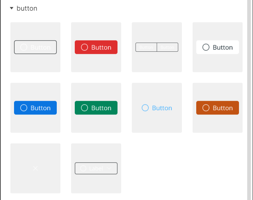
However, when designing for a dark UI it’s very frustrating to use the assets panel as most components are close to invisible. Often a component itself has no background color so the bright foreground elements are displayed on a light grey rectalngle in the assets panel.
Solution:
Instead of this light grey background, the assets panel should use the background color of the page a master component is located.
When designing for a dark UI it’s not uncommon to also set the background color to a darker grey to make it easier on the eye. So this solution would also work if you do not keep your components in one single page but across the entire document. And if one likes to organize them in frames, then the frame’s color could still kick in.