UI3 Contrast

Just got UI3 today. Contrast is far too low on icons in the Layers panel, grey text in the Styles panel, and input fields, buttons, etc. RGB values of 245, 245, 245 are not dark enough compared to 255,255,255 white values used for the UI. Please darken that colour further.

I was able to get every problematic grey shade in one screenshot. This needs to be dramatically improved for the sake of usability.
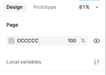
Screenshot 2024-10-11 at 10.42.27 AM

1 Like

Here’s another example where the border lines are almost invisible.

I know from my real-world experience as a designer that many people with even slight visual problems will have trouble seeing the difference between white and very very very light grey like this. These borders might as well be invisible for a significant proportion of the population.

They also won’t be visible over a poorly compressed Zoom call if somebody is sharing their screen.

This is basic accessibility. In some countries, shipping something this low contrast is quite literally illegal. Not a great look.

Screenshot 2024-10-11 at 11.04.25 AM

After a little bit of experimenting, changing --ramp-grey-100 to #ececec instead of #f5f5f5 makes a world of difference and makes the entire UI far more usable.

I second all this 101%

2 Likes