How to FIT-TO-SCREEN and present Figma protoype on all Device dimension

So I have this prototype made at 1920x1080.
I am able to make it fit to the screen on PC because there is such an option.
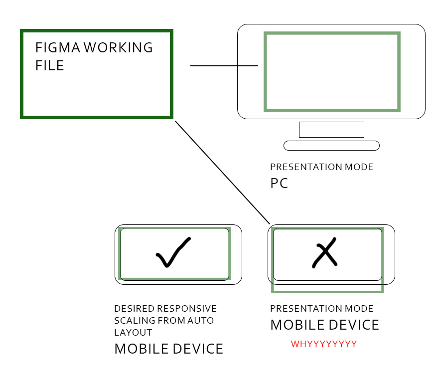
When I open the same prototype via Figma App on Mobile Device, however,
I am unable to make it fit to the screen. The prototype presentation is made fit to the width of my Mobile Device and ignoring the height.
So as you can see from my image, the height was too long for my Mobile Device and I had to scroll up and down to present the prototype on my Mobile Device even though I do not intend for it to work this way.

This design was meant to be port to Unity for development so I have already set the constrains such that certain UI elements will stick to Top, Left, Right, Bottom.
But I just cannot present that kinda responsiveness in Figma.
I have already tried to search on Figma forum and couldn’t find an answer to this.
If there’s any plug-in that would help, do let me know!!!

Your desperate designer,
Riviolas

3 Likes

What kind of mobile device? Instead of running through the Figma app, could you try the scaled down URL in browser instead, and take that browser tab full screen to hide the rest of the UI?

Hi,

Thanks for the advice! I am using Samsung Galaxy S21.
I had to uninstall Figma App to be able to open the prototype via Browser on Mobile Device.
I could fit it on screen now, just alot of black space by the sides and not accurately representing how the layout should look like on longer width devices.
But that can work for now!!!

Thank you so much!!!

1 Like

I have the same question, and your answer doesn’t match my needs which is usability test oriented.

The final users have their own mobile device and I need to make sure the the prototype fills both width AND height. I can find a solution for that.

Someone formulated that issue very well on stackexchange (I did things the same way on my designs):
“I have a frame with a design that uses constraints to scale nicely to different screen widths. When I manually resize the frame, I can see the content align correctly. But when I preview it using Prototype on different devices, it seems to use the frame’s initial size instead of fitting the device screen. So that the frame can be either too wide or too narrow depending on the device. Is there a way to make the frame width fit automatically?”

6 Likes