Scale is one of my most used properties when designing interactions and states. It would be great if we had true ‘scale’ as a property.


No, I’m not talking about the scale tool. That’s fake scale that affects the width/height of elements.


I want the ability to enter something like ‘1.5’ and change the scale of an element, respectively.

In addition to hover states this would also be useful for


• Drag-and-drop UI where a dragged element moves in z-space.

• Pitch/presentations where screens are displayed alongside meta info but where the presenter wants to bring things forward. This need has come up several times on this end working on designs that have two parties interacting with one another but each using unique interfaces.


@arcyia This has been driving me crazy for the last 4 hours… How did you achieve this result? Would you mind sharing this file with us, please? I can’t get the instances of my component to automatically adjust to the variable size of an icon, just like you did…


It seems that the main problem is that I don’t even have the “Hug contents” option for my icon.


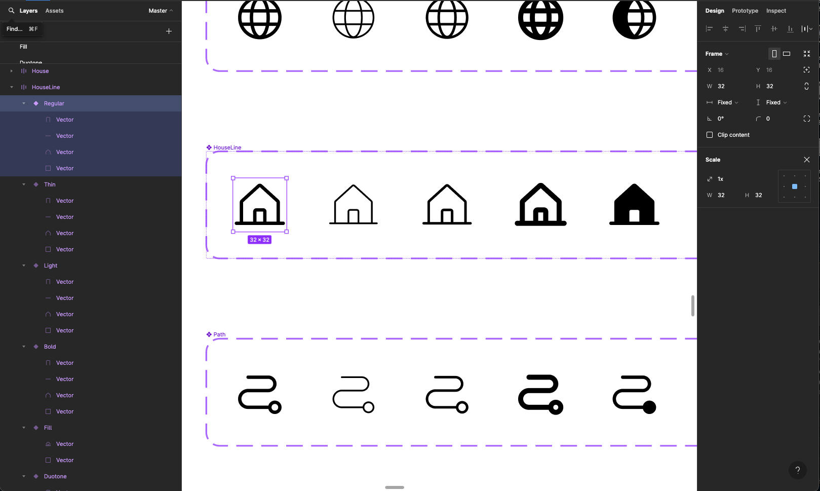
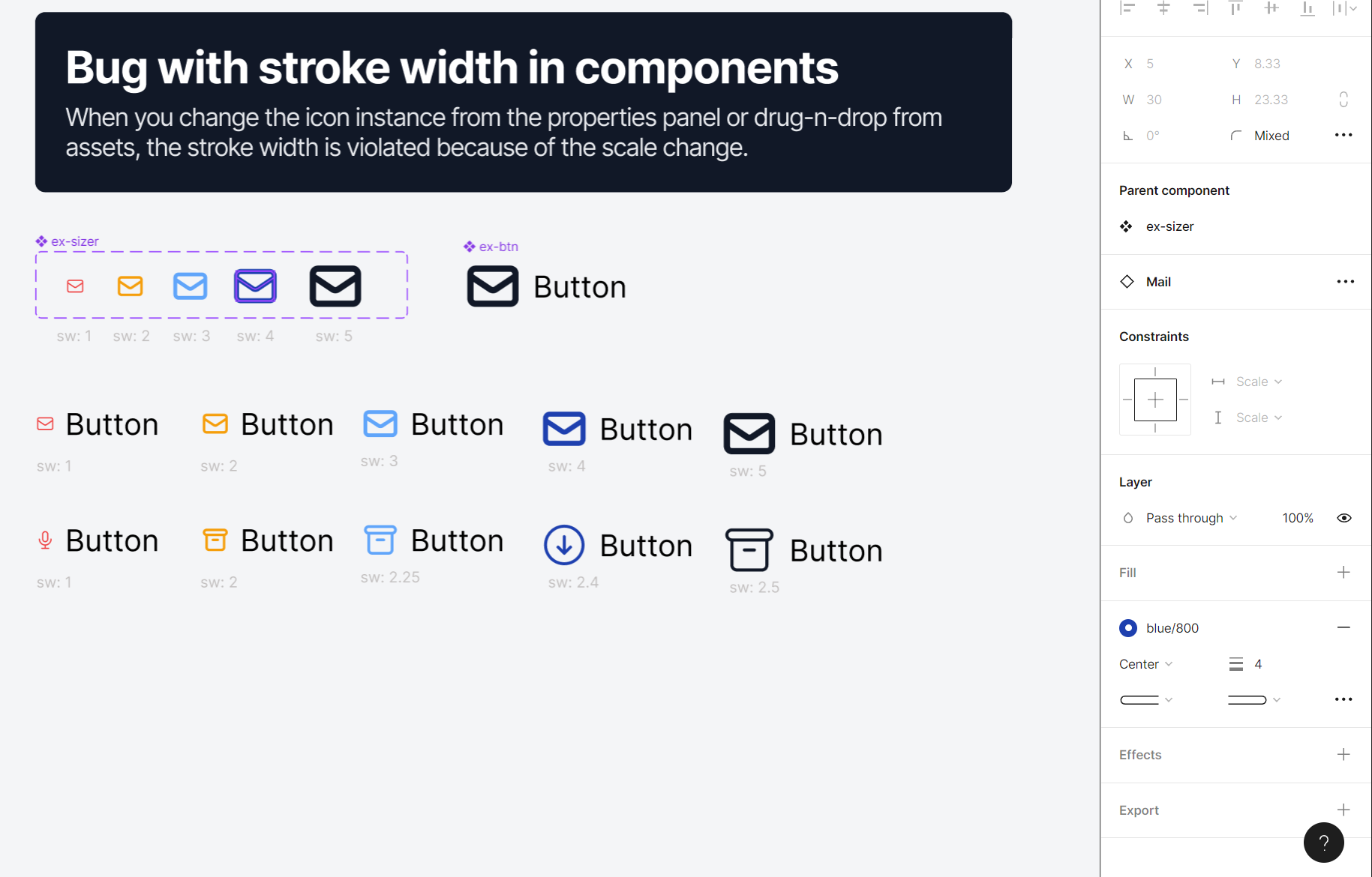
I think scaling in Figma needs a rethink based on usage. Scale is fine if you aren’t using things in components. My current need is the ability to proportionally scale a stroke in an icon on an as-needed basis. We’ve designed our font to scale with our 8pt grid starting at 16px sizes, then allowing for doubling up to 32px. However, as I built our icon-set using strokes, I would have to create all the size permutations for when they are placed in components.


While, generally, there is a need to keep icons in a pattern consistent, the ability to iterate and ideate upon an existing component and adjusting sizes within the component without breaking it apart is valuable to me.


This could really just come in the form of a toggle for the W/H parameters, in addition to where you can lock the dimensions.


As evidenced by the other users in this thread, the ability to scale as a parameter in animations is pretty key as well.


+1 for me. Would love to see this as one of the small fixes you guys put together in batches each year.


I’m faced with the same issue by making variants for different icon sizes:


I see in your demo that the component you swap has constraints set to top left. Seems like you need to fix your container component and set proper constraints first. Afterwards you would need to check if your design resizes correctly and you are golden


Figma – 31 Aug 22


Sure, please check this example. You need to add auto-layout to the outer package of the icon component.


I am having the exact same issue as described by Ben Greenberg (reviving the topic)


Works for me! Thanks.


I’m experiencing this issue as well and the solutions included in this thread don’t work for me unfortunately. I’m trying to make logo overlays to us inside tile components that need to scale to fit the various breakpoints of the tiles in our system. I’d like to be able to keep the autolayout functionality as well with the logo overlay so that it’s possible to switch which corner of the tile the overlay is in. It works if there’s just one logo option but if there’s a variant, it doesn’t retain the scaled logo size.


Thank you!! 👏 👏 👏 This solved my issue


This would be SO useful. Especially for prototyping any zoom/scale UI.


Warning: noob comments below 🙂


Yes. This.

Scaling seems to occur from the TL corner by default.

As a noob, I may be misusing the term, but I am truing to make a variant that has been enlarged using the handles… and animating between (effectively a scale), and no matter what I try, the animation is anchored to the TL of the default variant.


I hope there is a way… (sort of an “action center”???)


What needs to be rethought is the entire notion of properties.


They should not exist (this will confuse so many people)…


Everything should be a behavior. There are monumentally good reasons for this.


You just need to add a hug content to each individual icon size and that will prevent the icon from being resized through the master component.


Hey Ben! i’m struggling with exactly the same issue - Read through all these comments here but doesnt seem like it got fixed…did you figure it out somewhere else?


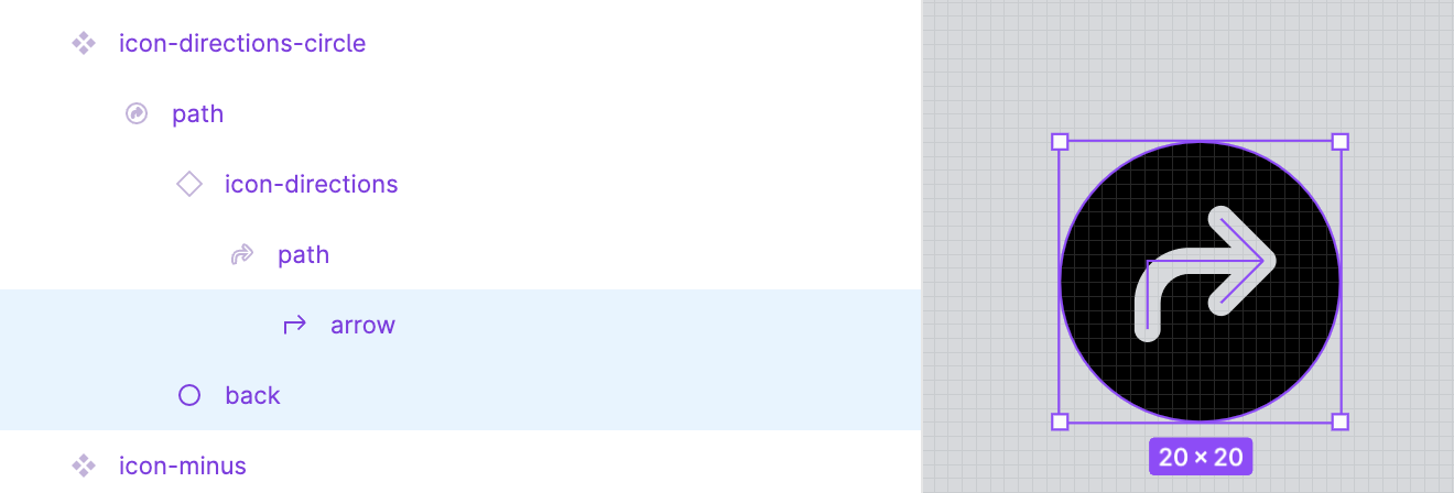
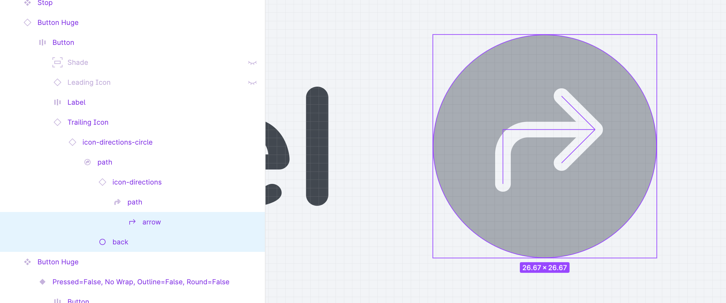
Did anyone figure out a fix for this? Here is a screenshot from the master icon library file i’m using where you can see the layers. If I should adapt the master icons, please let me know what I should do.


replying so this doesn’t close


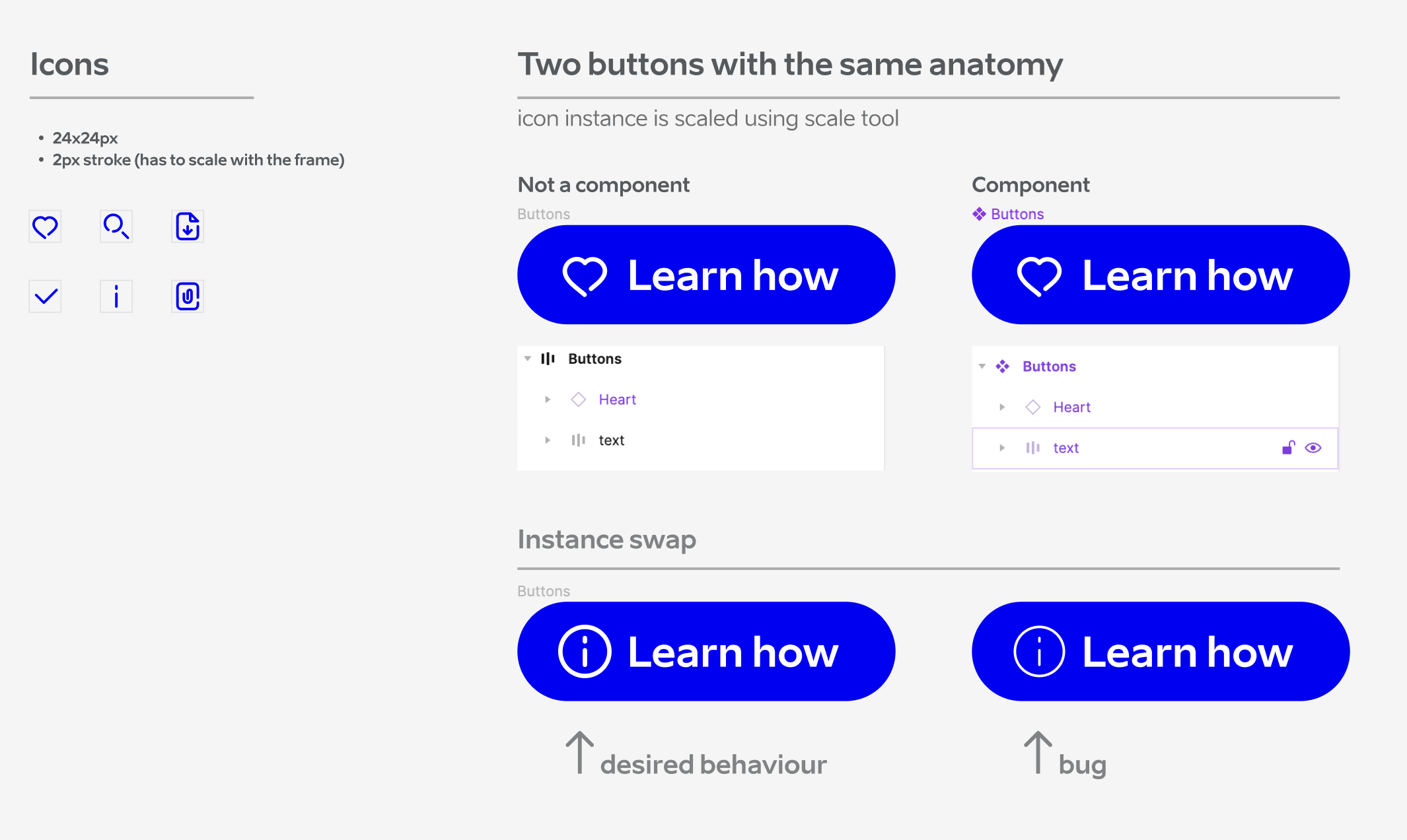
+1, I have icons at 24px with an intent to scale uniformly, but where I’ve used stroke inside boolean operations (to preserve editability), these aren’t scaling while in a swapped and nested instance.


Hopefully it’s clear in these images; the icon is scaled to 32px using the scale tool, but when swapped, the stroke weights are not scaled.


Yes, I need this (or similar) or I’ll be unnecessarily duplicating (or flattening) an icon library for the sake of strokes that don’t scale.


I use booleans to preserve underlying strokes but these don’t scale when in swapped and nested instances.


This is a serious issue that seems to be re-introduced with recent updates. I believe there is something happening when there are nested variants inside of a new master component. See video:


Those familiar with the Principle for Mac application will be familiar with the coveted Scale feature. It’s as simple as that 😉


But what I like about Figma, and what Principle for Mac doesn’t have, is that you can scale by changing the width or height, which automatically calculates the scale value.


Has anybody fixed this? I am having similar issue. Creating different sizes for each icon with a variant is not an option for me due to extensive icon library.


I was able to fix this using these steps:


  1. Select all the individual strokes that make up my icon

  2. Do a union selection to convert them into one single layer/object

  3. Right click or Shift + Cmd + O to outline the strokes

  4. Set the layer to scale within the component frame


After that, any instances of that icon component scaled correctly by changing the stroke width as well.


It would also be awesome if the scaled amount was visible in Dev Mode! My team has a need to have certain UI components that have a designated size be “scaled larger” in some designs/use cases, and being able to have that scale change be easy to see for developers would be amazing.


Currently seems that stroke, text size and effects inside nested components are resetting to their default state defined in the master component.

Even after recent Figma bugfix that fixed issues with absolute position on scaled components in auto-layout, this issue still persists.


Reply