Problem:
While Figma’s Prototype mode is great for building realistic interactions, it quickly becomes visually overwhelming—especially for those who don’t use Figma in their day-to-day. This often leads to a deer-in-the-headlights situation, where communication breaks down both internally and externally. Collaborating with teams outside our organization becomes especially challenging when trying to get them to understand the user interface from a high-level perspective.
Solution:
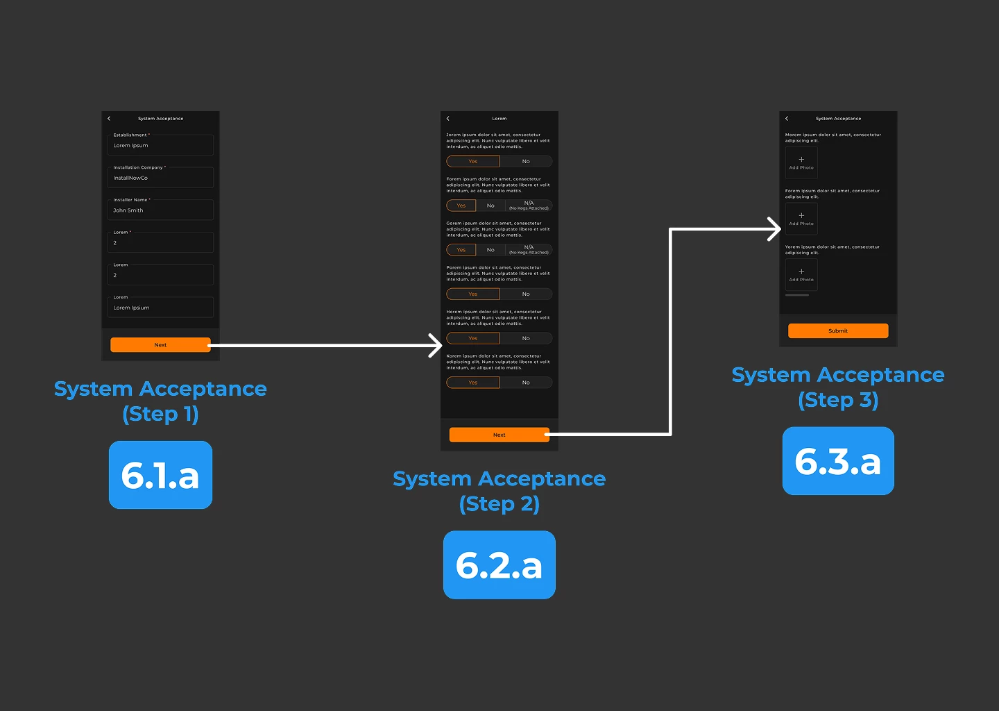
Our company has found the need for a deliverable that sits between static screens and a full prototype. It’s essentially a wireflow but with completed UI. Think of it like Prototype mode, but without the spaghetti mess.
I’m calling this concept “Proto-to-Flow.” Figma would analyze your prototype and generate a simplified, flowchart-like view showing only the primary user path. Each screen would be numbered for easy reference, with the option of hiding secondary or edge-case connections.
This view would help communicate UI at a high level, making it far easier for cross-functional partners to follow the intended experience without being overwhelmed by every possible interaction. I’ve created this example image.