Need a better solution for resolving branch conflicts

  • June 26, 2025
  • 2 replies
  • 139 views

Vero5

Right now, the “Update from main file” modal is the least helpful modal imaginable:
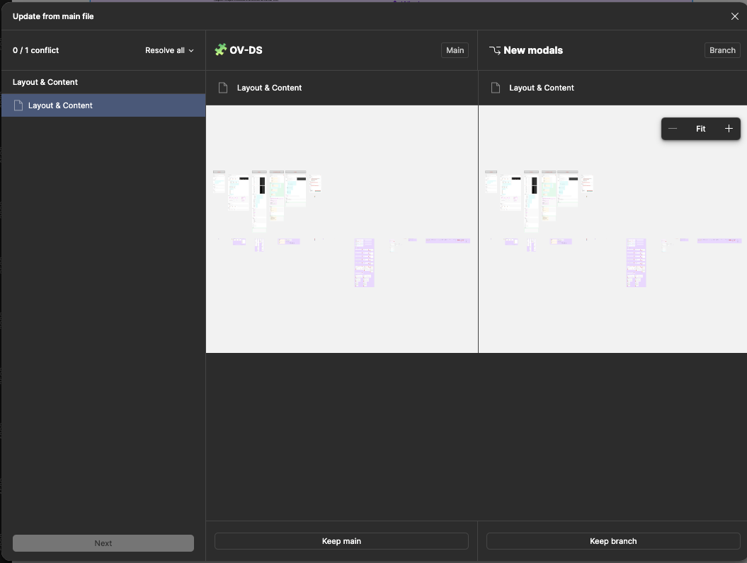
No indication of what or where the conflict is. All I see is a zoomed-out view of my “Layout & Content” library page with nothing highlighted or listed out anywhere. And with this information, I have to choose whether to keep these changes or keep my branch. I manage a design system for a team of 10 designers, split up into 3 pods. This is a nightmare every time.

Items with changes should be highlighted, and those changes should also be listed on the left-hand side.

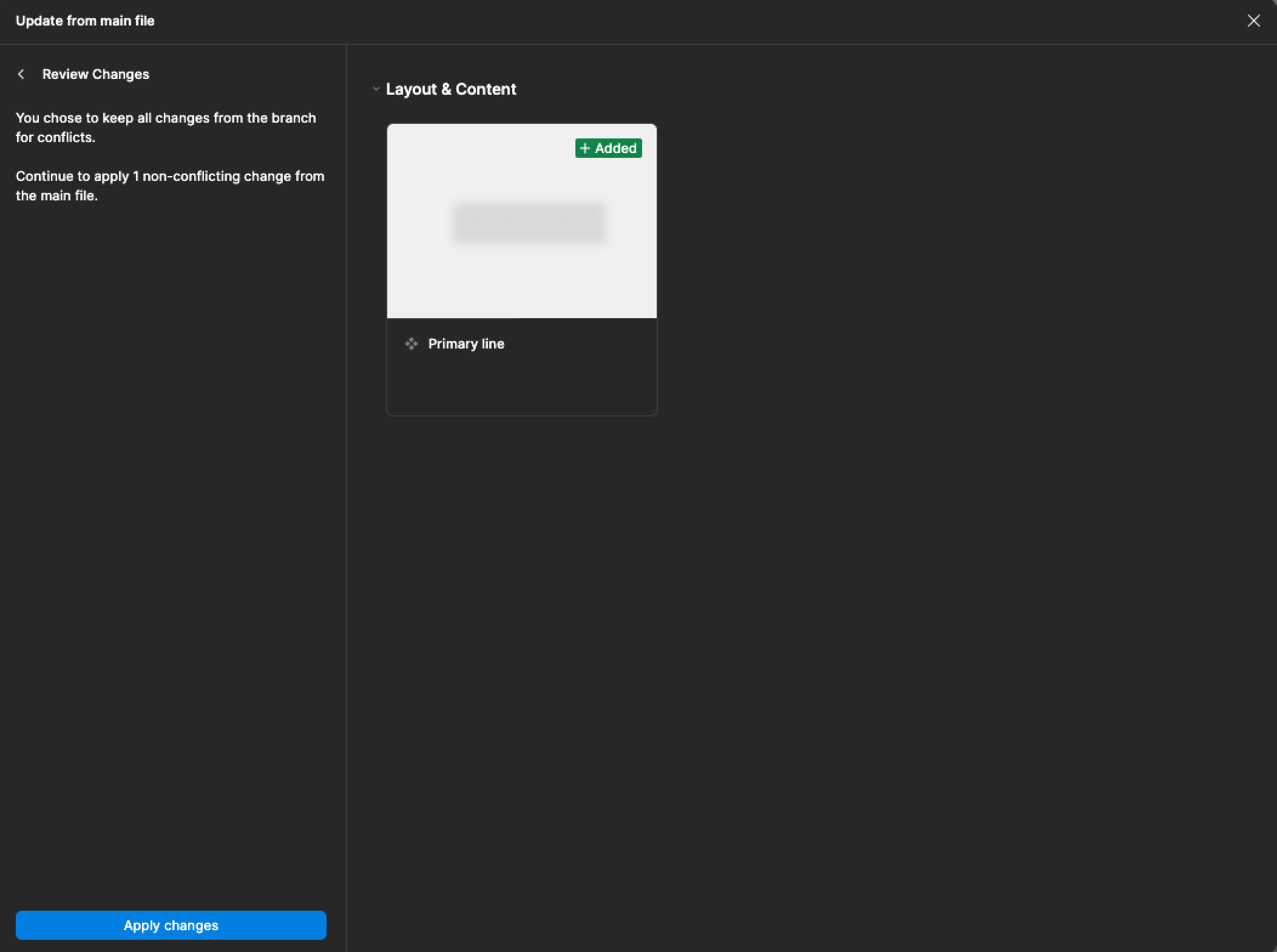
Edit: And would you look at that, I chose to keep the branch, arbitrarily, and the next screen actually shows me what the update involves! Why wouldn’t this be on the first screen? (I’ve edited out the content for NDA reasons) Now I actually have to go back to the previous screen and choose again if I’ve made a mistake.
 

2 replies

Felipe_de_Castro2

I agree. Also, the loading between conflicts takes so long. It’s very painful to resolve conflicts.


KellyK
  • New Participant
  • December 26, 2025

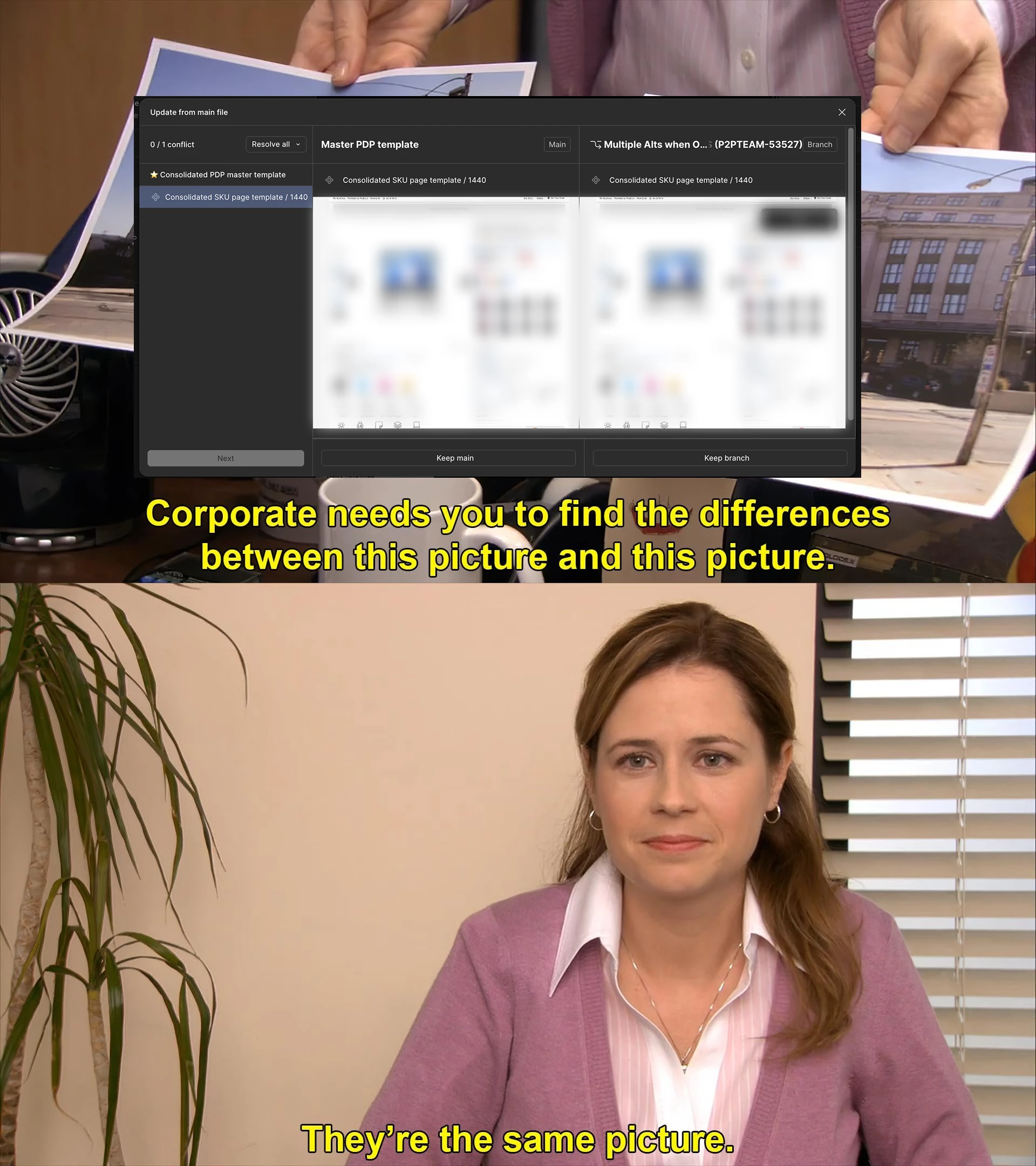
Yeah I’m having similar issues. Often times the two conflicting frames are either 99% or 100% visually identical, and if there is a difference there’s no way to find it in a large frame through that tiny window.

The changes could be layer names, fixed a typo, set up auto layout, components were cleaned up/consolidated, etc. Stuff behind the scenes. 

It would be great if they added a way to overlay the two and highlight the differences.

Also if it showed us the layer panel for each, that could help clue us in to which one to keep when there are no visual differences. 

Cause as it is now I’m just crossing my fingers and picking one based on vibes, then rolling back to a previous version if I broke something 🤷‍♀️