
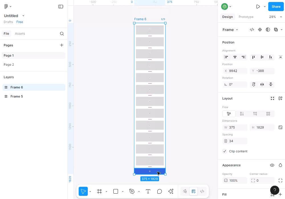
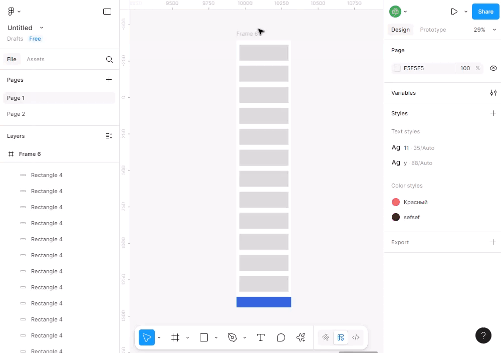
Right now, designing for scrolling views is a pain. We need to resize the parent frame to see all content, and then shrink it down again to the correct size to see it in action.

Some possible solutions:

  • add an option for the parent frame to hug contents in editor mode only
  • add some kind of pop-out view to frames with out-of-view content
  • allow us to substitute / link frames: one frame holds the content, another (maybe even as part of a component) displays it. They should not need to have the same size, but should probably share the same layout-settings. This would also be helpful for the general design flow

Why do you need to shrink it down to the correct size to see it in action? Can you share an example when it's needed?

I mean, you always can use prototype device or a custom presentation size and there is no need to shrink frame in editor for that.


Sure, maybe there is already a feature I don't know about, but no one I know does it any differently.
I am currently designing a scrolling view for IPhone 14:
 

This is of course not the correct format for IPhone 14, but expanded to allow me to design all the elements.

When I switch to presentation view, it looks like this

As you can see, the tab bar is not correctly at the bottom of the screen. This is obviously because the frame and device are not the same size, but that’s exactly the issue I am looking to solve.


I got it now. You may not shrink, just make sure your bottom tab bar is fixed at the bottom of the frame and has a bottom constraint. Here is example ↓


I guess that's possible, but it does not work when using auto-layout at the top level.


I guess that's possible, but it does not work when using auto-layout at the top level.

There is solution for that too — apply ignore auto layout to the tab bar


Reply