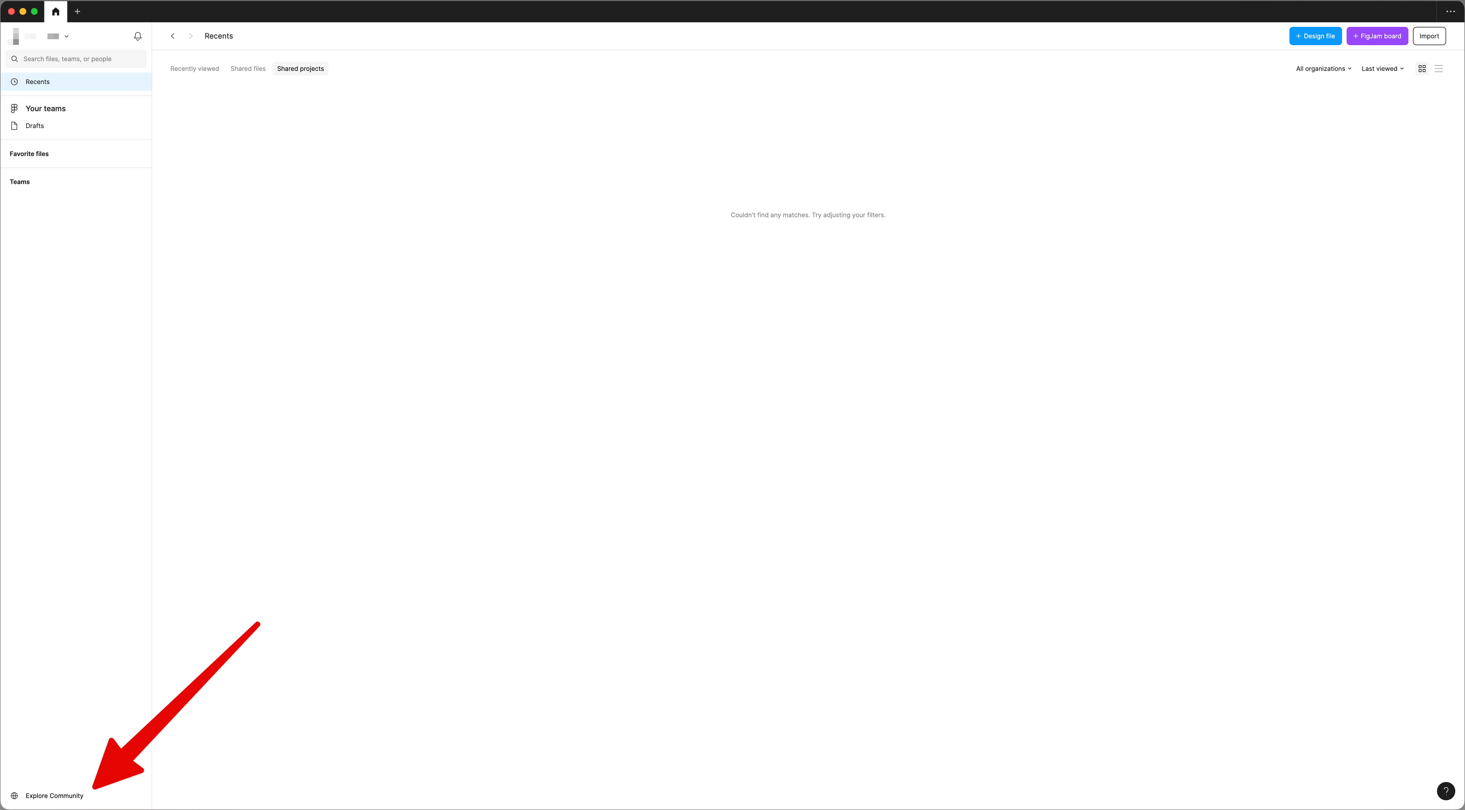
The Explore Community button is not easy to track due to the white color, same as the main color on the platform. Please differentiate it from the rest and make it easier to find it. 😃 Thank you!

I almost logged a bug that there was no way to open the Community tab until I searched and found this thread!


When Figma is maximized on a 27" display, the Explore Community button is virtually invisible due to all the whitespace between it and the other content. I think I just dismissed it as a copyright/legal notice.


Personally, I think it should be relocated to somewhere at the top of the side panel. But if there’s no good spot for it, then I agree with @N0kA that the current button needs more visual weight. It doesn’t need much, perhaps a light gray background would be enough? 🤔


Screenshot 2024-02-13 at 15.36.33@2x


Hey everyone, thank you for your feedback! I’ve shared this internally with the team for consideration.


That’s a good idea, @Uhl! In the current design you’ll get the “light grey background” when you hover of the button. I do understand it is a bit difficult to find at a first glance.


In the current design you’ll get the “light grey background” when you hover of the button. I do understand it is a bit difficult to find at a first glance.


Yes, I know, that’s how I got the screenshot! 😆


But if someone doesn’t know it’s there, they’ll never “hover” it. I’m proposing that it always be light gray (and get darker on hover), so it’s actually noticeable in the first place.


Placing a small element in one of the least focused areas of an app, is problematic. While it’s not a critical element, I wonder how many support tickets Figma gets on how to open the Community tab? 🤔


Thanks for the feedback! It’s actually pretty rare to receive the kind of cases 🙂


Reply