
I encountered an issue as I was building a prototype.
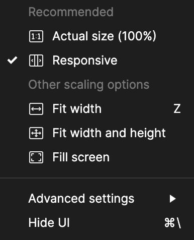
When going into the prototype mode, we have the option to change the scaling to be “responsive”, which allows anyone who access the prototype to view it at full screen size, regardless of their device dimensions, which is great.
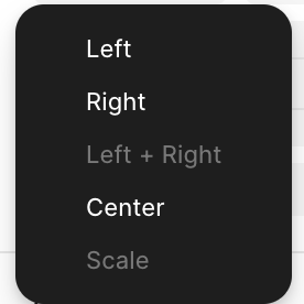
However, fixed position elements, such as a bottom sticky drawer, do not go responsive. They do not stretch left and right together with other scrolling elements. When looking at the alignment options, it looks like “left and right” and “scale” are disabled. That’s why it doesn’t go responsive.

If we could enable the “left and right” option for fixed position elements, so that my bottom drawer can be responsive and stretch to full screen width, that would be great..