
Hi team,
Variable modes are incredibly helpful for testing layout behaviors in the Editor. Typically, we duplicate frames and assign modes like Desktop, Tablet, or Mobile. While this works, it doesn’t extend well into Presentation mode.
Currently:
-
Presentation → Responsive works nicely with Auto Layout + min/max constraints.
-
However, variable modes remain static—locked to whatever mode was manually applied to a frame.
-
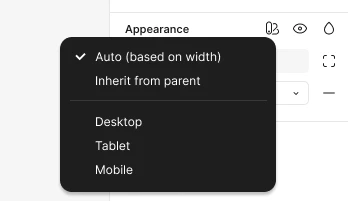
The existing “Auto” mode is limited to inheritance (children follow parent), but the parent itself still requires a manual mode switch.
Feature Request:
Introduce a real “Responsive Auto Mode” that automatically applies the correct variable mode based on the element’s width.
I know this might not be a fully realistic approach, since Figma can’t always know which numeric variable should be responsible for triggering a breakpoint.
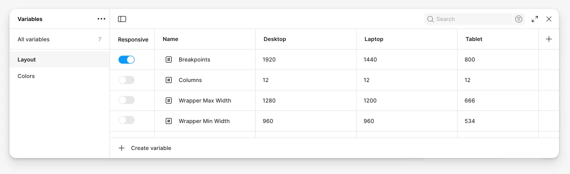
An alternative would be to add a “Responsive” toggle in the Variables panel, where the designer explicitly marks which variable (e.g. width, breakpoint, or container size) drives the mode switching.
Maybe even this alternative can’t be applied, so a third approach could be to take “Responsive breakpoints” out of variables and make it a stand-alone setting (with the ability to freely define your own set of width sizes, of course).
This way, you would have breakpoint sizes on one hand (which Figma explicitly recognizes as breakpoints) and variables on the other hand, set independently but with the option to (optionally) attach them to one or more breakpoints.
Anway, the Benefits:
-
Enables truly responsive previews in Presentation mode.
-
Lets clients and stakeholders view designs that adapt naturally to their screen size, without designers manually duplicating frames or switching modes.
-
Extends the power of variable modes to match how responsive design works in real-world products.
This would make Presentation links far more representative of actual responsive experiences and reduce the manual overhead of managing multiple frames.
Thanks a lot for considering!