
Many people have said the same thing, but I’m here to recommend supporting percentages within auto layout. I’ve seen many people asking for the same thing.
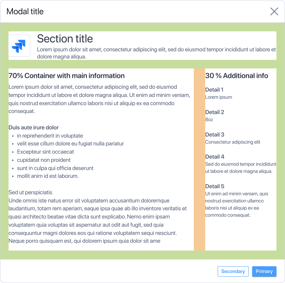
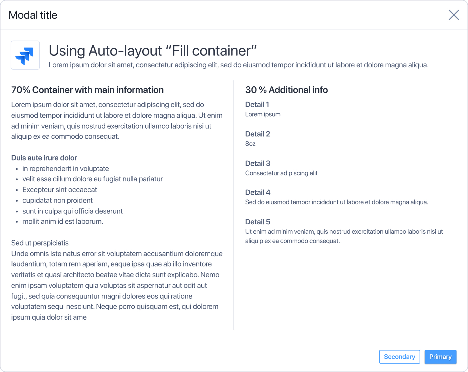
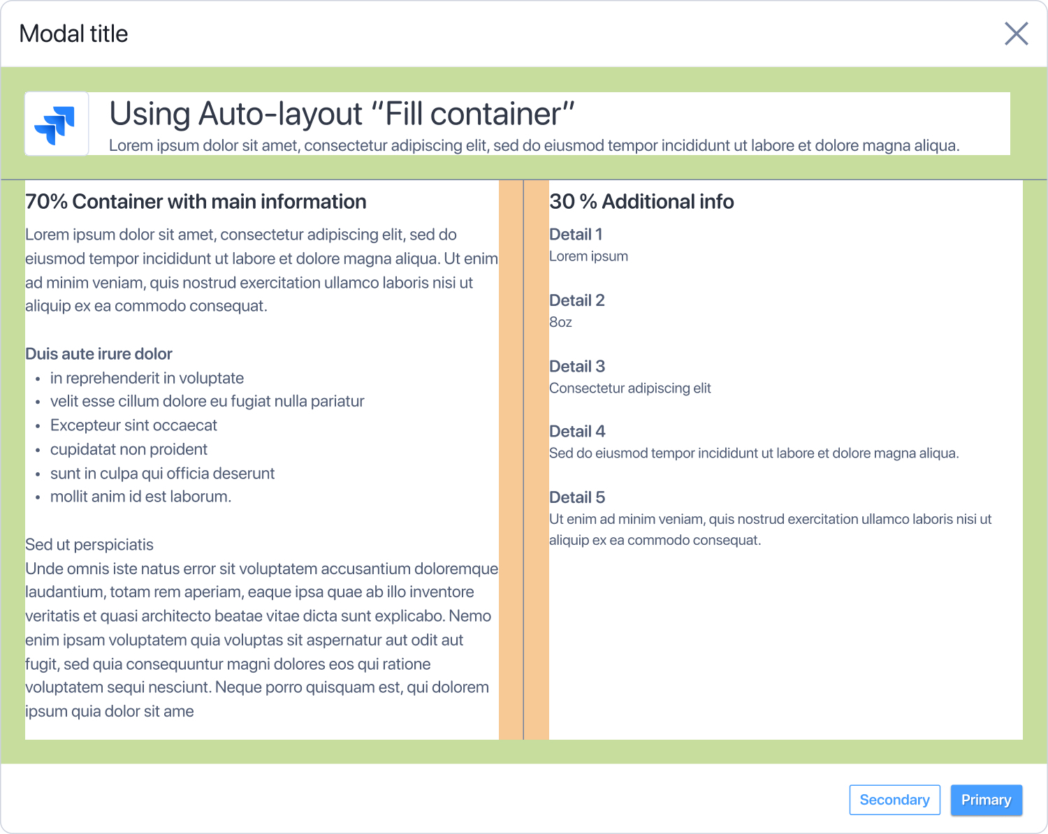
Percentage width auto layout would help us be more efficient. Auto layout “Fill container” is great for sections being sized equally (50/50 or 30/30/30).
When we’re designing content with sections, the sections are generally not the same width as each other to indicate importance.
Myself and many other designers would love to have autolayout support something like this:
- The main container has the same spacing all the way around
- Each section takes up a specifid percentage of the container (70% and 30%)
- When the modal grows and shrinks, those sections maintain their width of 70% and 30%
| Without spacing | With spacing | |
|---|---|---|
| 800px wide | 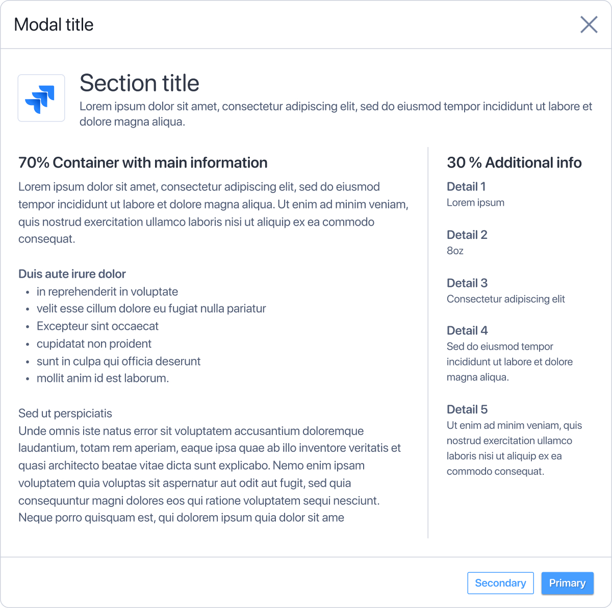
| 
|
| 1000px wide | 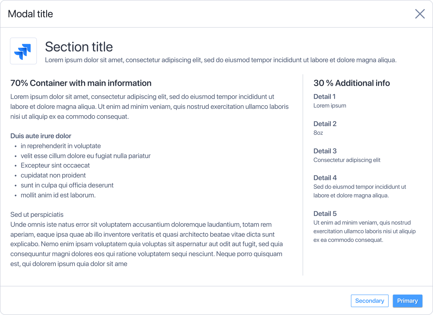
| 
|
This is what autolayout currently supports
If we use auto layout, each section must be a specified width or the same width as the other sections. It makes it so we cannot use autolayout on re-usable components like page layouts or dialogues because the content cannot maintain its scale.
| Without spacing | With spacing |
|---|---|
 | 
|