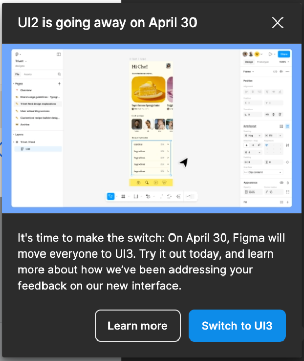


I can't believe Figma is forcing this change on us. UI3 is, without a doubt, the most unfriendly design possible. It has made my workflow painfully slow and incredibly unproductive. What’s the harm in letting people CHOOSE which UI works best for them?

I always thought switching to UI3 was a HUGE mistake, but I never felt the need to comment on it because UI2 was still an option. Now that you're FORCING this change, I have to speak up.

This is NOT an upgrade. It’s a downgrade in usability, efficiency, and user experience. Figma was supposed to be about flexibility and user-centered design—so why ignore the feedback of those who actually use the platform every day?

Give us back the choice. Let people stick to UI2 if they want. This forced migration is a slap in the face to long-time users who built their workflow around UI2.

From today I lost my faith in Figma, I don't tryst them anymore, and I will defiantly leave the moment will be a competing tool. 
They forgot the essence that Figma is a working tool not for fancy playing! 


Although the new design looks good, logically it falls short and here is why.

The toolbar which was designed to “increase canvas area” is now positioned on the canvas itself. It misses one important aspect, just like on Mac OS, you want to align application windows so they are centered proportionate to icons. So are design objects on the canvas - their viewing is in direct relationship with the toolbar to maintain balance.
The properties panel unable to sustain hierarchy with eyes physically falling on typography section. The structure requires memorization without being intuitive, which creates fatigue. You need to mentally keep track of every element. Also, the decision to square adjustment controls has created monotony blending sections creating a short mental pause slightly above central plane.

Some additional points: vector controls have been moved, hidden from easy access. The file section (top left corner) - navigating to that area, the layout makes you second-guess which of the three elements to use. The photography section STILL doesn’t have % markers for the toggles.

What is missed: improved/additional options for the pan tool, improved vector node selection and editing, typography tools such as text banding, type on path, letter height adjustment for cleaner superscripts, on the canvas GIF and video playback with toggles to enable/disable autoplay or loop, timeline for simple keyframe animation in prototype view, ability to link external working files.

In situations like this, building user interface as a live experimental feature shaped by genuine user feedback, which is rolled out gradually and as an optional feature, invites rather than forces by creating a better experience alongside those who need it.

🌳


At least allow the bottom bar to be moved to a header… It is extremely annoying to have that thing float into the design area. I can’t imagine there was any research going into this design change.


I’m switching design programs until this is reverted.

What a horrendous mistake they made.


LET US CHOOSE! THIS IS AWFUL!


I don’t need UI3. I want to use UI2. Where is the option to switch to UI2 back?


I'm thinking about switching to another software. I've painstakingly written a Figma textbook, using illustrations with the UI2 interfaces.

The forced switch to UI3 means I have to replace hundreds of illustrations in my textbook that's about to be published.

I'm considering changing the drawing software used in the textbook.

Figma is really disgusting.

Dude I am so sorry. We’re all affected by this horrid decision, but a whole Figma textbook with UI2 images… that’s nuts.


Please Figma, change it back.


I feel so uncomfortable seeing the new changes, especially the main panel. Why did you move it down? How do I move it up? It's horrible for me

well… I got used to it in a day. Almost forgot what previous design looked like. Yeah, was unhappy at first. But now I am fine. I feel like the more people wait to try new design in a calm setting - the more frustrated they are when they have to use it...


well… I got used to it in a day. Almost forgot what previous design looked like. Yeah, was unhappy at first. But now I am fine. I feel like the more people wait to try new design in a calm setting - the more frustrated they are when they have to use it...

So I don’t think the issue is around people disliking change, it’s more around the bad functionality design of the changes.

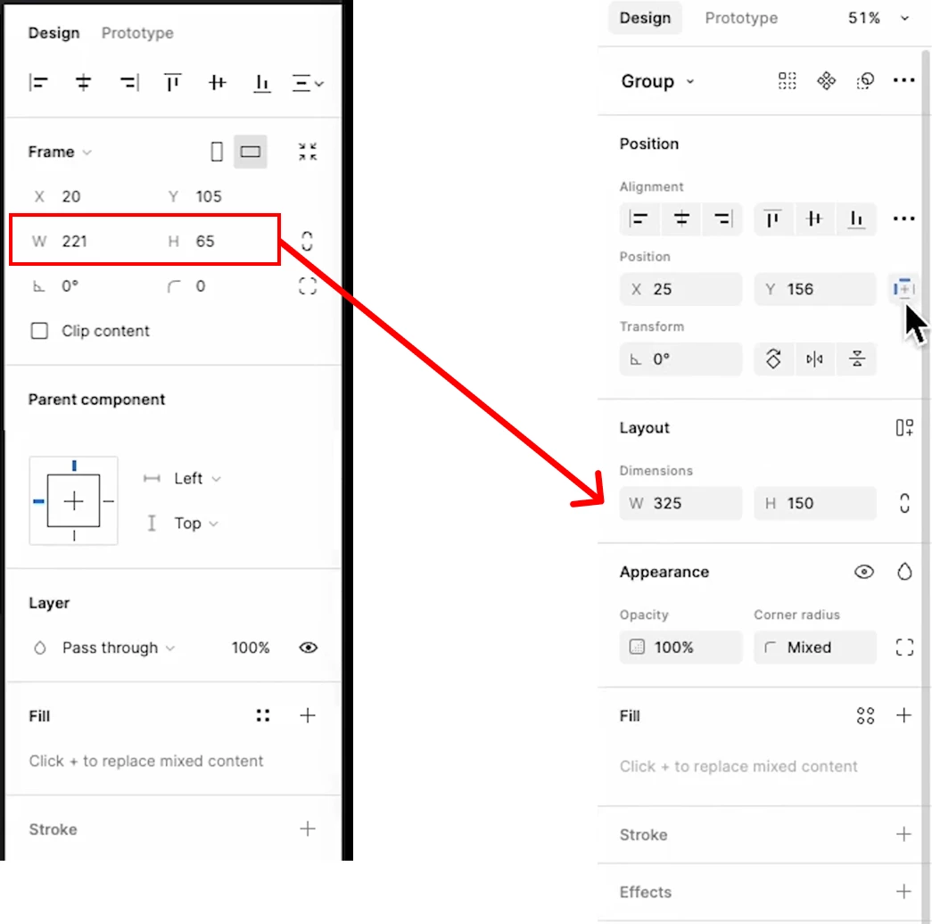
For example the thing that annoys me the most is the width and height is forever moving and is no longer in a static position like it once was. Especially when you are working with components with multiple options/variables. Small things like this really slow down you/teams workflow down in a production environment searching for locations i.e. it’s constantly shifting up and down.

In addition to this, people who have been using design tools for 15+ years are very familiar to the general placement of key items and other historic location placements. UI3 ruins this flow.


Example


Remember good design shouldn’t make you stop and think. UI3 has poor UX. End of.


Reply