
I'm honestly furious. The new design is simply bad and they are forcing it on us.
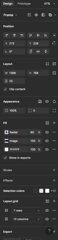
Basic tasks now take more clicks, which slows us down. The bar underneath is distracting, and I can't understand why every single thing in the panel needs a different background color or a stroke. It's visually overwhelming and makes it harder to focus and find what I need. The interface feels cluttered and inefficient. It's honestly ironic—and disappointing—that a UX/UI tool is creating such usability problems.
What is this? Actions that were previously accessible at the top are now crammed awkwardly into the top of the side panel—because apparently the panel was too clean before? For some reason, position and dimensions are now separated, adding more friction to simple tasks. And then there’s the action bar... at the bottom?
Seriously? We read from top to bottom. We work from top to bottom. Putting key actions at the bottom—where they overlap the workspace—goes against the most basic UX principles. It’s disruptive, inefficient, and just baffling. This isn’t innovation; it’s a step backward.
Let’s not pretend we don’t know what this is about. The company gets bought by Adobe, and suddenly we have a useless bottom bar, a cluttered and inefficient UI… sound familiar? What’s next—endless bugs and painful subscription fees? I’m genuinely very, very disappointed. This is exactly what happens when companies are allowed to buy out their competitors: innovation dies, and users are left with bloated, frustrating tools.
I’m sorry for the long vent but i needed to say something. Very disapointed and if this keeps up, im honestly considering just abandoning the software so that i can move to another one, so that they can buy that one too years later.