
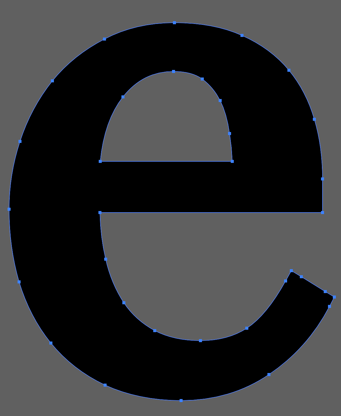
I’m looking into Figma Draw vs Adobe Illustrator and noticing some inconsistencies when using vector tools such as expanding / outlining strokes. Below I’ve attached two screenshots of the letter “e”. The black is from Adobe and the white is from Figma. This “e” was created using Georgia font as the default style, expanded to vector, sized to be 62.9px tall (specific for my use case), given a 2px outer stroke, and then expanded to vector again.
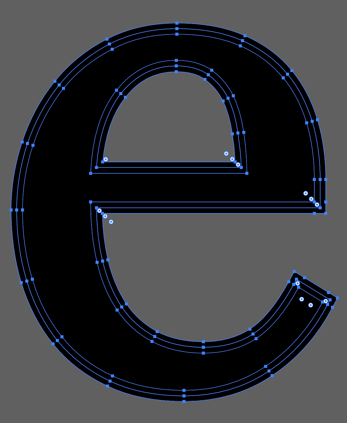
As you can see, the Figma version has much more vector points. Though Adobe does have an extra line between the expansions (not sure if this is intentional or a bug, its always happened).
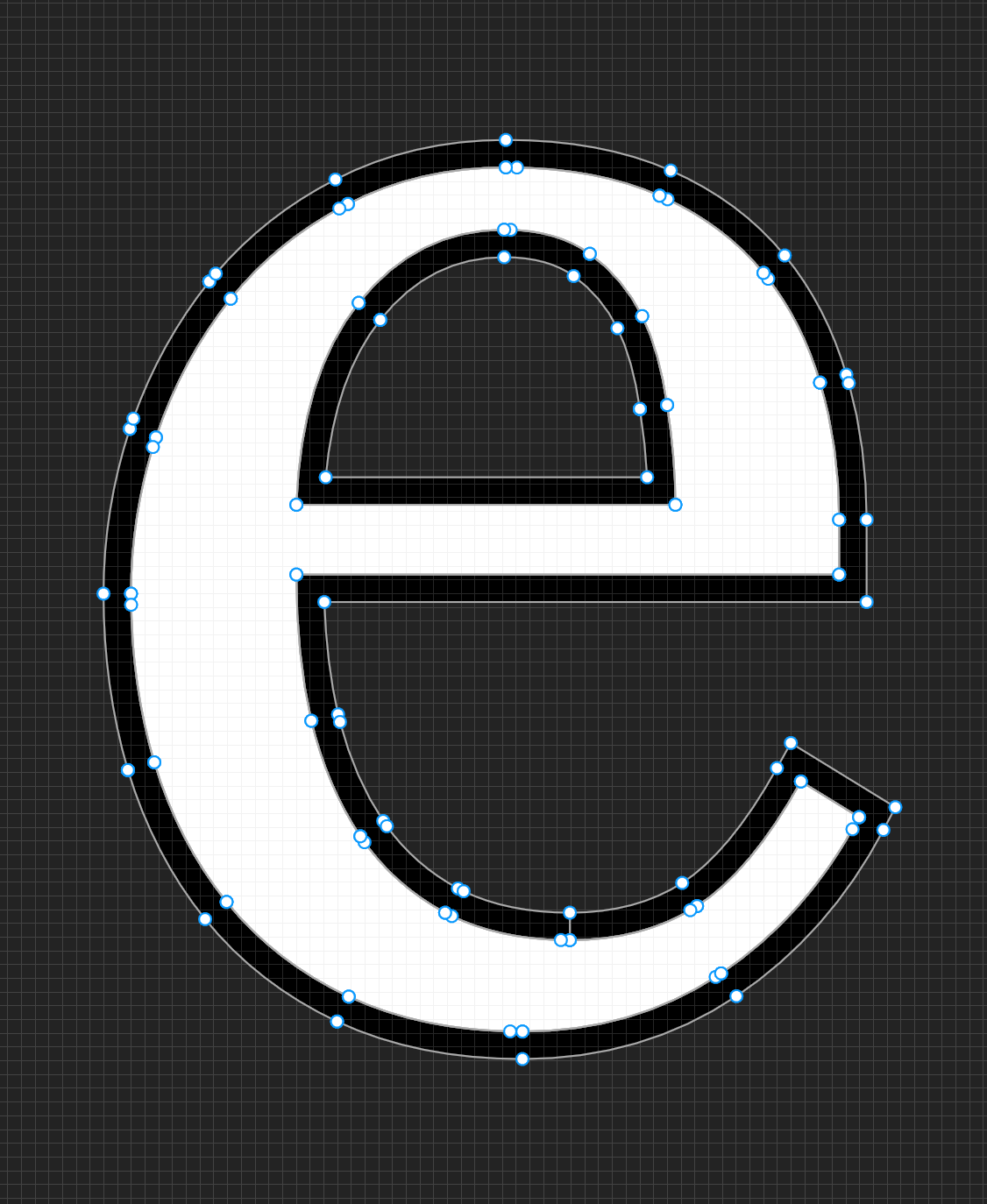
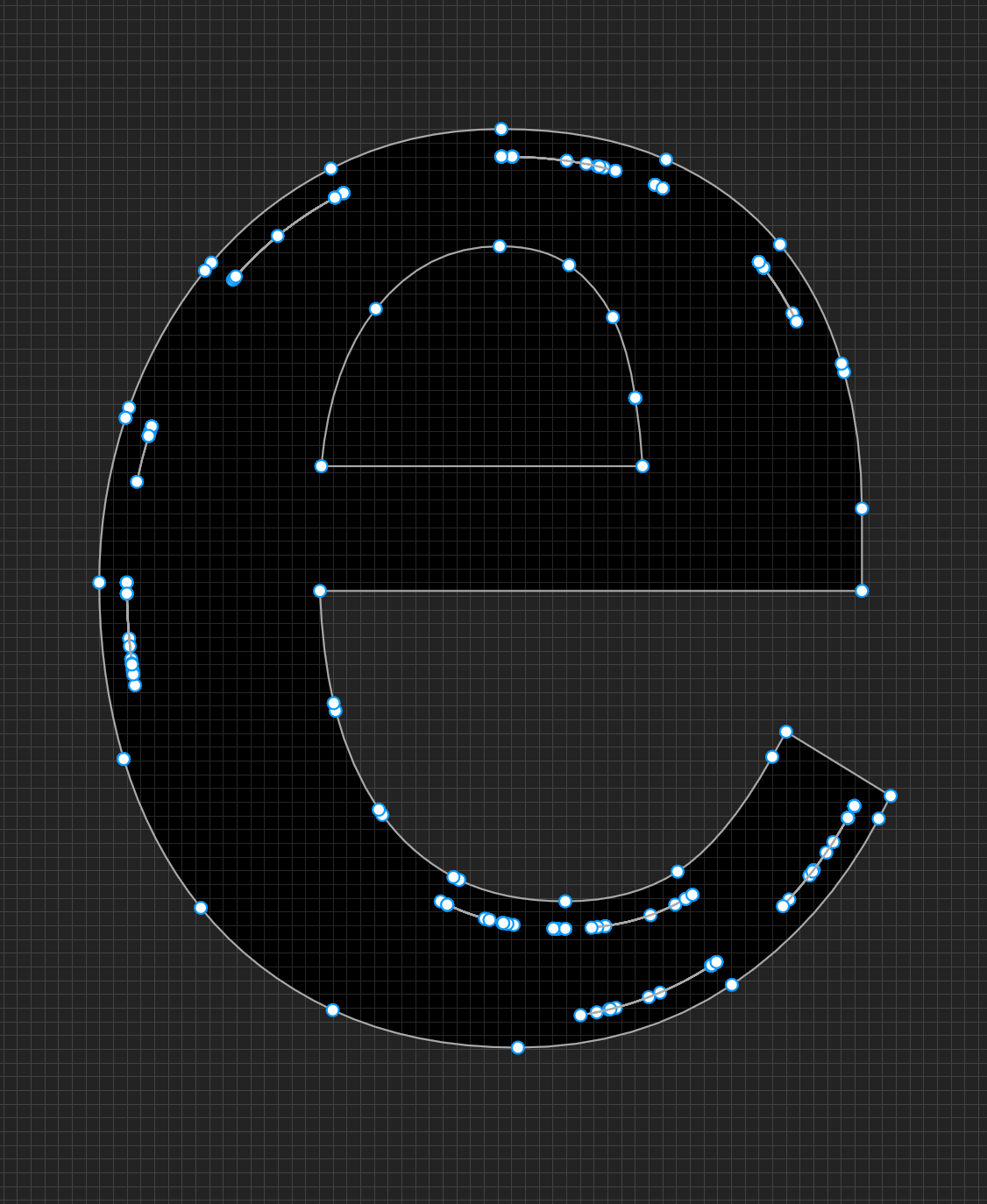
The rendering issue becomes more apparent when using the shape builder tool. As you can see, the Figma version has extra lines and loses the hole in the “e” whereas Adobe’s tool seamlessly combines the different sections. I use the tools in the exact same way, highlighting only the solid sections of the “e”, yet I cannot seem to get the Figma tool to combine properly without manually selecting the extra points/lines with the lasso which is more of hassle than what I do in Adobe.
I know Figma Draw is still in beta and these tools are still new, but I figured it’d be useful to share this. I would love to make the switch to Draw for my team, but I am worried how these issues will impact my vectors as I scale things. I work on a library of over 1,000 icons and they get used in a variety of sizes and exported in a variety of ways. I am worried that these inconsistencies may show and render incorrectly when exported as compared to the Adobe Illustrator counterparts.