Question

Mobile menu in Figma sites

  • June 1, 2025
  • 10 replies
  • 886 views

Cody_Porter1

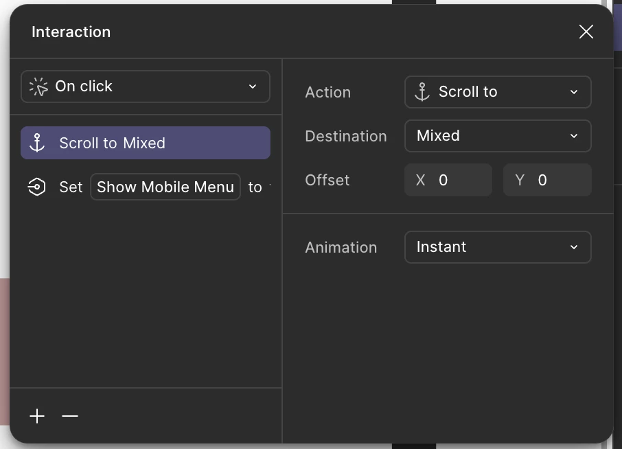
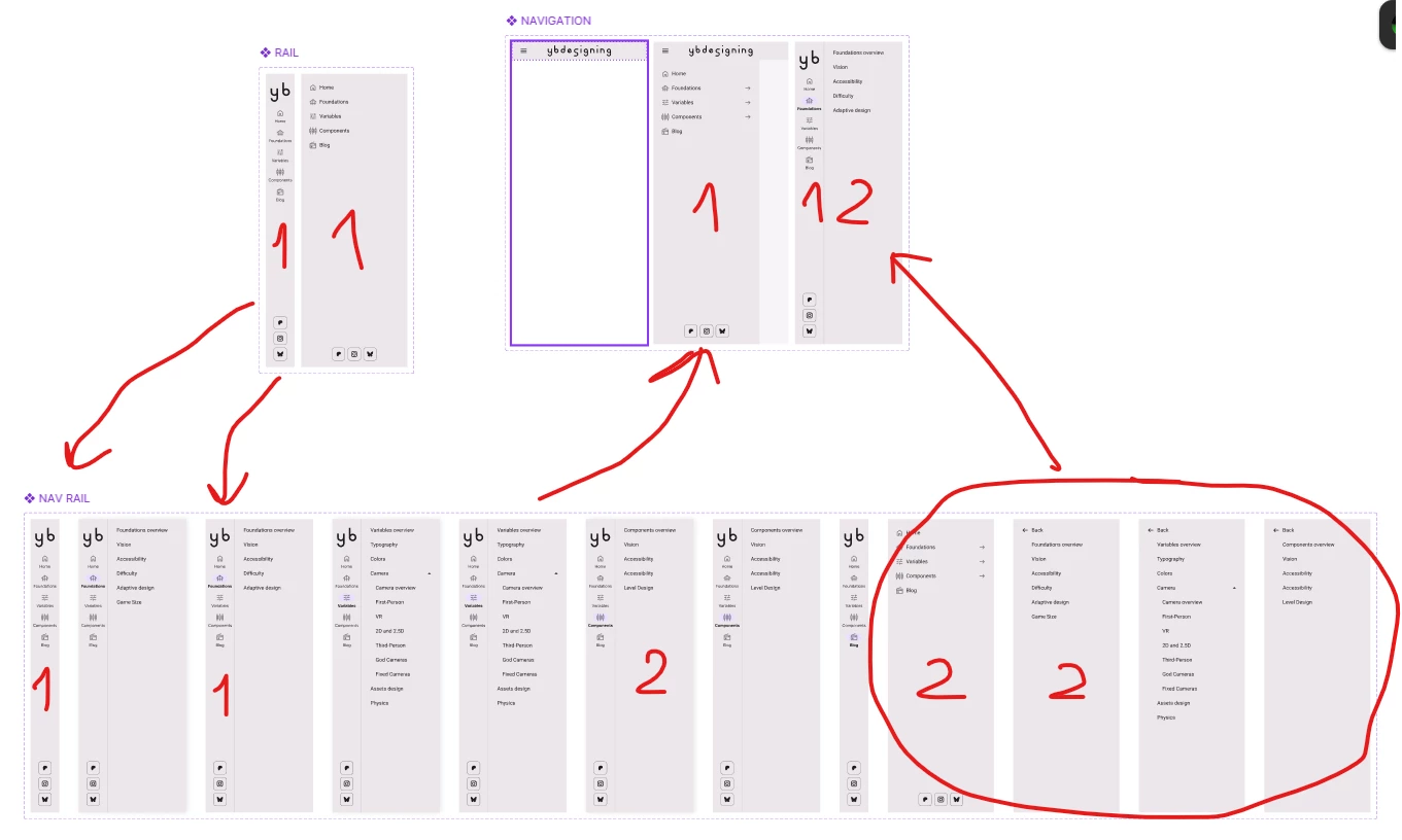
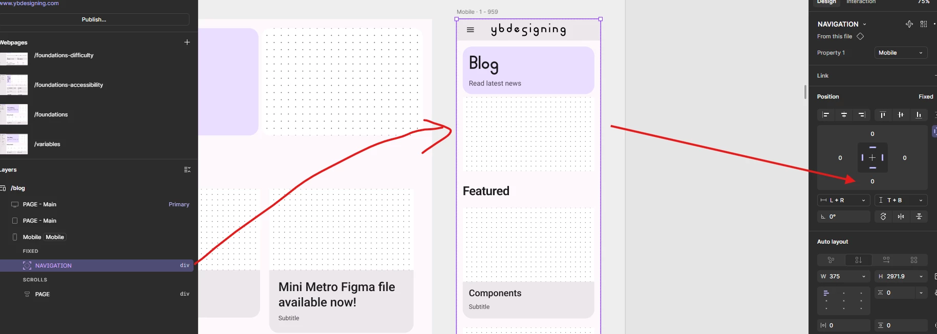
Is there any work currently being done to allow a mobile navigation in a hamburger menu for Figma sites.

None of the navigation blocks have this option. in the mobile component and even when I create components with an overlay interaction, the overlay will not appear when I use the component in Figma sites no matter what I try.

This is a pretty big limitation to one of the most common patterns in mobile UI.

Is there any way to accomplish this that I am missing?

10 replies

Klaudia
  • New Member
  • June 3, 2025

Up! I have the same issue


djv
Figmate
  • Community Support
  • June 4, 2025

Hey All, thanks for reaching out! 

Our Sites team confirmed that this is possible, but it’s likely different from what you’re used to creating, because Open overlay is not yet available in Sites.

Basically, you will need to create a hamburger menu variant set with an open state and a closed state. The closed state needs to be a duplicate of the open state that you will clip off using clip content.


I hope this helps explain, but for step-by-step help with your particular file, please reach out to our support team here: https://help.figma.com/hc/en-us/requests/new


Cody_Porter1
  • Author
  • New Participant
  • June 5, 2025

Thanks for the response.

I just tried to implement what you suggested and in a nutshell it feels super hacky and doesn’t end up giving me the result I want.

I was able to get the menu to open but it comes with some big limitations:

There is no way for me to add interactions to nav items in the component because they aren’t visible/accessible when I’m working in sites. This may be due to me using a published component library. I could try bringing an instance into the sites file, but then that means it will be floating in space which doesn’t seem like the level of functionality and organization that I’m looking for.

Additionally, the menu isn’t responsive. Since you are forced to use “clip content” and nest the entire menu in a smaller parent frame, there is no option to fill or pin the edges. So This resulted in the navigation drawer opening, but with no responsiveness.

While your suggestion works, it feels like an unnecessary work-around. I would love for some focus to be put on this to create more improved way of handling mobile navigation in sites.

For now, it may be helpful for there to be a help article for how to create a mobile nav with the way sites is currently built. I’ve talked to handful of designers about this and no one is able to figure it out.

Thanks for listening and trying to help.


djv
Figmate
  • Community Support
  • June 5, 2025

You’re welcome, ​@Cody_Porter1

We hear you. This is definitely a more involved workaround, so I wish there was more I could do.

For now, I’ve updated your topic into a feature request, and I’ll pass your feedback onto the Sites team. Hopefully, they can implement Open overlay before the end of the open beta. 


Serhii D.
  • New Member
  • June 9, 2025

You can also use Boolean variable to the effect of a modal appearing on the page. Just place a frame where you will need it, apply false boolean to it’s visibility and enable it with the nav button. I did it for my website, but there is another problem - I can see no way of hiding the nav modal after the navigation, since multiple actions are not supported with navigation interaction)) So it’s still a mess, but it is something.  


Brannon
  • New Member
  • September 4, 2025

@Cody_Porter1 ​@Serhii D. Would either of you guys be open to sharing this as a resource? I am building out several new sites and this would be a lifesaver.


goldimacs
  • New Member
  • September 12, 2025

I still haven’t found a reasonable workaround for this as my site has numerous pages - am i expected to set up an additional page for tablet & mobile view to accompany each site page (ie. 3 pages for each screen) for a hamburger menu to work? Has there been any updates recently on this?


Red Elephant
  • New Member
  • September 20, 2025

You can also use Boolean variable to the effect of a modal appearing on the page. Just place a frame where you will need it, apply false boolean to it’s visibility and enable it with the nav button. I did it for my website, but there is another problem - I can see no way of hiding the nav modal after the navigation, since multiple actions are not supported with navigation interaction)) So it’s still a mess, but it is something.  


Hey there! That should be possible. Your “On Click” interaction can have multiple click events, i.e. “closing the nav modal via boolean = visibility = false” AND i.e. “scroll to section” (in case you want to scroll to a section on the same page). Hope that helped. That should even work with multiple navlinks in the mobile menu. Let me know if you have any questions.


nir_Ux Ui Ai
  • New Member
  • October 26, 2025

There is a way around this
Create a mobile menu component in a closed and open state.
Create an interaction between the two states in the component.
Insert the closed state in the main web screen (which will affect everyone)
Create an auto layout of the header with the menu.
Delete the mobile menu from the main web screen (which will also affect everyone)
Insert the mobile menu into the auto layout we created.


Yelnar_Bolatov
  • New Participant
  • November 18, 2025

Hi, I’ve solved this problem by creating fullscreen fixed Navigation component that has 2 mobile states for header (closed, open) and desktop rail. 

The main rail has two states - mobile and desktop

It is used inside drawer with the submenu (forgot to rename it in screenshot)

And the drawer is used inside full screen navigation component.


Then I place it in mobile version as fixed and resize it to fullscreen with restrains from all sides. So, for that reason it understands where screen height ends.

When navigation opens from header, it works as you would expect.

And desktop version does too.


My method only has one problem / bug:
You can’t click anything in mobile version, as transparent navigation frame prevents it. But I am pretty sure that it should not do that. Will create a topic on that.


I was inspired by Material design website.

You can test my menu here on my published website:
www.ybdesigning.com