Hi I’m working in a Design System where I’m using an Icon button with what is called a Master icon (so the icon inherit the color from different states or modes). When using this icon button inside another. component is shown distorted, but very randomly I would say.
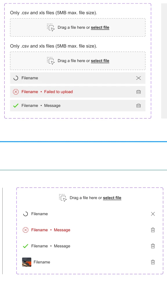
Here is an example, on the bottom is the base component of a File uploader component and the icon button with the bin looks fine, but when I take these base components into the main components (top one), it looks distorted.
I assume this is a Figma bug, because sometimes happens, sometimes not and the button is done exactly in the same way as the other button component that shows Label + button.
Is anyone having the same issues?