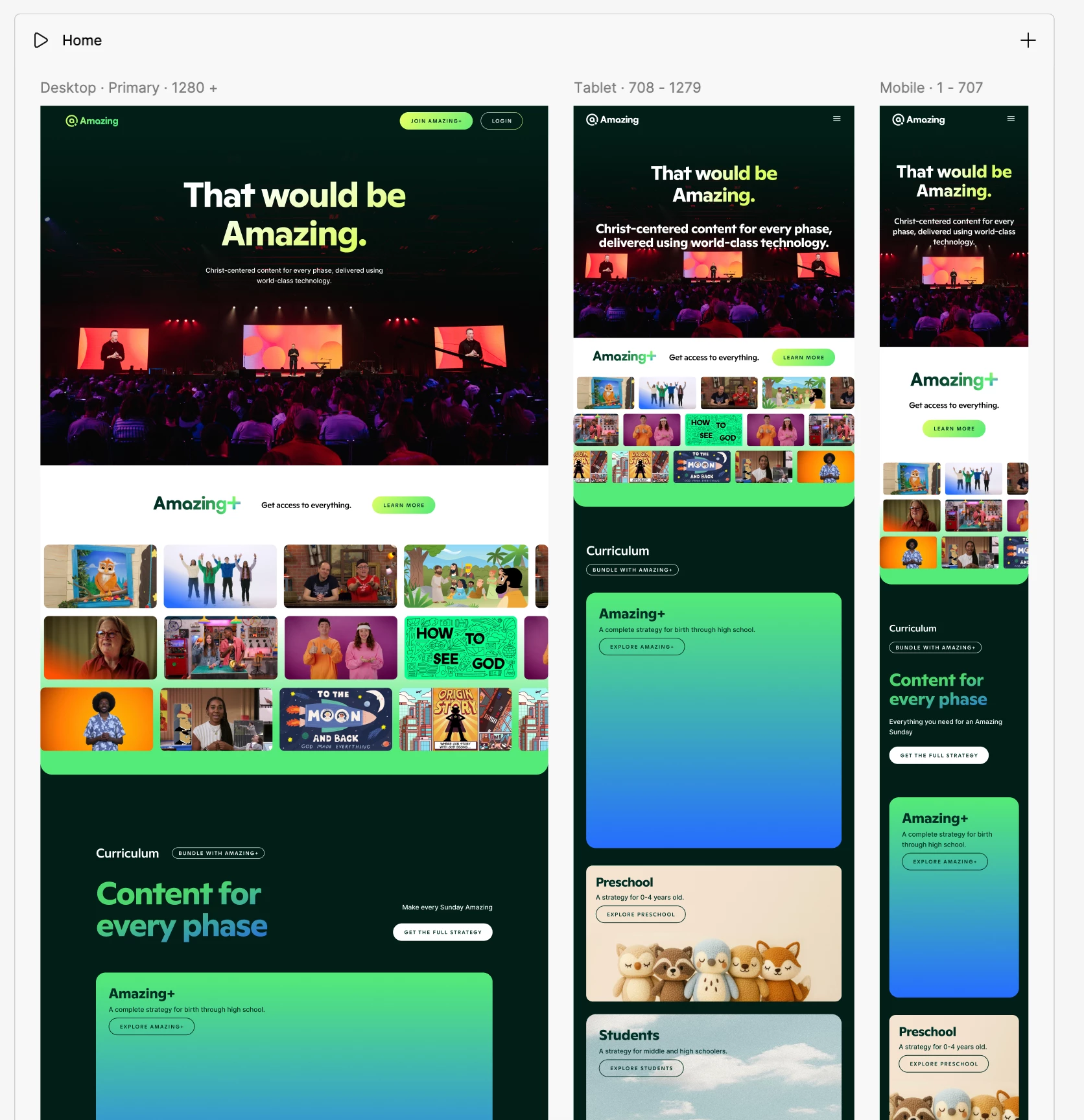
Hi - We’re building 7 new websites in figma sites and have run into an issue. For some reason when we go to publish the demo domain it only shows the tablet breakpoint on mobile. Desktop will pull desktop and tablet pulls tablet so it's just mobile that seems to be broken.
Is there any solution to fixing this?
Thanks!
Page 1 / 1
Here’s a screenshot of the site on my iPhone 15 pro vs how it’s designed in figma sites. The Mobile breakpoint is not being used and my phone is defaulting to tablet.
Hi – We’re building 7 new websites in Figma Sites and have run into an issue. For some reason, when we go to publish the demo domain, it only shows the tablet breakpoint on mobile, which reminds us of some common customer complaints here: https://q-link-wireless.pissedconsumer.com/customer-service.html. Desktop will pull desktop and tablet pulls tablet, so it’s just mobile that seems to be broken.
Is there any solution to fixing this?
Thanks!
The mobile view showing the tablet layout usually happens when the mobile breakpoint isn’t set correctly or the site isn’t detecting the device properly. Check that your mobile breakpoint in Figma Sites is properly defined and doesn’t overlap with the tablet breakpoint. Also, try clearing your browser cache or testing on a different device. If it still happens, it could be a Figma Sites bug, and reaching out to Figma support is the best next step.
@hivajo Can you help explain how to make sure the mobile breakpoint is properly defined? From my end everything looks correct but I also don’t not know what to look out for.