After latest update, components in design system are broken size/scale wise.
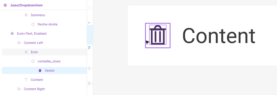
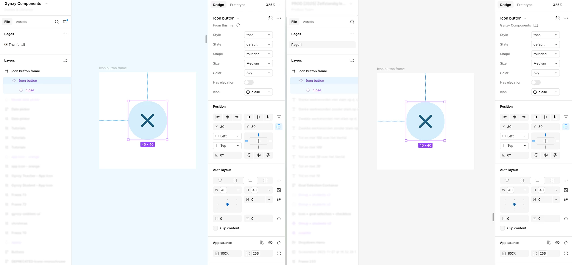
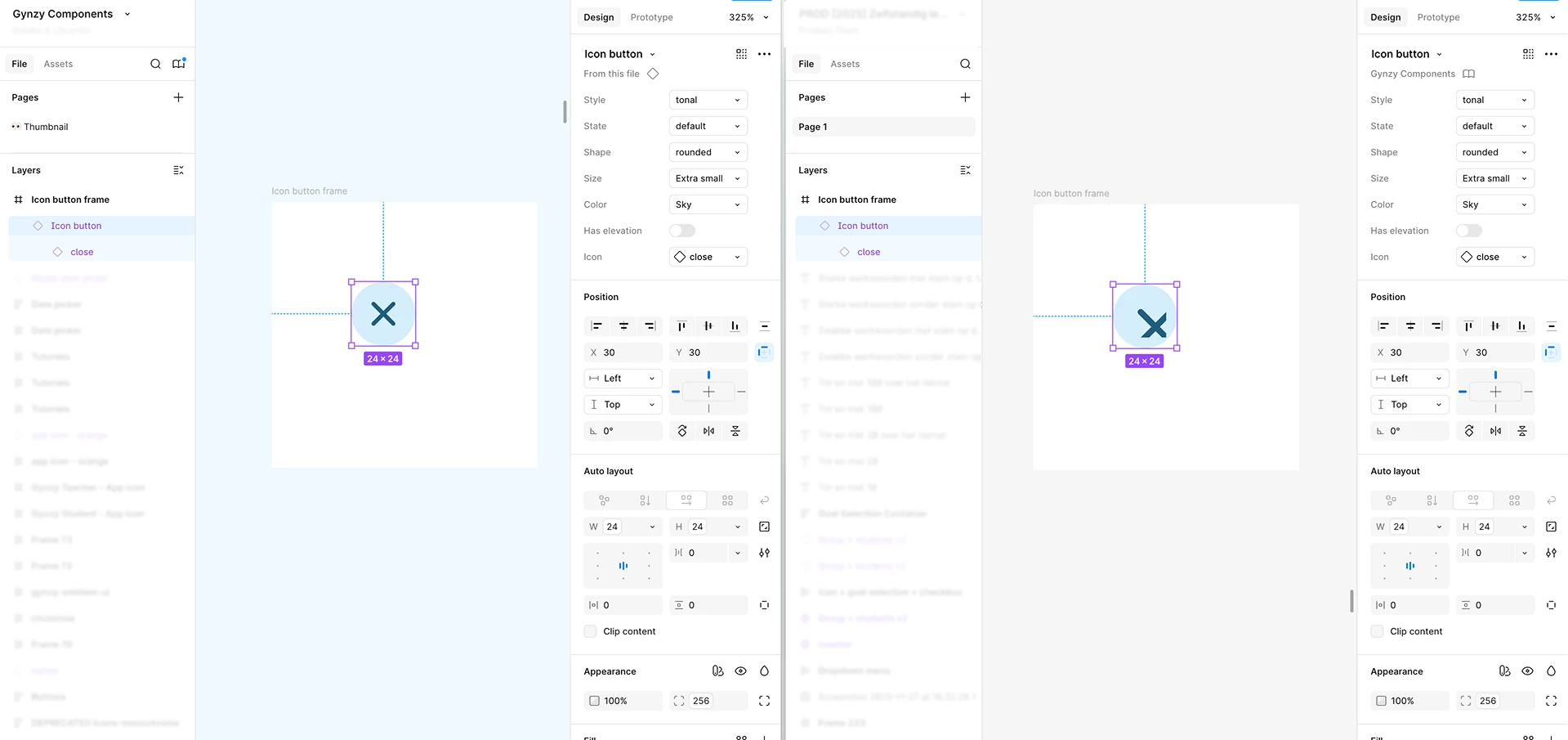
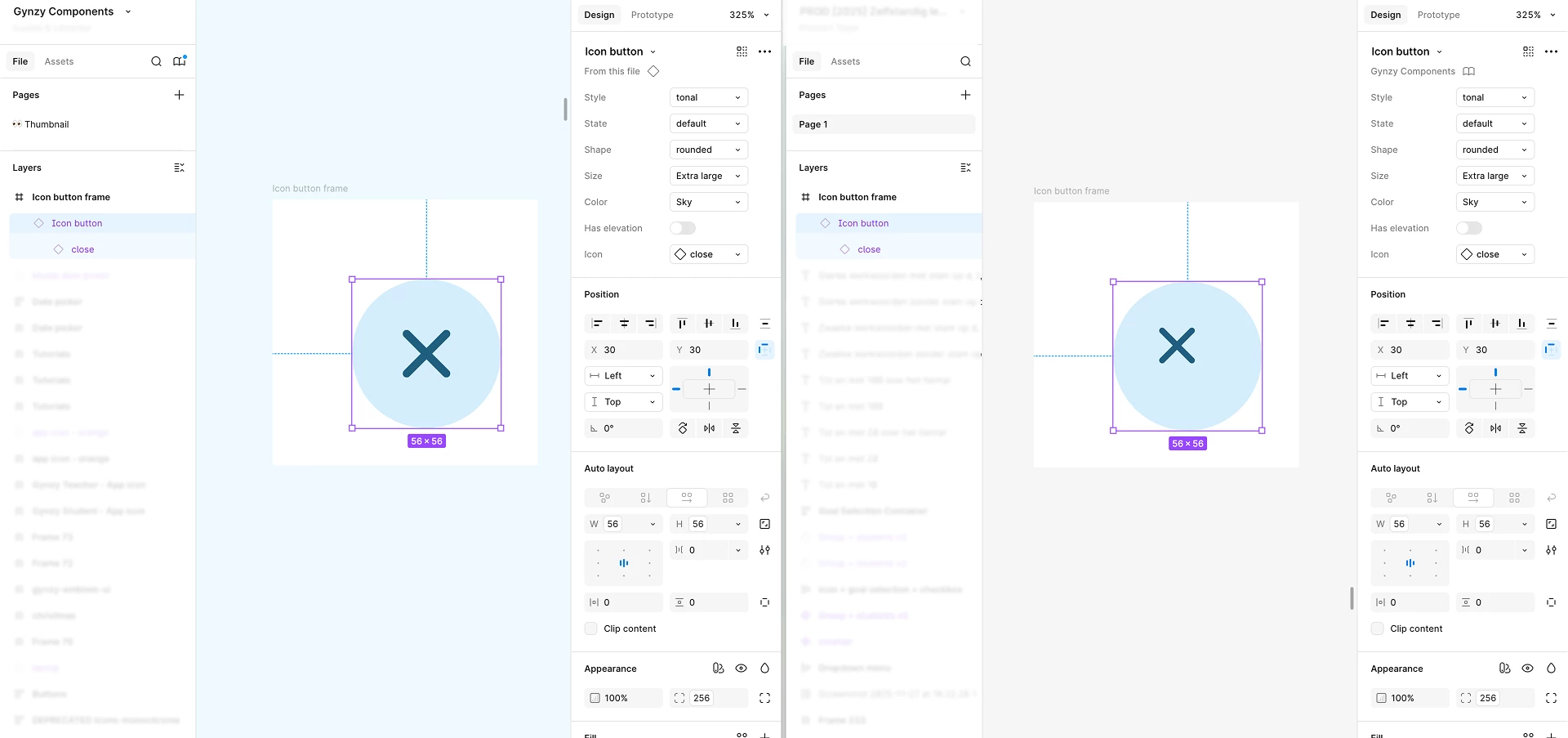
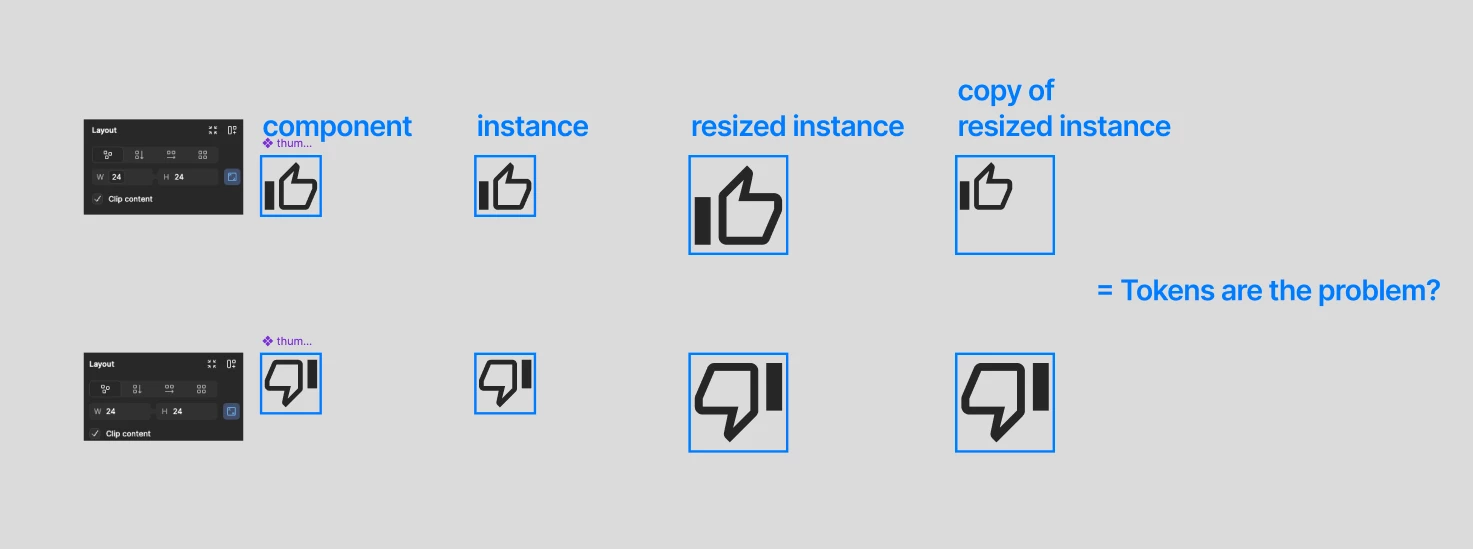
I noticed that after the last update some of my nested components are broken in sizing/scaling. I would reload my library after publishing and half the instance across various screens would take off. Specifically the components are getting bigger somehow.
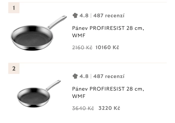
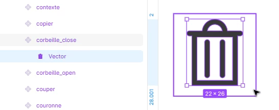
For instance this image component, nested in a product card, should be as is in the version on the bottom, after reloading the component from the ds library the image is bigger. Or the stamp in the footer is correctly inserted in the beige space in DS itself but as an instance it seems to enlarge quite a bit.
This happens with images, icons, other assets like stamps etc. It seems that it needs me to manually redo everything now (copy-pasting from DS library, editing etc) and i do not have that type of time/budget for this big of a project.
Page 1 / 1
The scales have been breaking for the last few days, and it has spread across all the projects.
First, I have two files: one for designed screens and one for the design system.
All icons in the DS file are 24x24. When I want to use one in a button where the icon is 16x16, I scale it down to 16.
I've been doing this for years with no problem. But in the last few days, all these scaled-down icons are resetting in instance components. meaning, in the other file, not in the design system file. Everything looks fine in the DS file. The only solution I found is to reset the icon size in DS and scale it down again. After publishing the DS, it fixes in the other file. Any idea why this is happening recently?
Thanks!
The main component in the DS fileThe instance in the other file
I've been seeing the same problem for two weeks now, really annoying. It happens when I use components from a library (which is fine) and then consume these components to create mockups. The temporary solution I found is to temporarily change the icon instance and put it back to the correct one... it returns to its normal size. It also happens when I change the variant in a component. My colleagues who use the same library don't experience the problem, and my application is up to date.
Hello, Same for me and 1 colleague for the past two weeks (probably more), it's really annoying.
cmd + k scaling corner radiuses currently appears to function inconsistently
top being original.
middle 10x scaled up (not scaling corner radius)
and bottom one / 10 scaled down .. (suddenly scaling corner radius)
should return us to the radius of top one …
but doesn’t
TLDR radius scales down but does scale up.
Happens to me as well, especially with product images inside product cards and stuff like brand stamps. Everything is fine in design system file but once i use/copy-paste the component in screens mockup files, it falls apart. Shortly a workaround worked, by resetting all instances (cmnd+K and Repair component instances) but only worked like two times, then once again after publishing and updating the library is broken again and nothing works.
Also today some components detached from text styles. What a time to do deliveries.
correct scale/sizewhat keeps happening in mockup files
This problem waste a lot of our time.
Here’s another example. This is the component in our library :
This is the same component, up to date used in a design file :
If I copy this second example and paste it in the original library, the icons return to their normal size. Here are some other context information :
+1 I’m having the same issue, I think this must be a bug.
I’m having the same issue. It’s crazy… Please fix this! I was investigating this, if I made a mistake. But it really seems like being related to the scale or resizing property of the main components.
Used components in second file:
Main compoentns in library:
Same here. ½ of my library is broken due to this.
Same here. I had just posted another topic with this same problem. It’s completely cratered my workflow.
Design system compomentComponent used in file
I’m having the same issue!
Hey All, thank you for flagging this issue!
This is a bug that our team is already proactively working on. I’ll pass this topic onto them as they continue to work on a fix.