Hi all,
I'm working on a web app that needs to work on a touch screen (most likely tablet-size). For the environment it will be used in, it's extra important that text stays readable and interactive elements are easy to touch
To get a feel for this, I have a tablet with a 1900 x 1200 resolution, 10.1 inch screen size and 224 pixels per inch, to try out prototypes of the screens with the Figma mobile app. The designs I make are also in 1900 x 1200 frames. When I open a Figma prototype in the mobile app, it gives 2 options for scaling the content: Fixed or Responsive.
For reference, please see attachmed images below (these are not the actual screens from the web app as I cannot share those).
When I view the designs on the canvas on my desktop at 100%, sizes look fine to me.
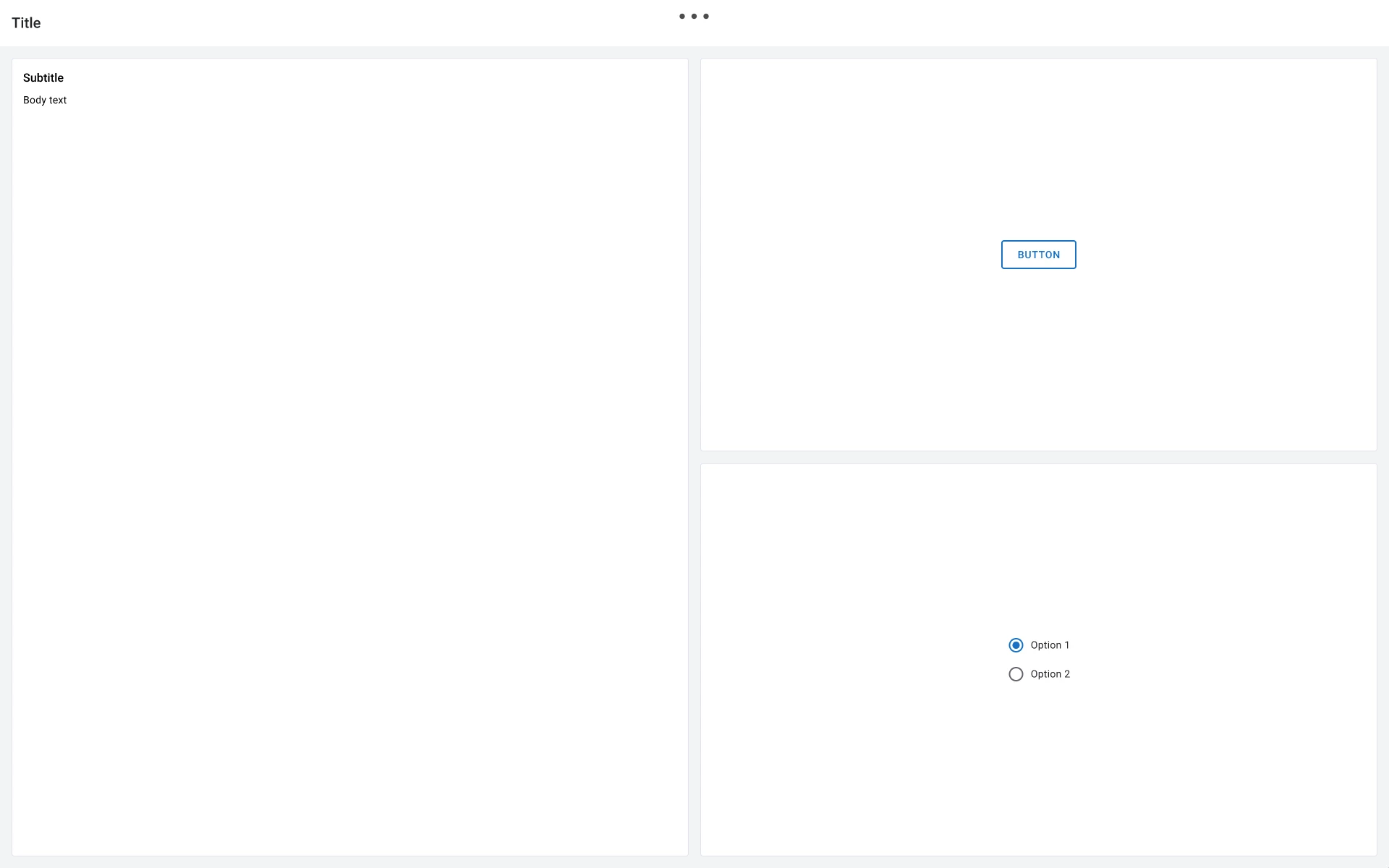
On the tablet, this is also the case when I set the content scale to Responsive (image A). This adds a strange blank area to the right and bottom that I can scroll to by the way.
When I set it to Fixed (image B) however, everything looks noticeably smaller and not good enough for me
But which of the 2 options in the prototype on tablet shows the real situation when the screens are actually built? I know this also depends on the implementation too for the end result, but I'd like to know I'm looking at an accurate representation while I work in Figma too. I feel a bit stupid for having to ask this, but I couldn't find an easy answer on the internet.
Thanks in advance for any help!