Question

Ui3 color contrast fail (no longer WCAG level AA conformant)

  • September 19, 2024
  • 2 replies
  • 35 views

alex214

Hi there,

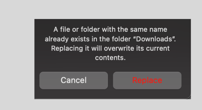
The new UI3 uses an updated gray font color which is lighter than before.
At the same time, there are new light-gray background boxes behind the gray fonts & icons.

The lighter texts and darker backgrounds reduced contrast and compromised readability significantly. In fact parts of the UI fail WCAG level-AA color contrast.

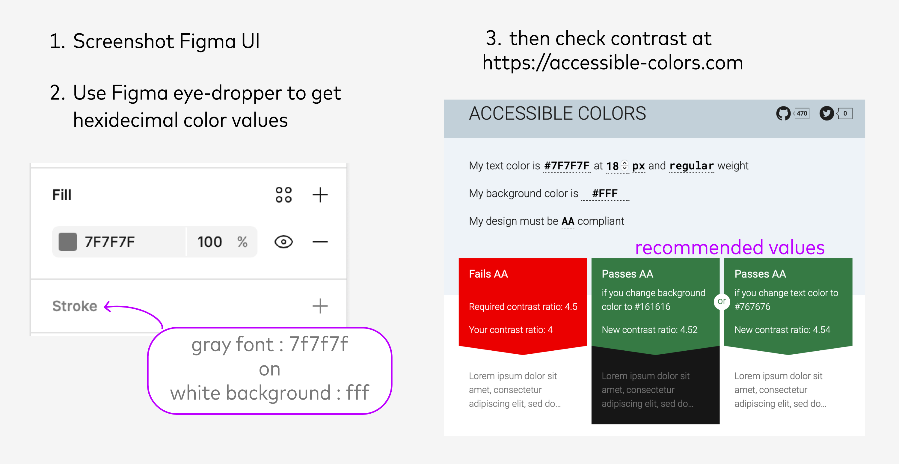
Here’s how I use Figma to quickly test color contrast for accessibility in my designs;

  • And are we using a smaller font in the UI3 to make up for the added padding? (other people already posting about padding but the weenie fonts making me feel real old today).

I have perfect vision and on first impressions this visual update immediately strains my eyes.

2 replies

shaina1
  • 4 replies
  • September 19, 2024

UI3 is a nightmare in dark mode, i can’t tell input fields from the background without putting conscious effort into finding them. I’m reverting back to UI2 where things were usable.


CH11
  • New Member
  • 1 reply
  • December 9, 2024

(upload://bewHcooZrqs8qFGZwLg4Xi4YrTd.png)

It seems like many others have already mentioned this, but I wanted to add my feedback as well. The red color combined with the grey background is really hard on the eyes and not WCAG-friendly, even for someone with great vision like me. I’d really appreciate it if you could look into improving this.


Reply


Cookie policy

We use cookies to enhance and personalize your experience. If you accept you agree to our full cookie policy. Learn more about our cookies.

 
Cookie settings