Question

Swap instance based viewport?

  • February 20, 2024
  • 2 replies
  • 357 views

Rich_price

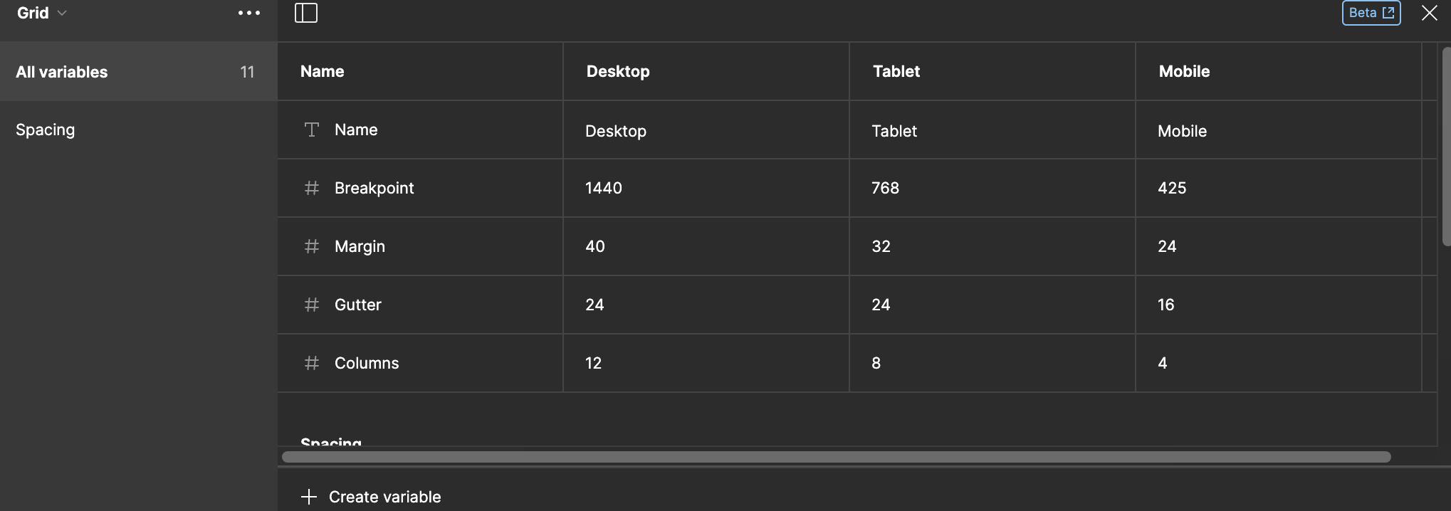
Hello - is there any way to use layout grids ad have them change based on viewport size. IN the same vein, can component instances be swapped based on viewport or grid layout?

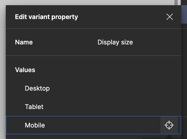
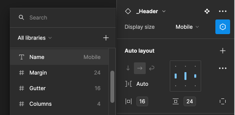
I’s love to be able to have a template that when it scales down to template size mobile variants get swapped into the design. I can see that this can be done manually. You need to swap the grid manually and then swap the component manually(one that could be optimized for mobile)

Thanks for any ideas or plugins. πŸ™‚

2 replies

CamilaB
  • Active Member
  • 26 replies
  • February 20, 2024

What I did for this was create a β€œgrid” variable that has the width of each viewport I wanted (desktop, tablet, mobile), and they have a text variable with the name of each mode. I then link the frame width to the grid width variable. After doing this I create the component variants I need to swap depending on the mode selected for that layer, I name the variant the same name as the grid modes (desktop, tablet, mobile) and then link the instance property with the grid name variable.

Setting up variable

Setting up variants:
image

Using variable as variant property:
image


Rich_price
  • Author
  • 5 replies
  • February 20, 2024

Hi Camila. Fantastic. I was wondering if variables could do the trick! let me absorb the implications here. It sounds like just what I was hoping for. πŸ™‚


Reply


Cookie policy

We use cookies to enhance and personalize your experience. If you accept you agree to our full cookie policy. Learn more about our cookies.

 
Cookie settings