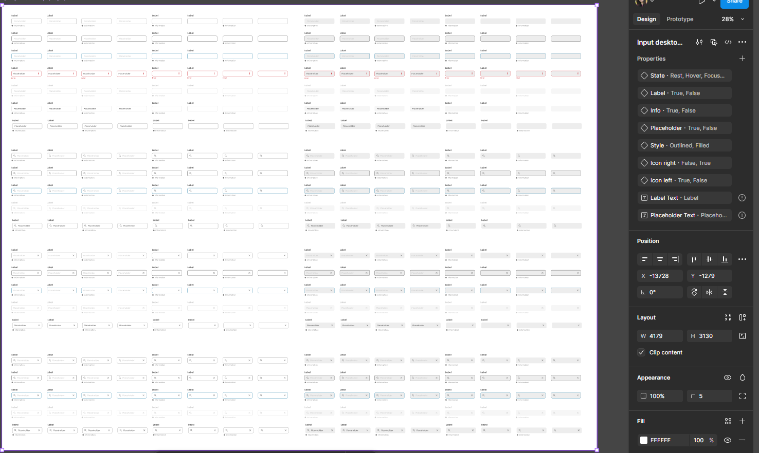
I'm working on a design system and when I got to the input components, I created variants for the desktop version—all the same size but with different properties. However, I also need these variations for the mobile version, where padding, icon size, font size, and other properties change.
Sometimes, I also need larger versions, like for a self-checkout screen, where the inputs are significantly bigger.
Based on the desktop input I created, is there a way to create another set of components with the same variants and properties, but only change the padding, font size, border radius, etc., without having to simply duplicate and manually adjust the size of everything to fit mobile and other screen sizes?
If you have any suggestions on how I could improve the way I've created these components, feel free to share. I've been using Figma for a few years now but haven’t fully mastered local variants, components, and related concepts.