
Hi everyone,
I’m looking for some UX feedback on a small tool I’m designing and wanted to get opinions from the community.
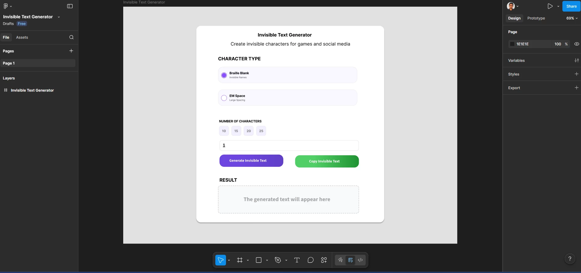
The screenshot attached is my current Figma design. It’s a very minimal interface for an invisible text generator. On desktop, the design has a heading + text on the left column, but I’m not sure if this approach makes sense for mobile.
My goal with design was to make sure the tool is the first thing the user sees when he opens the website either on their phone or on a desktop.
A few things I’m unsure about:
-
On mobile, should this stay as a card layout, or should it take the full screen / hero section? (Which it currently does)
-
Would a full-width layout work on a desktop.
-
I also considered a neo-brutalism style at first, but the clean and minimal version felt more usable. Do you think minimal is the better direction here, or would a stronger visual style help?
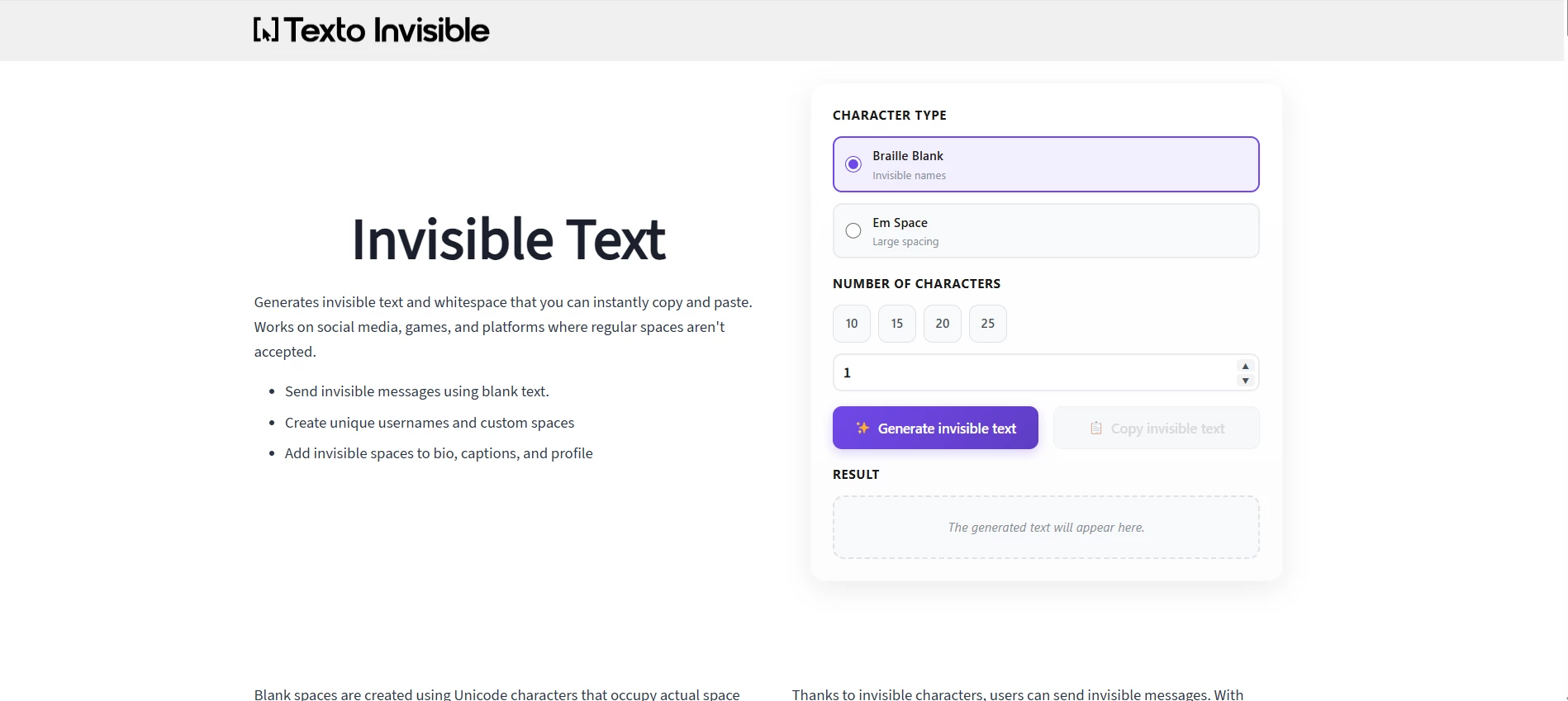
This is the live version Design:
This is for a real working tool, so usability matters more than it being flashy.
For context, here’s the live version: https://textoinvisibles.com.
Please let me know how can i improve the design because i am still in contact with the developer who offered me free changes if i wanted any.