Hello everyone!
I'm facing an issue with interactive components and icons in Figma.
I’ve created a button component that includes an icon (e.g., a camera icon) and some text, all wrapped in an Auto Layout. The default state of the icon is a line version, and on hover, I want it to switch to a filled version of the same icon. This works fine when using the default camera icon — I’ve set up the component so that the hover state changes both the icon and the button's background color.
The problem arises when I use an instance of this button and swap the icon (for example, from camera-line to pencil-line). When I preview the design in Presentation mode, the hover interaction still changes the icon back to the camera-filled icon, instead of showing the filled version of the new icon (e.g., pencil-filled).
I believe this is happening because the hover state is tied specifically to the camera icon, not a generic slot that supports swapping both line and fill icons as variants.
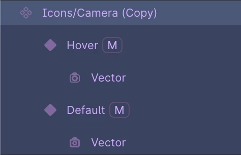
Here's how I've structured and named my icon layers (screenshot attached).
How can I make this setup flexible, so that when I swap out the icon in an instance, the hover state switches to the corresponding filled version of the new icon (not the default camera)?
Thanks in advance!