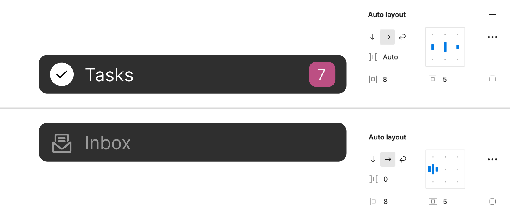
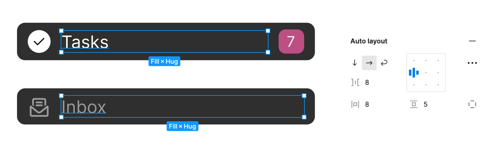
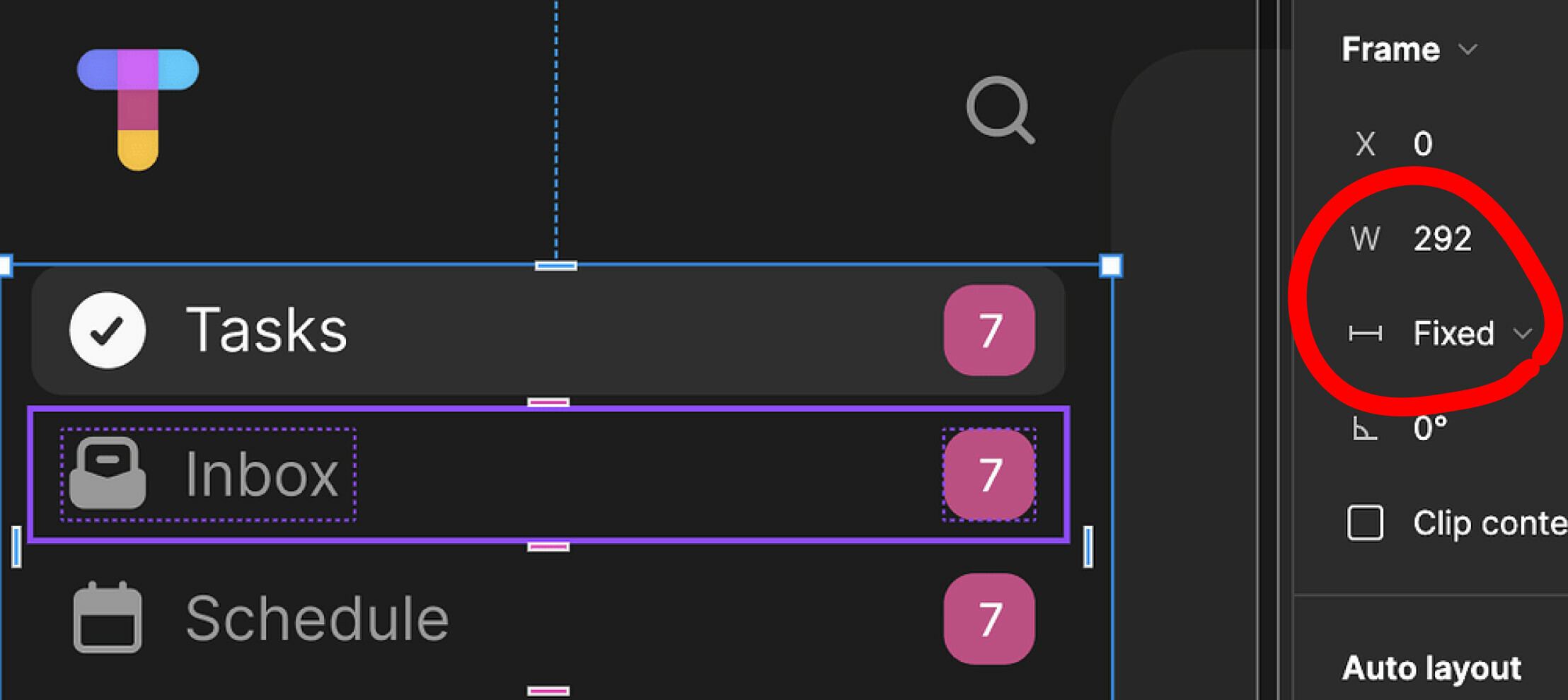
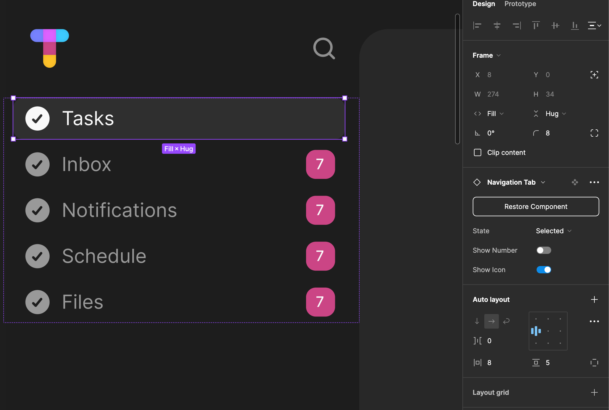
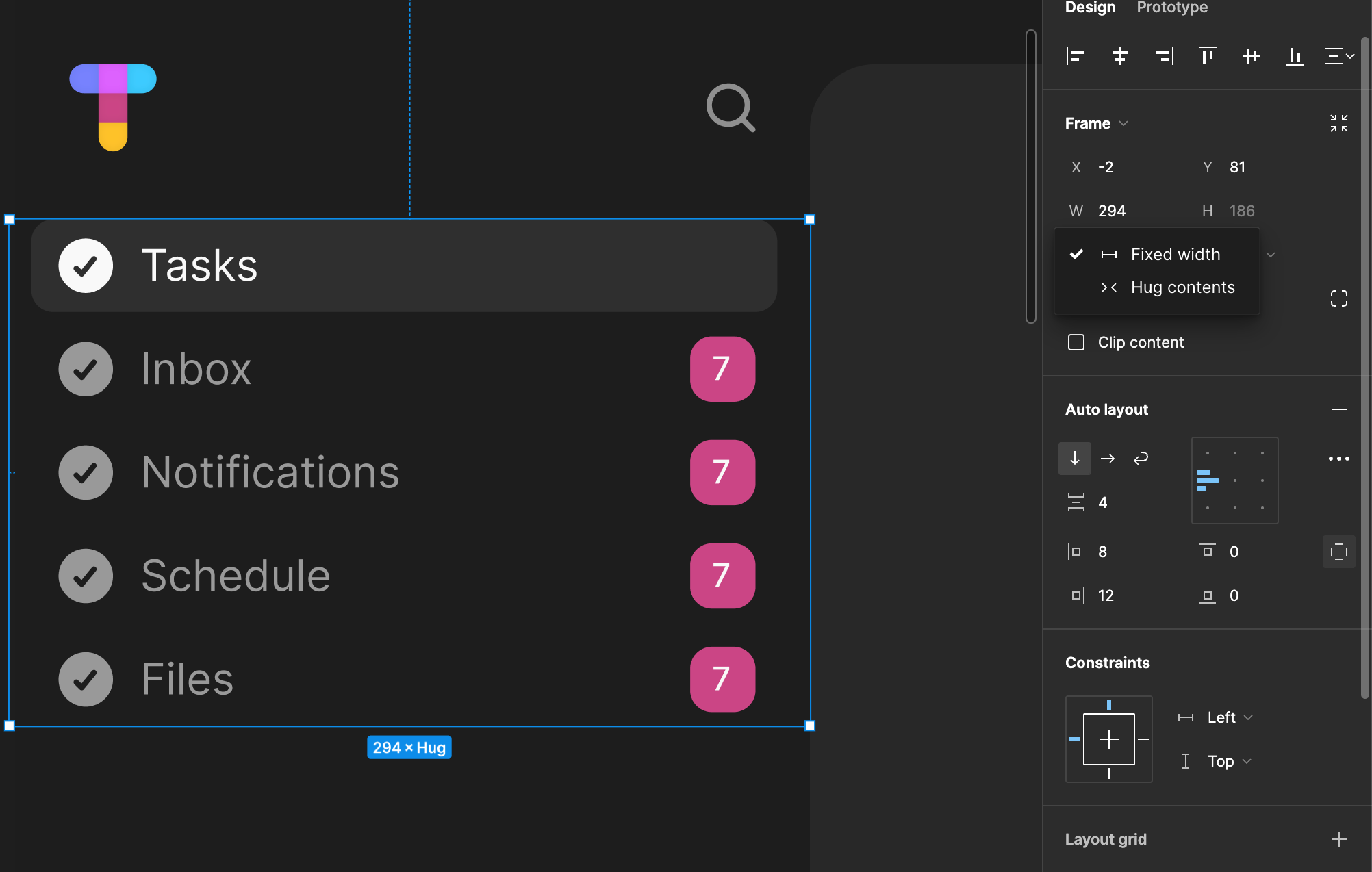
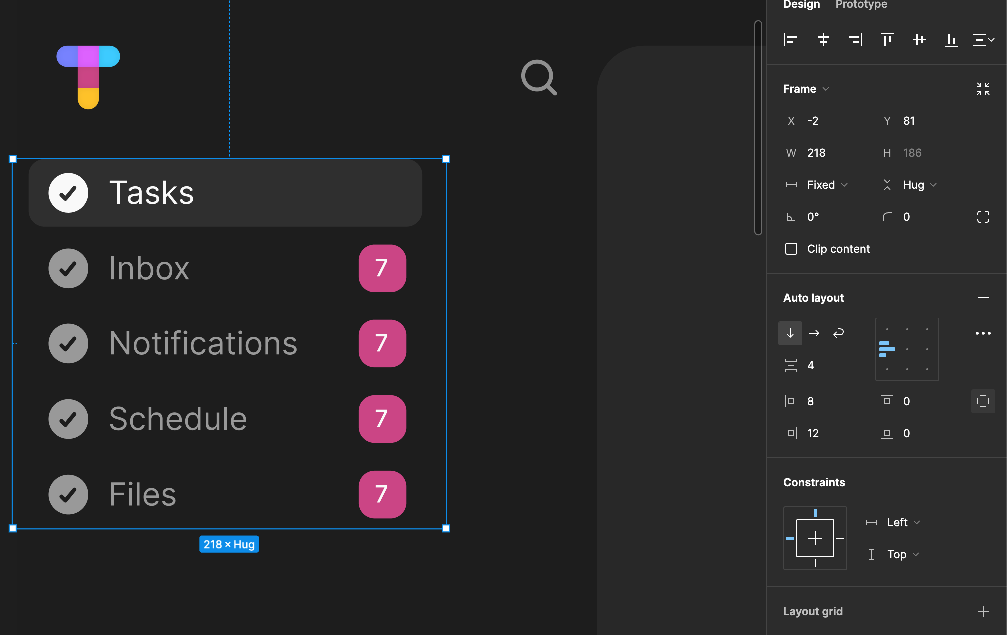
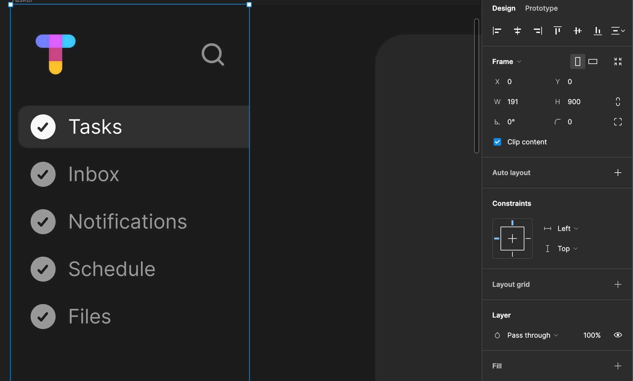
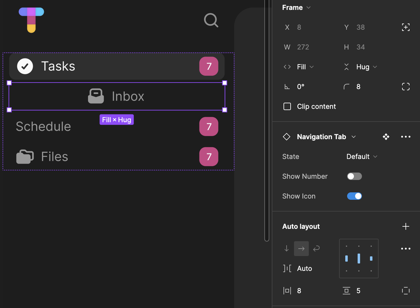
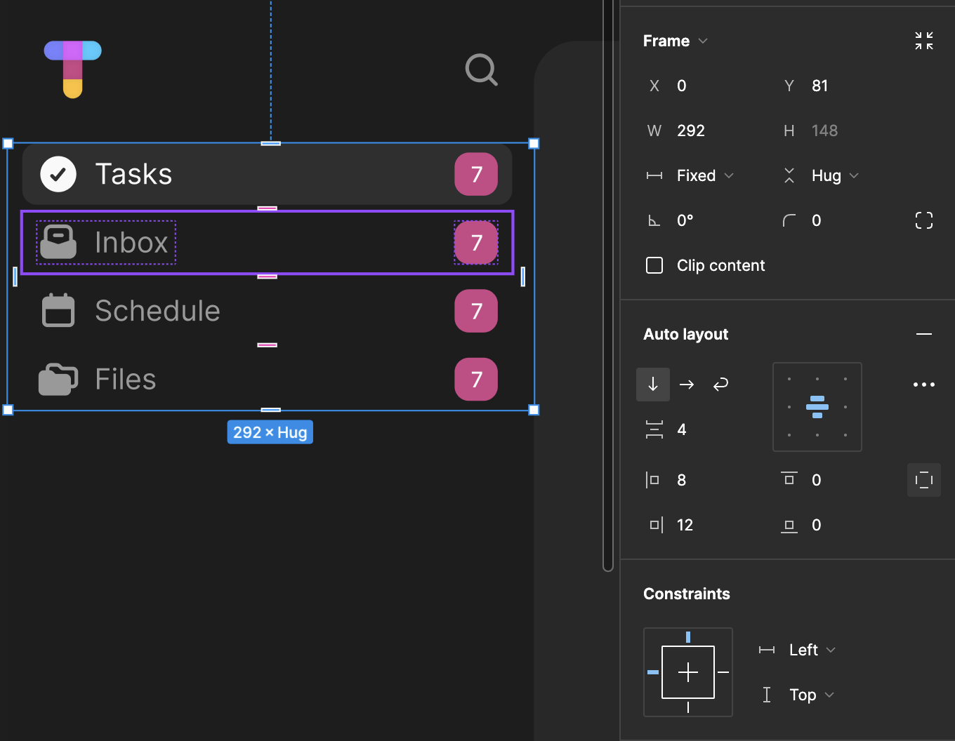
Hi @Brennan_Hom
Navigation tab alignment
Your tab is an auto layout with an horizontal gap set to auto, which mean its gonna arrange anything inside so there’s the same amount of space between item. If there’s only one item it will be centered in the auto layout.
You may :
- set the horizontal gap to 0 when there’s only one item and align everything left
or
- set the text’s width to fill so it takes all the remaining space and set an horizontal gap (that will define the space between icon-tab name-number counter)
This solutions would allow your design to keep the icon + tab name to the left
Responsiveness
As you can see on your screenshot the tabs have a fixed width, which mean no matter the width of their parent they’ll always be 292px
wide
So for your whole tab to be responsive, you’ll need to :
- set your tabs’ width to fill
- set your tabs container’s width to fill
You can change this value to “filled” which mean it will take all the available space in their parents (you can take a look at the documentation for more information Explore auto layout properties | Using auto layout )
Hope it helped
So I set the tabs width to fill, but it won’t let me set the tabs container’s width to fill as well. It resizes how I want when I resize that tabs layer, but when I try to resize the entire side navigation frame, only the top portion (logo + search icon) resizes, but the tabs get cut off.
It appears that the list
and its items
are in fact auto layout but the parents
of this list isn’t.
⚠️ The “Fill” option is only available when working within an auto layout frame
You can
-turn the parent
into an auto layout and enable the “Fill” option for the list
or
-Use “Left and Right” option in the Constaints panel of your list
Sorry it’s been over a month now, but I ended up starting a different project because I couldn’t figure this out. As I circle back to this project now, I still can’t figure out what I’m doing wrong. Any chance you have a video tutorial on how to make the tabs responsive as you resize the frame? This is absolutely killing me because I have so many ideas that include a sidebar navigation, but can never figure out how to anything properly responsive 😥
Hi @Brennan_Hom,
I cannot give you edit access on my file but you can duplicate it in your draft and take a look on how it was made → Figma file
If you still find yourself struggling with Auto layout I invite you to take a look at this YouTube playlist Auto layout: Learn to create flexible designs and components