Question

[Fixed] Figma Sites text breakpoints always use mobile values on load


prayminder

First of all, kudos to the Figma team for Sites, it’s an amazing product even in beta. I've been looking forward to Figma making this happen, an easy way to publish a website directly.

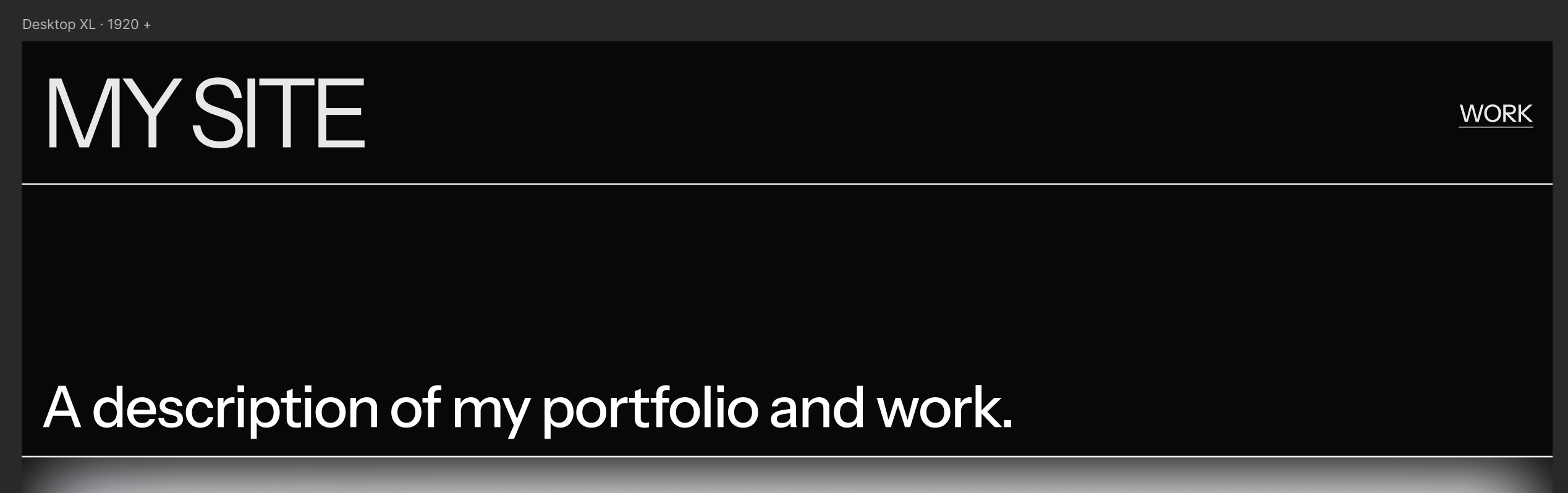
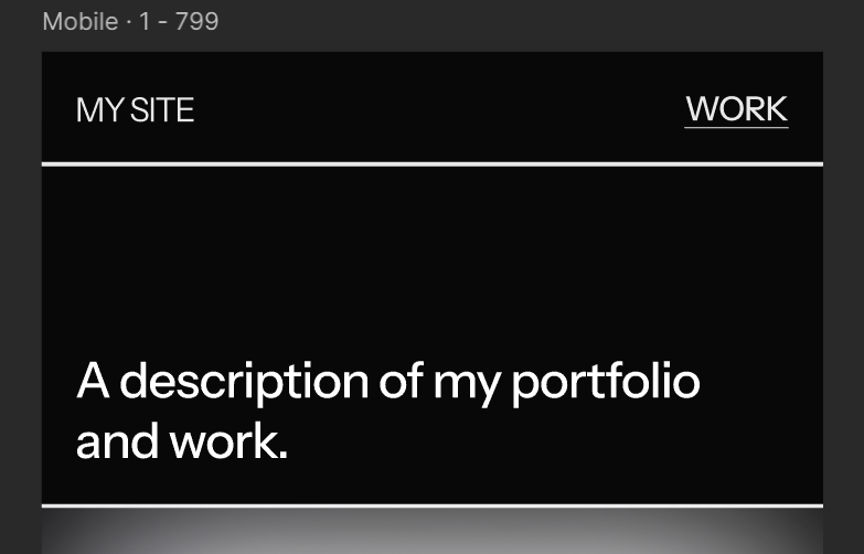
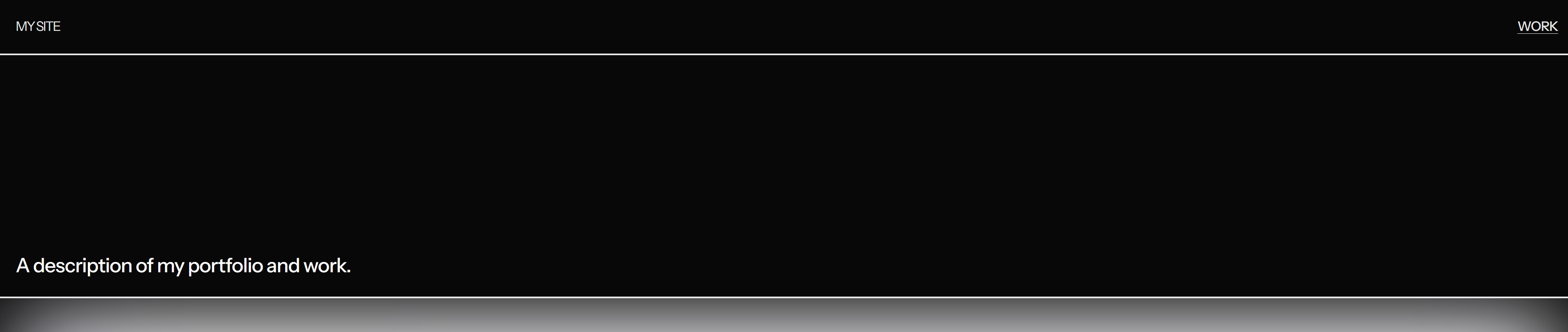
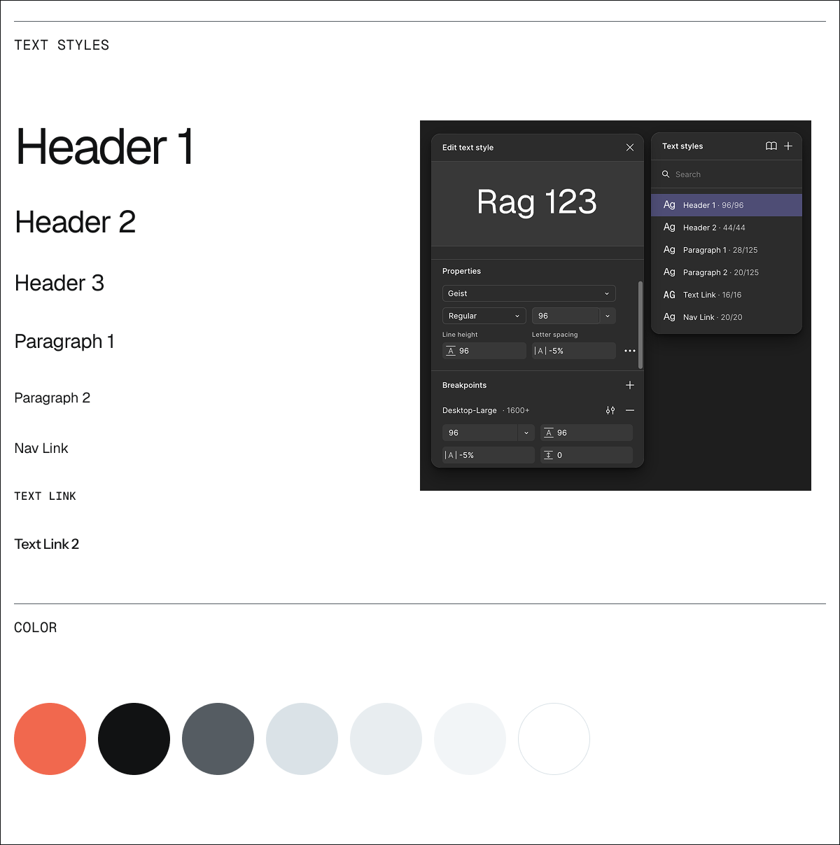
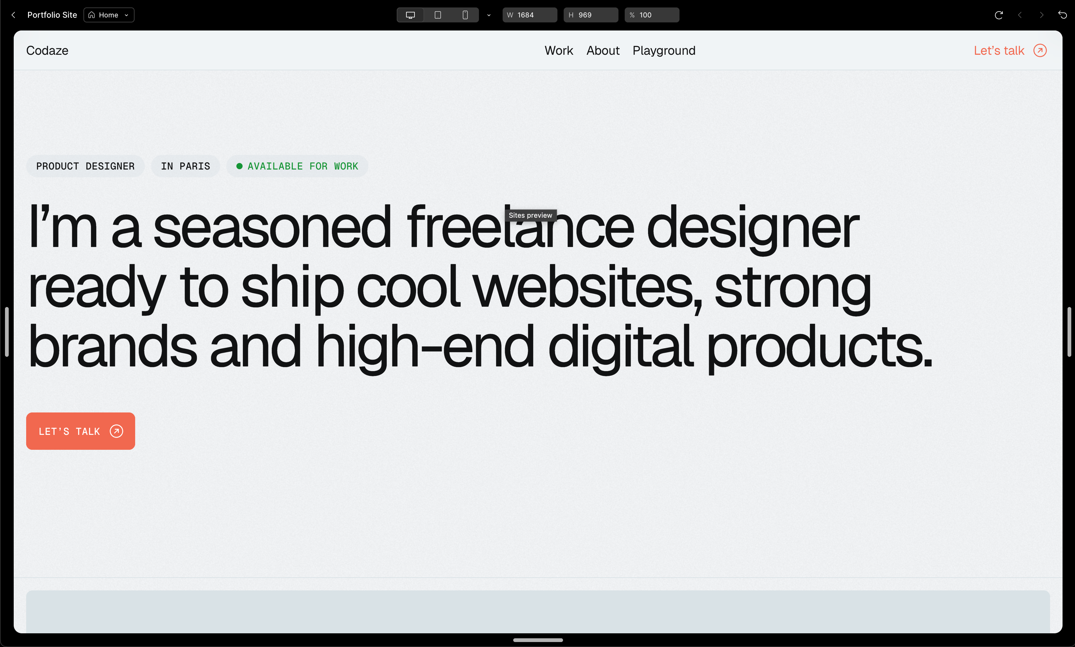
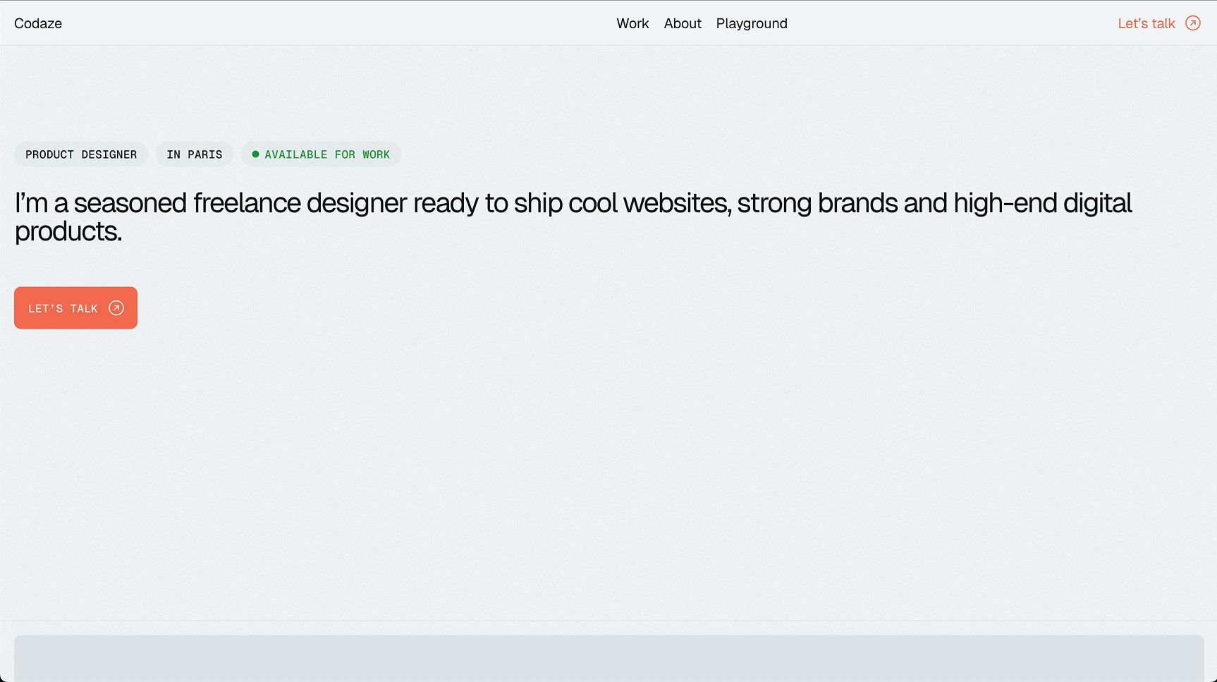
I’ve been moving our website from Framer to Figma hoping to switch, however I encountered one issue: I have text styles with breakpoints for desktop, tablet and mobile. Everything looks good in the preview, however when I publish the site, styles use the values for the mobile breakpoints even on the desktop.

Interestingly enough, if I resize the browser window to a smaller size and then back again, it works. So it looks like the first view is the one with the issue.

At some point, I think it was working properly, but now this issue is back again. I can’t seem to see any correlations with anything else I’m doing.

Anyone else experiencing something similar?

Thank you,
Panos

11 replies

gravitypanda

I created a Home page for my site with 5 breakpoints, mobile, tablet, desktop (primary), desktop large, and desktop XL. I created text styles for the font sizes for the primary desktop, and defined reduced sizes at the tablet and mobile sizes for that text style.

When I published the site, by default, the page was using the mobile sizes, even though my screen is at at the desktop large size. When I resized the browser, then the font sizes would adjust to the correctly defined breakpoints sizes.

I had another page with similarly defined text styles that did not have this problem.

XL Desktop in the Site designer (“My Site” is 100pt)


Mobile size in the Site designer (“My site” is 16pt)


Published website at browser width (1920). (It’s hard to tell in the screenshots, but the browser type size is pulling the mobile font sizes.


Craig_Garner
  • New Participant
  • 12 replies
  • May 15, 2025

I’m experiencing the same behavior, on page load, it defaults to the mobile breakpoint size on desktop, then once you resize the window down to mobile and back to desktop, it then applies the desktop style.

Seems like a bug.


y_toku
Figmate
  • Community Support
  • 2545 replies
  • May 15, 2025

Hi ​@prayminder ​@Craig_Garner ,


Thanks for reaching out. I'm touching base with our internal team about this and will circle back once I have any updates I can share.


Thanks for your patience!

Toku


Max Cdz
  • New Member
  • 1 reply
  • May 16, 2025

Hello,

I am currently testing the new Site feature and I encounter a problem with my published site.

My problem is: the font size do not load as designed when I load the site online.
I designed text styles with various breakpoints.
 

My text styles

And when I preview my design, it looks like this:

Page preview


But when I publish it and load the page, it looks like this: 

Page loaded online


Everything goes back to normal if I resize manually the browser window.

How can I solve this?
Thank you for your help!
​​


Sam_Di_Mauro

I’m having the same issue here, hope it’ll be solved soon (:

Edit: I’m temporarily solving this by detaching text style, not ideal but it works


Senoaji Puspo Murdargo
Sam_Di_Mauro wrote:

I’m having the same issue here, hope it’ll be solved soon (:

Edit: I’m temporarily solving this by detaching text style, not ideal but it works

This works for me, detached in the Typography section. And only doing it on the Desktop breakpoint only.

Thank you so much!


Jocelyn3
  • New Member
  • 4 replies
  • May 26, 2025

I’m having the same problem :( 


y_toku
Figmate
  • Community Support
  • 2545 replies
  • May 27, 2025

HI all,


Thanks for your patience! Our product team has confirmed this was indeed an unexpected behavior and they've deployed a fix. The issue should now be resolved.

Could you please try either reloading the file or restarting your Figma app, then check your published site again?

If you're still experiencing any problems after taking these steps, please let us know and we'll continue investigating.


Thanks,

Toku


Dawid5
  • New Member
  • 1 reply
  • July 15, 2025

Hey,

The issue still exists. I defined font styles with different sizes across breakpoints (Desktop, Tablet, Mobile). In the editing board, they seem to work but both published domain and prototype don’t apply different sizes on smaller breakpoints. It is the desktop size only, through all screen sizes. 

Cheers :)


djv
Figmate
  • Community Support
  • 4907 replies
  • July 15, 2025

Hey ​@Dawid5, thanks for following up about this! 

Did this ever work as expected for you on or after May 27th, when our Sites team pushed the fix?

If so, when did you most recently see this change back to the previous behavior? And are you using the most updated version of Figma?

With a few more details, our Sites team will be better equipped to pinpoint the cause of this bug and fix. 


Nicole Bryan

I am having the same problem as ​@Dawid5 - I’m using Figma Desktop App version 125.5.6 .  In Figma the different breakpoint font sizes show up correctly but when I publish it all of the fonts are the desktop font size


Reply


Cookie policy

We use cookies to enhance and personalize your experience. If you accept you agree to our full cookie policy. Learn more about our cookies.

 
Cookie settings