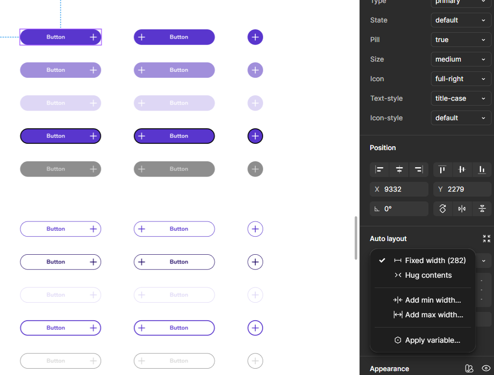
Hi, I am working on a designsystem/ UI-kit in figma. I am currently working on the button components using variants. I want to create differents sizes. eg. small medium and large and set these as variants.
I want the width to be responsive to the size of the device. For example the big button will take up the complete width of the screen minus 7px margins on each size.
I know I can do this with auto-layout -> fill container and applying margin to the whole screen-frame. However I can not add this setting to the main-component button since it is not inside a frame/does not have a parent yet. Is there any way to achieve responsive components that size with the screenwidth by having "fill container"? Thank you so much in advance!