I need percentages too… just found this thread 😂
+1. I would also like to use this functionality. Sometimes it is necessary to make columns 60/40, 70/30 and 80/20. Does anyone know if there is a way around this now?
This is really really needed. It would be great if autolayout frames would conform to grid just like normal frames do. If I set a grid for an autolayout frame and set set an object inside it to fix that conforms to the grid - it should stay this way if I resize the parent frame.
How is this not implemented yet? The Figma team is known for their engineering prowess. This is 2nd grade math. You don’t have to build any new UI. All the Figma team has to do is interpret the % character in their dimensions inputs, and then compute it in the background.
I am relatively new to Figma. I was drawn in by the idea of being able to build what I want developed the way it would be developed. So when I found I could not base max or min sizes on percentages or use relative positioning I realized rather quickly that what I was hoping for is not a reality. Is there any intention to add this feature to Figma any time in the near future?
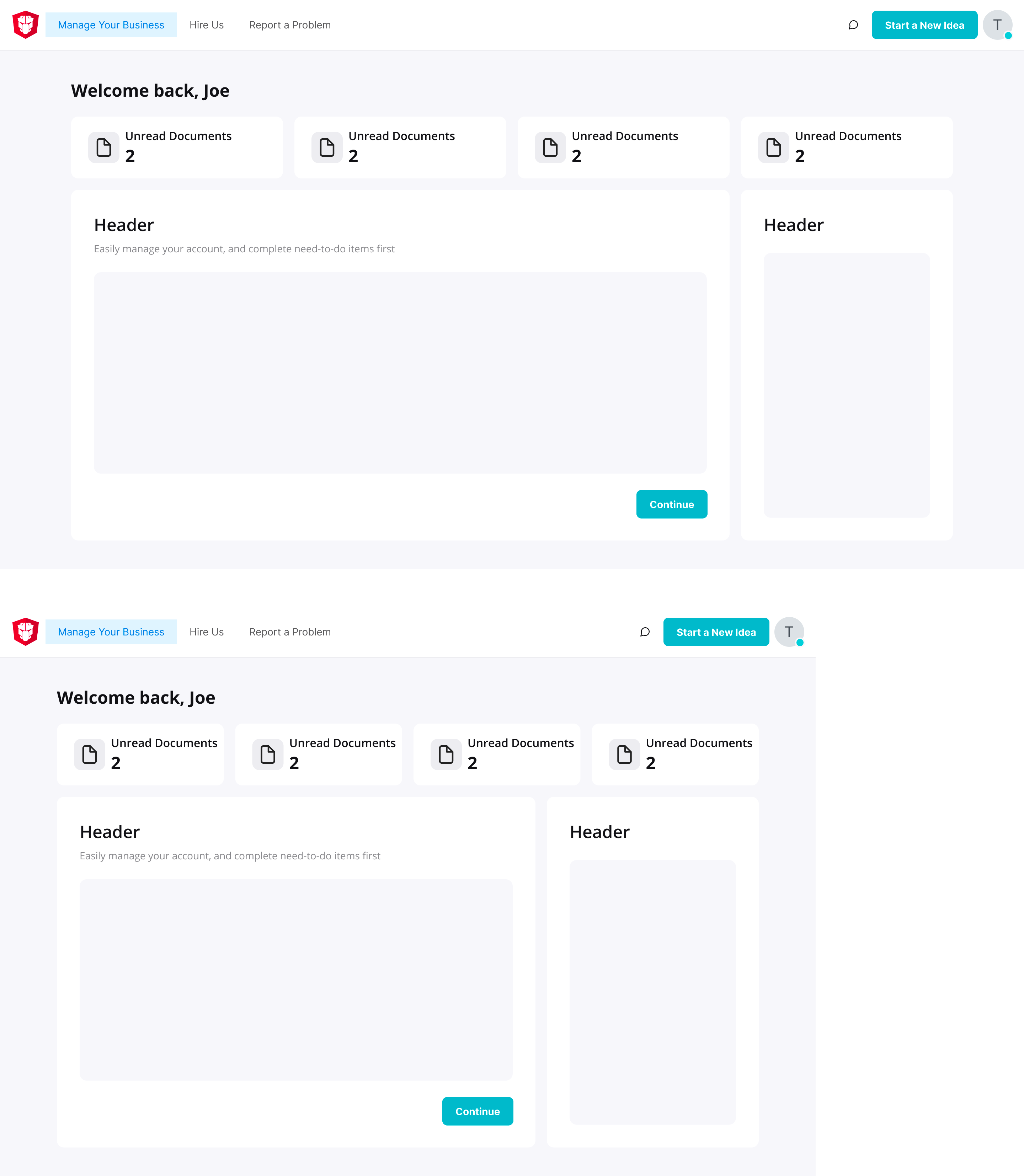
+1!!! This feature would make an amazing addition to the min/max width feature. As others have said, it’s a great way to control column sizes that scale with size of the screen/frame. Here is my current example:
In the first image in the screenshot I essentially have the page broken up into 4 columns, each taking up 25% width (aside from spacing). With the top 4 elements this is easy to lay out because I just set all elements to fill container width, however with the next row of elements that consists only of two elements of differing size it gets more difficult. Because one element takes up 75% and one takes up 25% I have to set the larger element to fill container, and the smaller element to have a max-width that is the same as the widths of the elements in the row above. This creates the illusion that they are using column widths.
Usually in code to achieve this we would use class based width applications based on a certain column grid size that apply a percentage based width. In this case we will say we have 12 potential columns so we will use col-9 for 75% on the larger element and col-3 for 25% on the smaller.
The second image in the screenshot shows why the % widths are needed in Figma, it shows what happens when the frame condenses for that same layout. You’ll see that the column widths no longer line up and it would require a manual change of the width of the smaller element on the second row. Hope this provides a a good example of just one of the ways % based width values would be a HUGE time saver.
Big plus for this, it would be helpful in a lit of cases… I won’t re-hash all the examples, but I do have one to add.
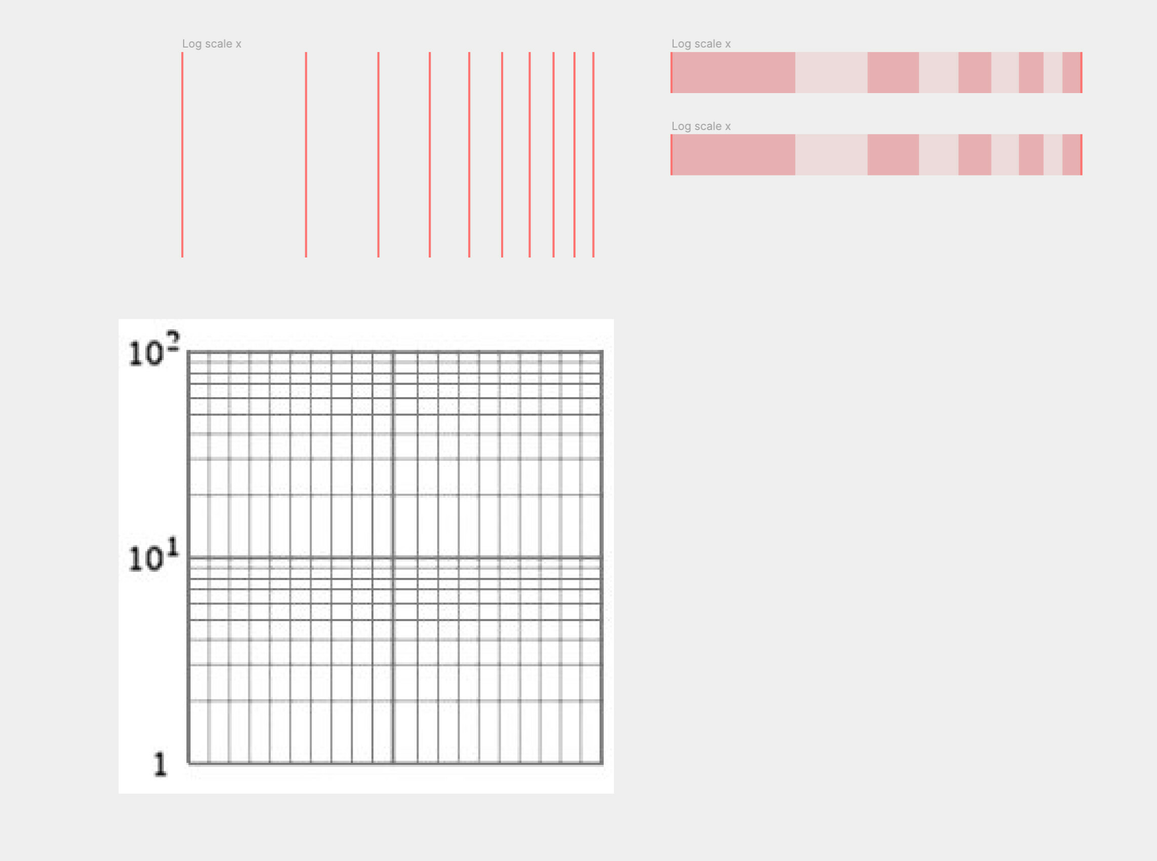
I was attempting to make a logarithmic scale for a chart I was mocking up yesterday which requires the ticks to be spaced proportionally…
Ideally I should have been able to take frames within an auto layout and given them a percentage width and voila… but after a convoluted mess of min/max, nested items, etc, I couldn’t get it to work so I gave up.
I get it… it’s not a typical design measurement, but it’s useful, and ultimately it’s a supported unit of measurement in CSS, so I don’t see why it wouldn’t be a supported. It’s not like we’re asking for calc()
(though, that’d be nice too 😉)
Easily this would be helpful IF Figma could support responsive display in presentations mode!
I have so many designs that could benefit from a full-width hero or even just the line beneath my title bar to extend all the way across my client’s browser would help our jobs as designers and product people.
Having to have a client resize their browser window because our prototypy does not stretch to their giant display settings is detrimental.
Obviously that is a different rant all together. But definitely having some level of being able to alleviate a small part of that presentation challenge could easily be solved by percentage widths.
+1
this will be very useful. will probably use it more often than pixel size.
+1 percentages values for lengths
This is by far the most active feature request and I think everyone on here came to it independently after they wanted to throw their coffee mug at their computer monitor.
Figma, you have created your own problem by introducing some magic that almost gets it right. Autolayout is conceptually the best thing to happen to design software since SVG files. But let’s be honest, once we start using it heavily we hit the walls fast. And we’re mad because we love it but it’s not there.
Put your best people on it.
But yeah REM, EM, and % would go a really really long way. You can tell your engineering team I would even “wait” for the result to be computed, if the constant algebra is the problem (doubtful, but we never know what eats computation.) Seriously, I can either spend 30 seconds waiting for your server with an Nvidia GPU to calculate or I can spend the next three days resizing everything. Guess which one I’m going to choose?
And maybe just do it the way that CSS and CSS frameworks like Tailwind do? 3 columns. 1/3 each. margin? 6% em. Padding? 6% em.
How cool would it be if we could create ‘uneven’ auto layout fills? Let me explain:
Currently in auto layout, if we set content blocks to fill on a column grid it fills it evenly. So in a grid of 6 columns this would mean 2-2-2 or 3-3. But what if we want content blocks to span in a 2-4 way? Or a 1-5? All auto-magically using auto layout.
I’ve tried simulating this by applying min & max width to content blocks but this feels/looks strange when resizing your device frame. It doesn’t grow or shrink evenly. It stretches 1 block to it’s max then starts stretching the other block. Same with shrinking.
Allowing percentages in width could allow this to work. Or changing the way min & max constraints shrink & stretch. Just thinking out loud…
Anyone else struggling with this?
Wait until you try Framer 😍 😍. The most feature-rich tool for layout and design.
Hi @renco.tampere, Thanks for sharing your feed back about auto layout! I noticed another community members requesting something similar here. Therefore, I merged your post to consolidate all the feedback in one location.
Feel free to give this idea a vote up!
Thanks,
Good day! Are there any movements on this topic?
- 1 for me, ideally combined with pinning auto layout boxes to columns. Setting a grid and telling a component to span 4 columns on the mobile layout and 1 on the desktop layout would be a boon.
+1, any updates on this one?
Where are the other topics that got merged together? Want to keep my eye on those as well.
Hey @Greg_Huntoon1, sorry for the confusion!
Once topics are merged, all Votes and replies will exist under this topic, since it’s the only one that remains open. There’s no real reason or need to monitor the previous topics. They are listed and linked beneath the original topic though, if you want to scroll up! ☝️
Here’s a screenshot of what to look for:
+100000 !!! Must have ! Currently having to work around this and it is very annoying
Pointless even posting here. Of all the posts ive made on i dont think one of them has been answered or resolved. This is at 3yrs now. Request to be able to copy/move pages is at 4 years. Billing is still an absolute nightmare where i have to contact support to add VAT number as a business? The list goes on…and each day im using penpot and framer more and more.
Reminds me of Sketch and lessons from “how to squander a great product”
Oh i forgot alignment options on image fills. 3+ years! Crazy