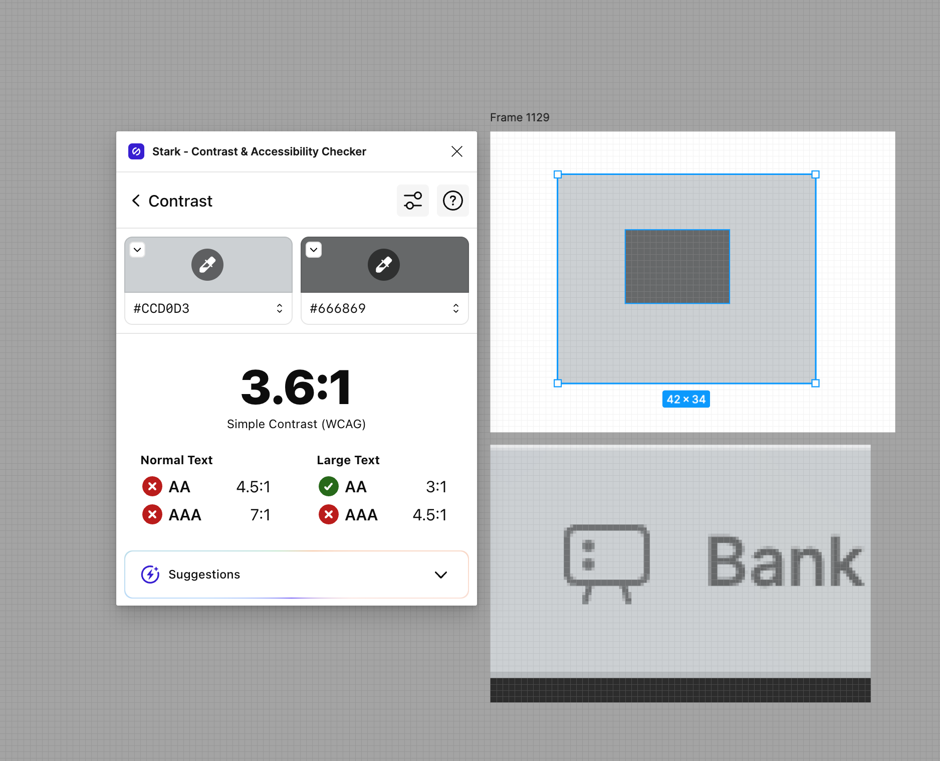
the transparent menu bar is really unreable in light mode, plz return back to black

Hey, my Figma top bar has changed on its own since yesterday and it got so annoying working with it, feels like I am working with Windows 98. I cannot change it back to the default.


Real pain! As I move to Safari browser

Can’t working cause this white top takes a lot of focus on it is own ((((


Hey Kenneth!


Some questions! Pls help!

Where you made this changes?

can you pls provide short steps for me? pleaaase!


I can’t work because this white top panel come to me and talk to me )))


Yes, both the light and dark tab bar fail WCAG AA minimum text contrast requirements.


You may have to clear your cache (Which will also clear your history and reset some of your settings, so … your choice.)


+1 please change it back, it’s super distracting and busy!


At least meet AA contrast guidelines… 😅


I know this will be unpopular, but in addition to disliking dark mode settings (I know, I know) I have always had a very strong dislike of Figma’s black frame and tabs — I use the desktop “application” on Mac OS. So I welcome the new tabs but wish the following were also changed:


  1. Increase the contrast of the font within the tabs — like, make it nearly black.

  2. Make the frame that is still black (the area around the tools, etc.) also light gray.

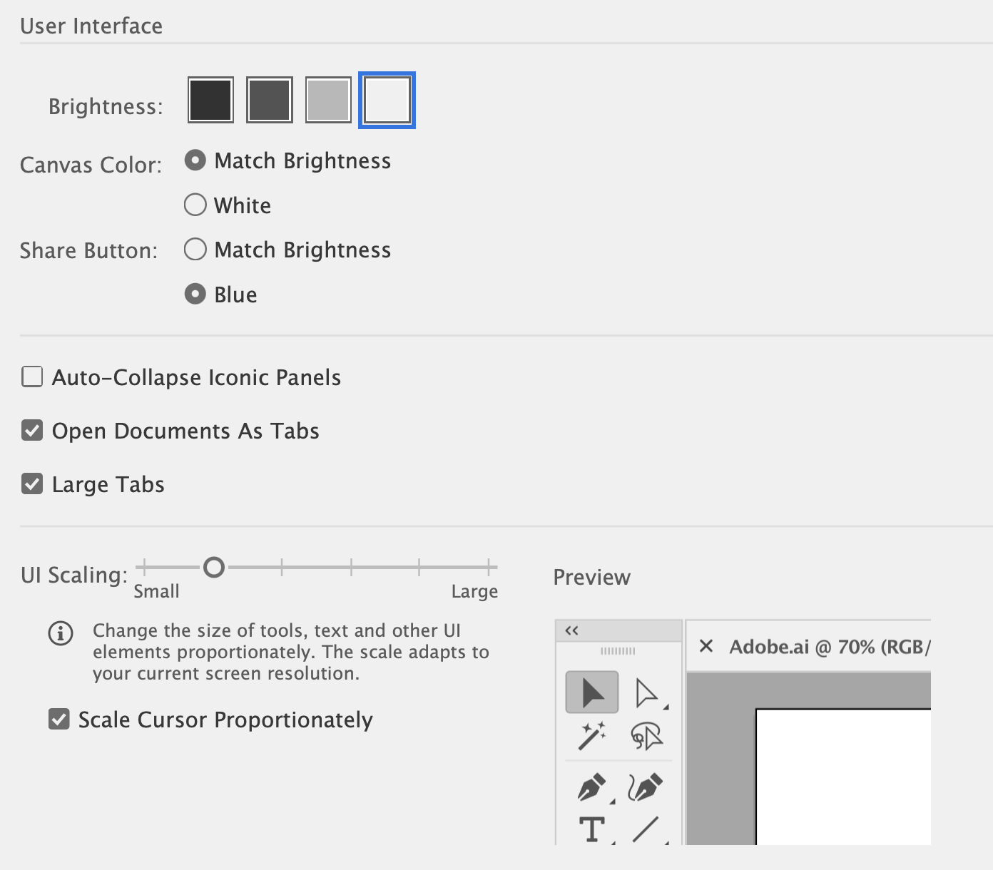
  3. Give users the option — you know, like Adobe does?


Of course, no post of mine would be complete without a mention of customizable keyboard shortcuts, which should trump this relatively insignificant UI change. But that of course is a topic for another extremely longstanding thread.


Temporary solution


1 Desctop APP — Help — Troubleshooting — Toggle Tab Bar Dev Tool


2 In Elements TAB — copy line with class UI3 etc


3 Ask GPT chat how to change color of the Tab bar in Figma to UI2 in context of line from Elements tab


4 Chat gives you scrip that you need to put in Console


5 After that, the same way to change color of Tabs on Tab bar


Time spend — 3 min


It works until restart the app


But for me it is ok cause I restart it not often


Hey All, thank you for your patience and understanding!


The updated panels were intended to be tied to UI3. We’re still rolling this out slowly to the community, but in the interim, we’ve shipped a fix to ensure that you don’t see a mixed UI2/UI3 experience.


If you’re still seeing the mis-matched tab colors, please refresh and let us know if you continue to run into any further issues.


not ugly. But this white guy is just yelling at me. 🤣


For real. Not good 🫠


Damn, The new version not only has strange interactions, but also has a very long path for exporting files. It is recommended that your product manager resign as the previous version did not consider user experience at all


Hey, Dvaliao!

Well the white screaming bar is back and screaming at me again, and there is no option in the settings to revert back to the previous UI. What’s your advice on what to do?


I have the similar issue, white tabbar and old Figma interface at working Figma account 😃


Maybe that is because I have new interface at my personal Figma account, and the app just want to show top tabbar similar styles.


Hey @Andrey22, sorry to hear this!


We took a look at the backend, and this seems expected since you already have access to UI3. There’s no option to revert back to the previous UI under settings.


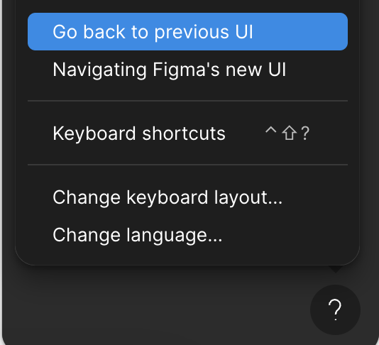
You can go back to the previous UI via the help ? icon in the lower, right-hand corner:

Screenshot 2024-08-06 at 10.35.37 AM


Hey @Dmitrii_Markov, sorry for the trouble!


The team took a look at your account associated with the email address here on the forum, and this nav bar behavior is expected since you now have access to UI3.


Which UI version are you seeing? When did you last refresh your tabs?


Reply