Hello everyone! 👋
I’m currently designing a collapsible sidebar for a project, but I’ve run into an issue I can’t seem to solve despite watching tutorials and googling extensively.
Here’s the setup and what I’m trying to achieve:
- Sidebar design:
- It contains menu items with an icon and a label.
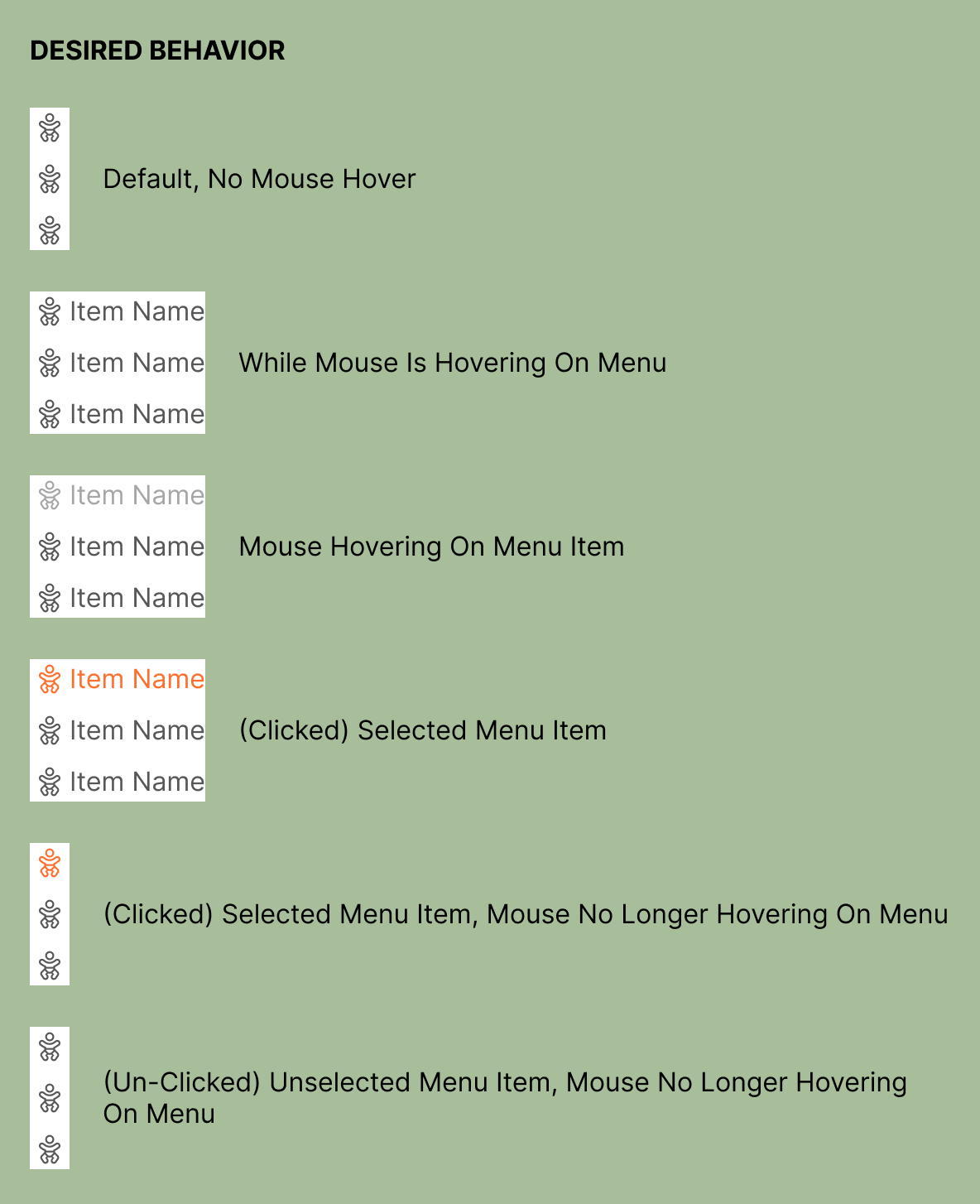
- When collapsed, only the icons should be visible.
- When expanded, both the icon and label should appear.
- Interaction details:
- Hovering over the menu (while collapsed) should show the label next to the icon.
- Each menu item has two variants:
- Expanded (icon + label)
- Collapsed (icon only)
- Additionally, there are three states for each variant:
- Default
- Hover
- Selected
This is the desired behavior:
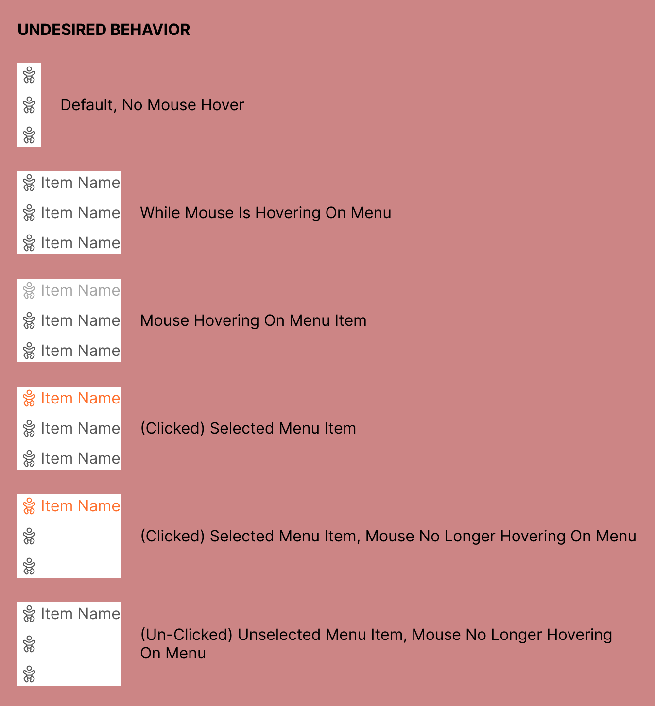
Vs the behavior I’m currently experiencing
I’m trying to keep the file as simple as possible, I’m using only one component per menu item, later on they’re meant to have different icons and labels. Should I have a dedicated component set per menu item?


