

I’d really appreciate it if Figma prototyping would support simulated OS and Browser chrome when viewing for smaller screens and devices.
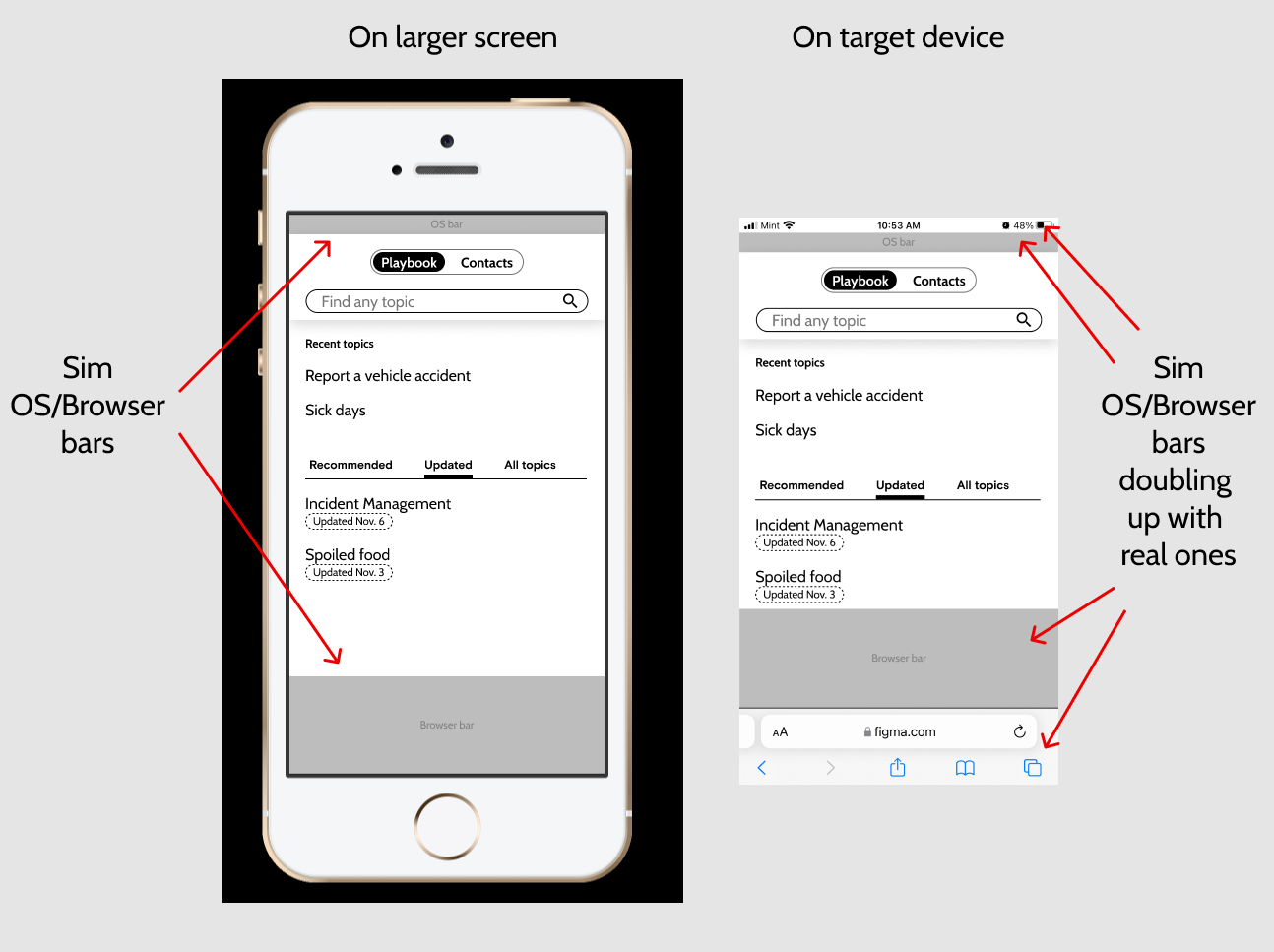
Full screen is great for games but apps show the OS chrome and web apps show OS and Browser chrome until scrolling. Not depicting that leads both designers and stakeholders astray, thinking they have more screen real estate than they really do.
There’s currently no way to simulate web apps well between the target device AND a larger screen. If I include them for viewing on larger screens, then they double up with the real ones on target devices. If I don’t include them to display correctly on target devices, the larger screens depict more room than will really be shown on the target devices.
The example I’m showing here is for an iPhone but the same thing applies for Android, Windows, Mac, and Linux.
Does anyone have a work around for this?
The only things I could think of so far are 1) knowing that people will only either use one device or the other, or 2) duplicating your whole design into with and without versions.