Hey @Michael_Staton, thank you for your feedback! I understand your frustration, this can be time consuming. I’ve shared your feedback internally and asked for workarounds/solution. I’ll get back to once I get a response from the team. I appreciate your patience!
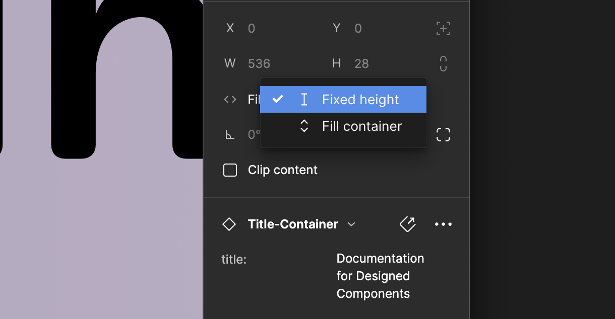
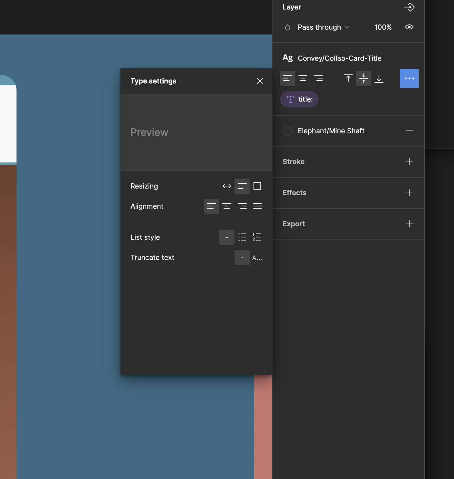
Apologies for a delayed update. So I’ve got the response that it looks like the text box resizing is set to wrap and not expand, would adjust the component first to allow it to resize.
Please let me know if this response helps and resolves your issue! Happy to ask the team for further help.
Hi @Gayani_S , this may make me sound like a jerk, but – I don’t want a work around. I want your text boxes to JUST WORK.
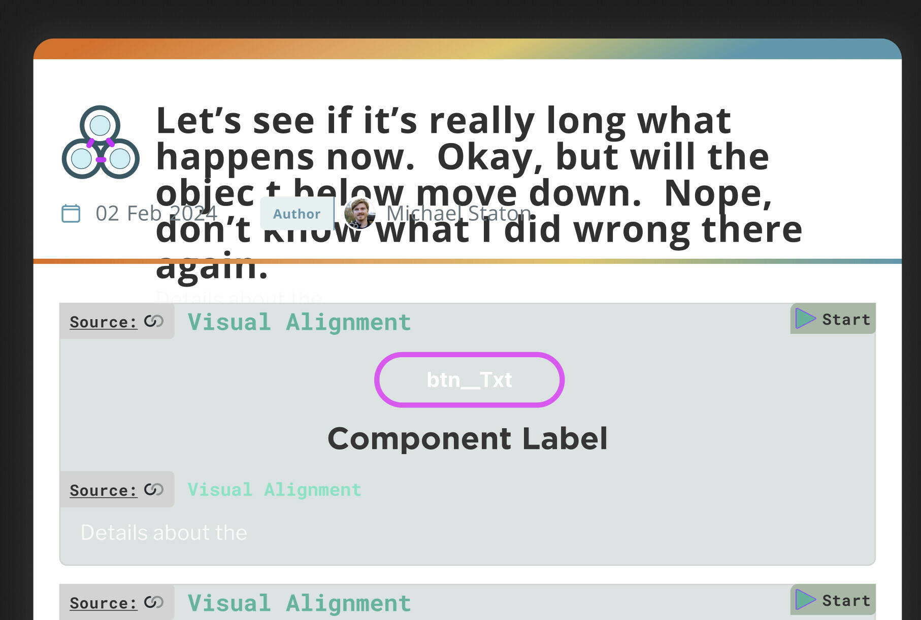
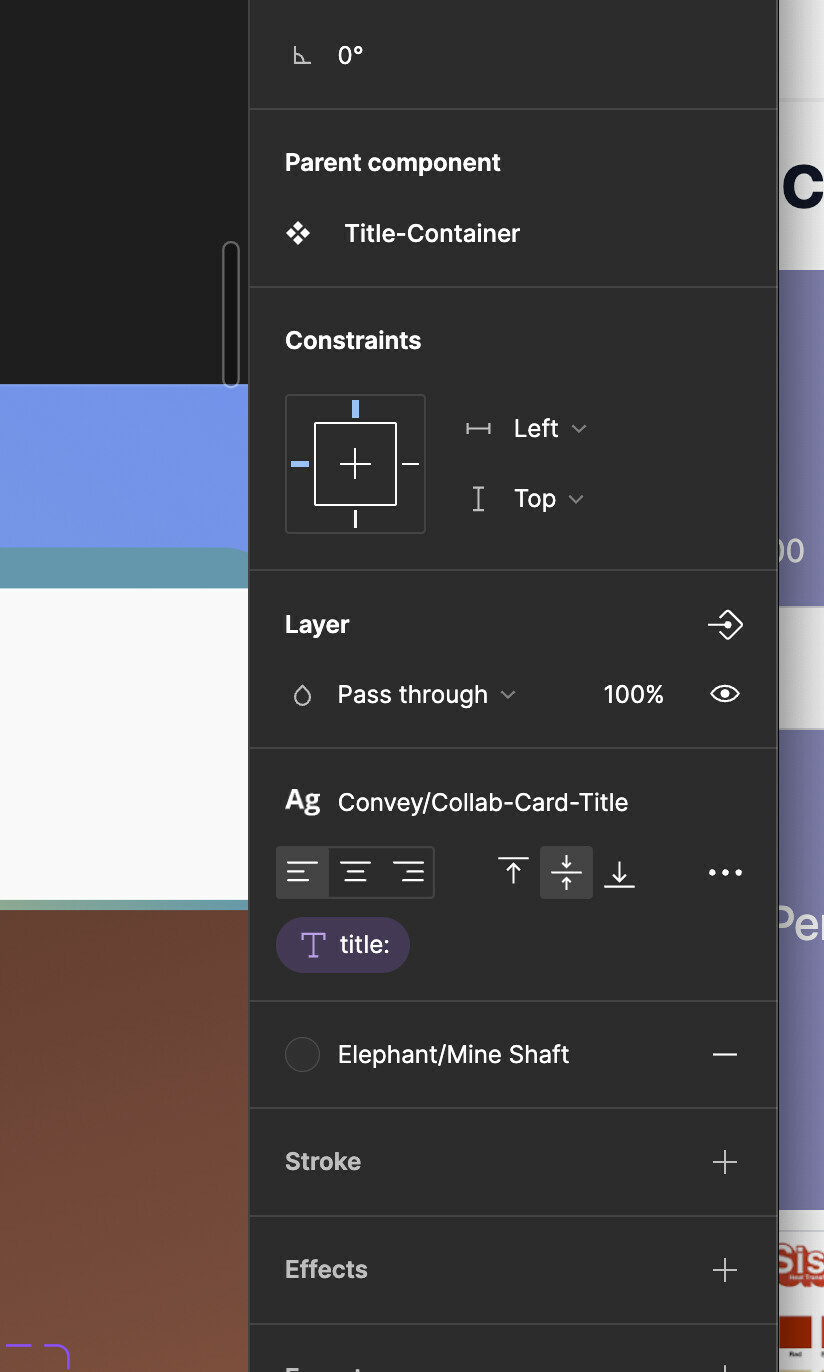
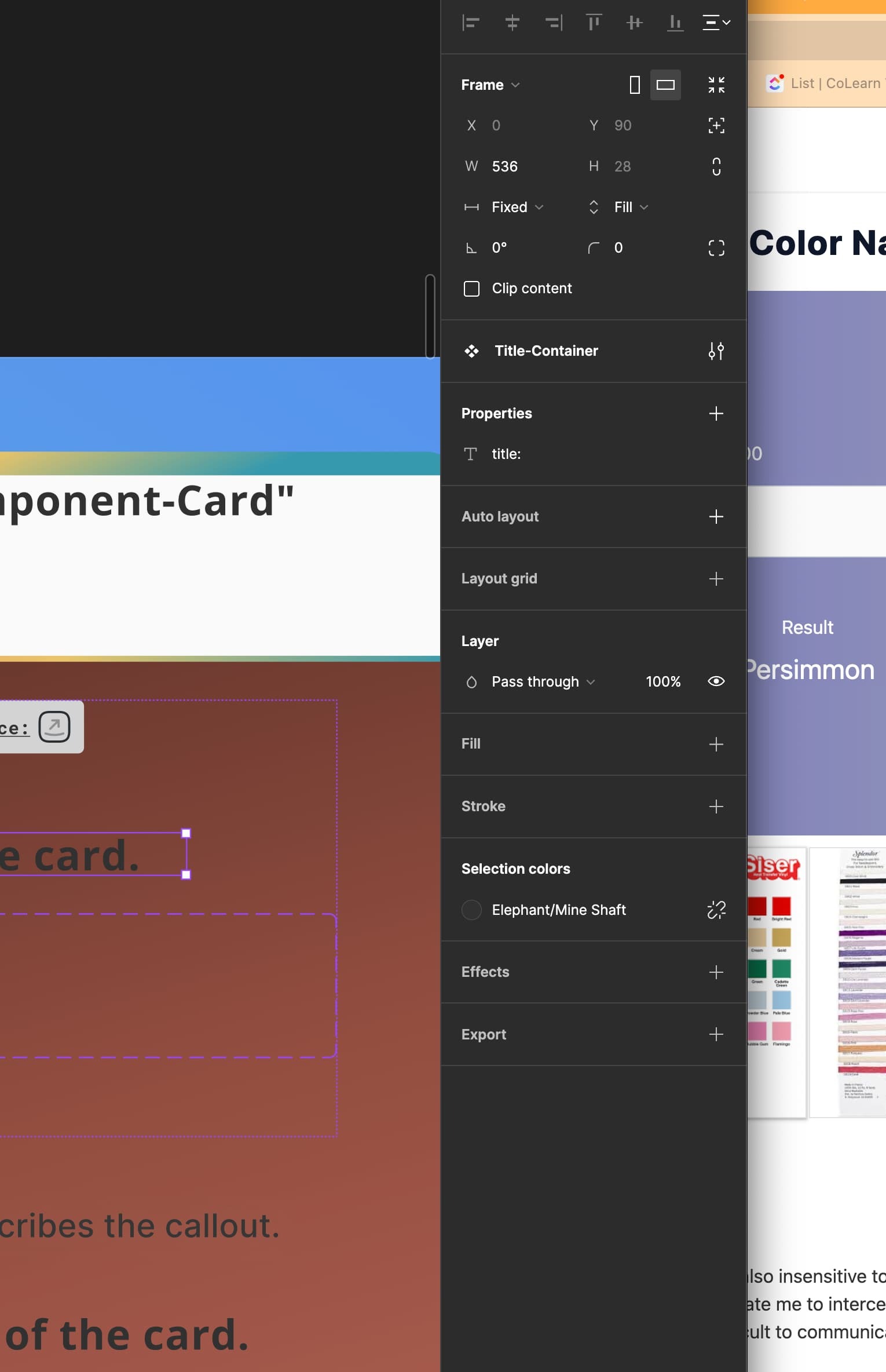
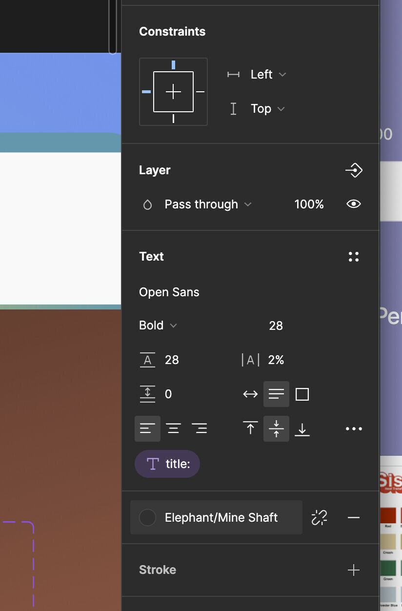
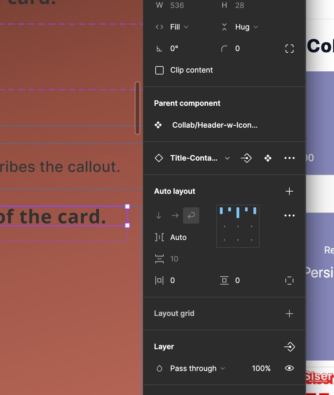
I followed your instructions, and went to through, I don’t know, 18 different places where the setting could be (because components have nested components, recursively. Then add on variants. Ugh. Here’s what I ended up with after I spent a good half hour trying to make sure every single property of the component tree was set and updated:
@Gayani_S I actually think the theme here is that any one object needs to have influence over the objects around it. If not influence, at least have a view.
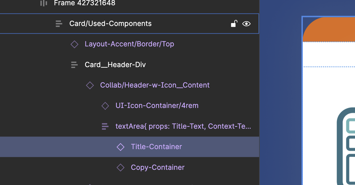
Like, in this one screenshot you are seeing there are around 8 components. There’s the slot for the Icon, the Icon itself, the date, the author, that author avatar, the Title, (a subtitle too), then there’s the top border gradient frame, the separator gradient frame, then they are all mashed together into a Card__Header.
Half of those components have many variants.
Figuring out where the “Fixed, Fill, Hug” properties of Autolayout objects is a scavenger hunt that never ends. Figuring out which part of any object has a Frame or Group that has their “Constraints” in some setting that throws the whole thing off is also a Scavenger Hunt.
It’s two the point where I’m spending probably 70% of my time NOT doing product work, NOT doing design work. I’m literally trying to just figure out what is going on with components and component properties. Not sure what the solution is, but please put this in the “urgent user requests” bucket.
Just to finish where we started, BLEEDS. Good old graphic design from publishing software created like 30 years ago. Easier controls and easier to find controls on which direction text bleeds WITHIN nested components, when you are looking at an Instance of a Component that has Nested Components.
Here are some screenshots on my epic and unsuccessful journey.
Hey, thank you for your detailed explanation and for providing screenshots! I totally understand your frustration, this is definitely a time consuming process. Appreciate that you’re taking your time to leave your feedback in the Forum. I am going to share your feedback internally and will update if I get any more information.
Thank you,
Gayani.
Hey @Michael_Staton, wanted to give you an update. Our product manager will be in touch with you soon to investigate further on your case. It’d be helpful if you can share a file with him so that he can take a look at your case.
Thank you!
That is sweet, how are they reaching out to me?
Hey @Gayani_S I am not really great at email. I get thousands every day. If I don’t connect with your product manager, I think the solution is a button that allows you to decide what to do with “text overflow”.
Text overflow will get even more important with the release of text variables, some of your community plugins that allow data to populate objects in Figma (shoutouts to data.to.design).
There are really only four options in this button.
- Bleeds? False. Ask the user to resize the font. (If you could automatically resize the font or have the component designer set decision rules here even better. Like, overflowed text just shrinks the font size to fit in the box. Here’s a magic box from SquareSpace that resizes the font for the user, (but doesn’t have constraints or max-min settings).

- Bleeds? True. Expand the box (frame or autolayout, shouldn’t matter. a) Expand the box horizontally left or right or both. b) Expand the box up or down or both.
For most written languages you are either expanding it to the right or to the bottom. With your max width and max height feature it could be a dance between both.
Allow overflow to override contextual objects? True. Overflow will move other objects in directions, even if the settings of the other objects are fixed. NO MATTER WHAT the text overflow will be handled the way it’s intended.
If override adjacent contextual objects is True, what are the constraints? To the left, to the right, to the top, to the bottom. Max width and height.
Allow overflow to override contextual objects? False. Back to number 1). resize the font.
Most of the challenges I run into are wanting the textbleed to stay in the same font size and weight but simply expand the height of the box downward. I promise you , I have monkeyed with this for hours and hours. When it works and when it doesn’t is still a dramatic mystery.
I will give a plug for another feature request I made elsewhere: a convenient Debug interface. Like an IDE. I think there’s something called a Stack Trace. If the IDE is good you can basically just follow the breadcrumbs until you get to the source of the problem, sometimes it even just takes you straight to the problem.
Hey Michael, apologies for the time to a response here. Would it be possible to get a copy of your components and design file to take a look at what’s happening? Some of it is certainly on us, but it’s helpful to see how you’ve got things set up to get to a better understanding of what’s happening.
The debug interface sounds interesting! Could you tell me what sorta info you’d want to see and why in there (in addition to some of what’s above)?
Oh, I’m said I didn’t see this sooner. I had to relocate a few times and lost my Figma focus. Yeah I can do that. Where do I put them?
Thank you, this was driving me nuts 🙏 🙏 🙏 🙏 🙏


